
Pass U.S. ADA Inspections: Mount Tactile Signs 48 to 60 Inches
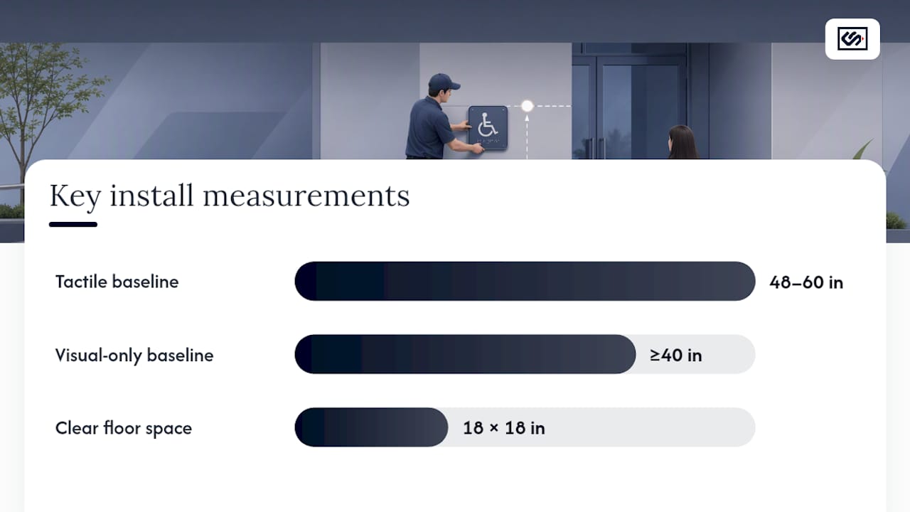
Under the 2010 ADA Standards, tactile signs must be mounted so the baseline of the lowest tactile character sits at least 48 inches above the finished floor, and the baseline of the highest tactile character sits no more than 60 inches above it. Visual-only signs follow a different rule: a 40-inch minimum mounting height. The 48–60 inch range applies to permanent room and space identification signs that require raised characters and Braille. Directional and informational signs, which are visual-only, only need to clear that 40-inch floor.
TL;DR:
- Tactile signs for permanent rooms and spaces must have character baselines mounted between 48 and 60 inches above the finished floor, measured to the baseline, not the sign edge.
- Visual-only signs such as wayfinding and capacity notices require a minimum height of 40 inches measured to the character baseline, not the sign's top or bottom.
- Sign placement should follow predictable latch-side wall mounting and ensure an 18 by 18 inch clear floor space beyond the door swing arc for accessibility.
- Sign lettering size must scale with mounting height and viewing distance, using the ADA character-height table to determine minimum letter size.
- Proper measurement, documentation, and consistent placement are crucial to avoid costly rework and ensure compliance with ADA standards.
Table of Contents
- ADA Restroom Sign Height and Other Tactile Signage: The 48–60 Inch Rule
- Visual-Only Signs and the 40-Inch Minimum Height Rule
- Character Height and Viewing Distance: How to Size Your Lettering
- Latch-Side Placement: Where to Mount ADA Signs Horizontally
- Clear Floor Space: The 18-Inch Rule Around Door Swings
- Elevators, Post-Mounted Signs, and Other Exceptions to Know
- A Day-of-Install Checklist for Verifying Compliance
- Common ADA Sign Mounting Mistakes and How to Fix Them
- What CrispSign Sees on the Manufacturing Side
- Why Predictable Sign Placement Is About More Than Passing Inspection
- Order Compliant Signage Without the Guesswork
- Where to Verify These Standards Yourself
- Sources
- FAQ
ADA Restroom Sign Height and Other Tactile Signage: The 48–60 Inch Rule
Most confusion around ADA sign height starts with one word: baseline. The 2010 ADA Standards §703.4.1 doesn't measure to the top of the sign or its center. It measures to the baseline, the invisible line each tactile character sits on, the way letters sit on a line in a notebook. The lowest character's baseline must be at least 48 inches above the finished floor. The highest character's baseline can't exceed 60 inches.
That distinction matters because a sign panel with a Braille row underneath the raised letters can still fail inspection if the character baselines fall outside that 48–60 inch window, even if the panel itself looks properly placed. Installers who measure to the bottom edge of the sign plate instead of the actual letter baseline routinely get this wrong.
Not every sign needs to meet this tactile standard. The Access Board's guidance draws a clear line: tactile characters and Braille are required for signs that identify permanent rooms and spaces, not signs that simply point the way somewhere.
Signs that typically require tactile characters include restroom doors, room and office identification, stairway and exit identification, and permanent space labels.
Signs that usually do not require tactile characters include directional signs, building directories, occupant load or capacity postings, and temporary or changeable-message signage.
If your business is labeling a fixed room that people occupy or use as a destination, plan for tactile and Braille at 48–60 inches. If you're just pointing traffic through a hallway, the visual-only rules below apply instead.
Visual-Only Signs and the 40-Inch Minimum Height Rule
Directional and informational signage skips the raised-character requirement entirely, but it doesn't skip a height rule. ADA Standards §703.5.6 sets a 40-inch minimum mounting height for visual characters, measured to the baseline of the character, not the sign edge.
The logic behind the 40-inch floor connects directly to viewing distance and readability. A sign mounted too low forces someone using a wheelchair, a cane, or simply walking past to crane downward at an awkward angle, and low-mounted text tends to get lost below sightlines in crowded corridors. The 40-inch minimum keeps visual text at a height that's readable from a standing or seated position without extra strain.
Where this shows up in practice:
- Wayfinding signs pointing toward restrooms, exits, or departments
- Building directories in lobbies
- Occupancy and capacity notices
- Room-number signage that supplements a tactile sign but isn't itself required to be tactile
The 40-inch minimum is a floor, not a fixed target. Character size still has to scale with how far away someone is likely to be standing when they read it, which is where the ADA's character-height table comes in. A sign mounted at eye level for someone standing close needs far smaller lettering than a wayfinding sign meant to be read from across a lobby.
Character Height and Viewing Distance: How to Size Your Lettering
Mounting height alone doesn't guarantee compliance. The ADA's character-height table (Table 703.5.5/703.5.6) ties minimum letter height to both mounting height and how far away a reader is expected to stand. A sign mounted higher, or read from farther away, needs bigger characters. A small placard mounted close to eye level can use much smaller type.
| Mounting height above floor | Horizontal viewing distance | Minimum character height |
|---|---|---|
| 40 in to 60 in | Under 60 in | 5 in |
| 40 in to 60 in | 48 in to 180 in | Scales up proportionally with distance |
| Above 60 in up to 120 in | Varies by distance | 2 in minimum |
| Above 120 in | Varies by distance | Larger minimums apply, sized for distance viewing |
To apply the table correctly, measure the actual horizontal distance a person would stand from the sign to read it, not the diagonal or the ceiling height. Overhead directional signs mounted above 120 inches, common in airports and hospitals, need dramatically larger lettering than a door plaque someone reads from two feet away.
Two details trip up otherwise compliant signs. First, the ADA measures character height using the uppercase letter "I" as the reference, since it has no ascenders or descenders to distort the reading. Second, stroke width and figure-to-background contrast matter as much as size. A technically tall enough letter that's too thin, or printed in low-contrast gray-on-gray, can still fail a usability review even when it passes the raw height number.
Latch-Side Placement: Where to Mount ADA Signs Horizontally
Height is only half the compliance equation. Where the sign sits horizontally, relative to the door, matters just as much, and the Access Board is explicit about why: predictability. Someone using a cane or navigating by touch learns to search for room signs in a consistent spot. Break that pattern and you've effectively hidden the sign, even if the letters are perfectly sized.
- Single doors: mount the sign on the wall on the latch side of the door, not on the door itself. A sign on a door swings out of reach and defeats the purpose.
- Double doors with one active leaf: mount on the inactive leaf, centered, at the standard 48–60 inch tactile range.
- Double doors with two active leaves: mount to the right of the right-hand door.
- No latch-side wall space available: mount on the nearest adjacent wall, following the door swing so it doesn't sit inside the arc.
The reasoning here isn't arbitrary bureaucracy. A blind visitor trained to reach for the latch-side wall in one building expects the same layout in the next. Every time a sign shows up on the door face, or on the hinge side instead, that expectation breaks, and so does usability. Facility managers retrofitting older buildings often discover the latch-side wall is too narrow or interrupted by trim, which is exactly when the nearest-adjacent-wall rule becomes the fallback plan rather than a shortcut.
Clear Floor Space: The 18-Inch Rule Around Door Swings
A sign mounted at the right height and the right side of the door still isn't compliant if nobody can physically get close enough to read it by touch. The standard requires a clear floor space of at least 18 inches by 18 inches centered on the tactile characters, positioned beyond the arc the door travels when swinging from closed to 45 degrees open.
That 45-degree arc matters more than most installers realize. A door doesn't have to be fully open to intrude on the reading zone. If the sign sits too close to the hinge side or too shallow into the corridor, someone reaching to read Braille could have their hand caught in the door's swing path, or simply be blocked from standing close enough.
Where this gets tight:
- Narrow corridors where the opposite wall limits how far the clear zone can extend
- Recessed doorways where the door swings into an alcove
- Vestibules with two doors in close sequence
Pro Tip: Before final installation, hold a paper template of the sign against the wall and physically swing the door to 45 degrees. If your hand can't comfortably reach the template without the door brushing your arm, the clear floor space isn't there yet, and the sign needs to move to the nearest adjacent wall instead.
Avoid mounting directly behind a door stop, radiator, or trim piece that eats into the 18x18 footprint even when the wall itself has room. Inspectors check the usable clear space, not just the wall surface area.
Elevators, Post-Mounted Signs, and Other Exceptions to Know
The 48–60 inch tactile range and the 40-inch visual minimum cover the vast majority of interior signage, but a handful of sign types play by different rules entirely.
- Elevator hoistway and car signs: raised characters on hoistway floor-designation signs can be as small as 2 inches, and control-panel tactile markings, the numbers and symbols embossed on the buttons themselves, often sit outside the standard 48–60 inch band because they're tied to the control panel's own required height, not a wall-mounted sign.
- Platform lifts: follow many of the same tactile and Braille criteria as elevators, with their own placement exceptions.
- Post-mounted signs (freestanding signs on poles, common for parking or building identification): if the sign's leading edge sits between 27 and 80 inches above the floor, it cannot protrude more than 12 inches into a circulation path.
- Blade signs (perpendicular wall-mounted signs projecting into a walkway): the same protrusion logic applies. A blade sign with its bottom edge in that 27 to 80 inch zone needs to stay within that 12-inch protrusion limit or be mounted higher, above 80 inches, where different allowances apply.
Signs with leading edges below 27 inches or above 80 inches follow separate protrusion rules, since they fall outside the head-height and cane-detection zone the 12-inch limit is designed to protect. Anyone installing post-mounted directory signs, exterior parking signage, or projecting blade signs should treat protrusion distance as its own checklist item, separate from mounting height entirely.
A Day-of-Install Checklist for Verifying Compliance
Getting the math right on paper doesn't help if the crew on-site skips a step. Here's the order that catches the most common errors before a sign goes on the wall permanently.
- Identify the sign type first. Tactile-required (permanent room ID) or visual-only (directional/informational)? This decision drives every measurement that follows.
- Mark the baseline, not the panel edge. Use a template with the baseline pre-marked, and measure from the finished floor to that line, 48 to 60 inches for tactile, 40 inches minimum for visual-only.
- Confirm horizontal placement. Latch side for single doors, inactive leaf or right-of-right-door for double doors, nearest adjacent wall if no latch-side space exists.
- Check the clear floor space. Verify an 18 by 18 inch zone centered on the tactile characters, clear of the door's swing arc to 45 degrees.
- Match character height to viewing distance. Measure the actual horizontal distance a reader will stand and confirm lettering meets the corresponding minimum from the ADA table.
- Photograph and log everything. Take a photo with a tape measure visible in frame, showing floor-to-baseline height and clear floor space, and note any adjacent obstructions like door stops or trim.
Pro Tip: Keep a laminated measuring template in the install kit that marks 48 inches and 60 inches directly on its edge. Crews that eyeball height with a standard tape measure are far more likely to mismeasure the baseline versus the panel edge, especially on multi-door jobs where fatigue sets in by the tenth sign.
Bring a 25-foot tape measure, a laser level, and the pre-marked template to every job. Skipping the photo-log step is the single most common reason facilities fail a follow-up inspection: the sign might be correct, but there's no record proving it.
Common ADA Sign Mounting Mistakes and How to Fix Them
Even experienced installers repeat a few predictable errors. Catching them before final walkthrough saves a callback.
- Measuring to the sign panel instead of the character baseline. This alone accounts for a large share of failed inspections. Fix: remeasure using the character baseline, and remount if the panel's design puts the baseline outside 48–60 inches.
- Mounting on the door instead of the latch-side wall. A sign attached to the door swings out of a predictable location. Fix: relocate to the adjacent wall; if no latch-side wall exists, use the nearest adjacent wall rule.
- Ignoring the door swing arc when placing the sign. The 18x18 clear space needs to sit beyond the 45-degree open position. Fix: test with the door physically open before finalizing placement.
- Undersizing visual characters for the viewing distance. A sign correctly mounted at 40 inches can still fail if the lettering is too small for how far away it's read. Fix: recheck against the character-height table and reprint with larger type if needed.
- Assuming all signage needs Braille. Directional and informational signs don't require tactile characters at all, wasting budget and production time. Fix: confirm sign category before ordering.
When a mounting error is structural, wrong wall, no available latch-side space, involving a facility's architect or a local code official before remediation avoids a second round of rework.
What CrispSign Sees on the Manufacturing Side
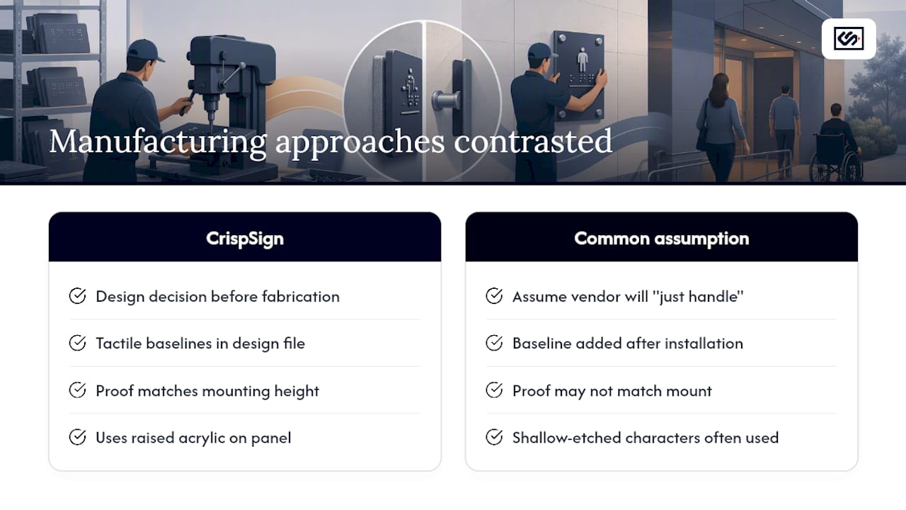
CrispSign builds custom signage for storefronts and interiors nationwide, and tactile compliance questions come up constantly from small-business owners who assumed their sign vendor would "just handle" ADA requirements. It doesn't work that way. Compliance is a design decision made before fabrication starts, not an afterthought bolted on after installation.
On the production side, getting the baseline right starts with the file, not the wall. CrispSign's production workflow builds tactile character baselines directly into the design proof, so what a business owner approves online matches the physical mounting height a crew will measure to on-site. That upfront precision is what keeps turnaround fast without sacrificing the exact measurements an inspector will check.
Material choice matters more than most business owners expect, too. Raised acrylic characters on a durable panel hold their profile better over years of door traffic than shallow-etched alternatives, which matters because Braille and tactile lettering get touched constantly, and shallow characters wear down faster than deeply formed ones. For restrooms, stairwells, and office identification, that durability difference shows up in whether a sign still reads correctly by touch five years after installation, not just on day one.
Why Predictable Sign Placement Is About More Than Passing Inspection
The height numbers in this article aren't arbitrary bureaucracy. They exist because a person navigating by touch or cane learns to expect a sign in a specific spot: latch side, waist to shoulder height, a consistent reach every time. Break that pattern building to building and you've made every unfamiliar space harder to navigate, regardless of how nice the sign itself looks.
Businesses tend to think of ADA signage as a compliance checkbox until a complaint or an inspection forces the issue. By then, remounting a sign that was installed on the wrong wall, or at the wrong baseline, costs far more than getting it right the first time would have. Documentation matters here too. A folder of installation photos with a tape measure in frame is cheap insurance against a dispute that could otherwise turn into a drawn-out and expensive correction.
Get the placement predictable and consistent, and you're not just avoiding a fine. You're making your business easier to use for everyone who walks through the door.
— Nick
Order Compliant Signage Without the Guesswork
CrispSign fabricates tactile and Braille signage built to the exact baseline heights this article covers, then ships nationwide with the mounting specs already built into the design proof. Every sign is produced to your exact room labeling and mounting requirements, so what you approve online is what an inspector will measure on the wall.

If you'd rather not hand your install crew a tape measure and a prayer, CrispSign also coordinates professional installation for an added flat fee, so the same team that understands baseline measurement and latch-side placement can handle the mounting itself. Whether you're labeling a single restroom door or outfitting an entire office building, start by designing your compliant signage online and get an instant estimate before you commit.
Where to Verify These Standards Yourself
Every measurement in this article traces back to federal standards, not industry convention, and it's worth bookmarking the primary sources rather than relying on secondhand summaries.
- Chapter 7: Signs, U.S. Access Board covers tactile character baselines, clear floor space, and mounting location rules in full.
- Chapter 7: Communication Elements and Features contains the character-height and viewing-distance table.
- The Ada hosts the complete legal text for code officials and designers.
- The Access Board's technical guide on signs details post-mounted sign protrusion limits.
Keep your own installation photos and measurement logs alongside these references. When an inspector asks how a sign's height was verified, a dated photo with a tape measure in frame settles the question faster than any explanation.
Sources
- Chapter 7: Signs — U.S. Access Board
- Chapter 7: Communication Elements and Features — U.S. Access Board
- Technical guide excerpts — U.S. Access Board (PDF)
- Ada
FAQ
What is the minimum mounting height for ADA signage?
It depends on the sign type. Tactile signs need a baseline between 48 and 60 inches above the floor, while visual-only signs need a minimum of 40 inches.
How high should a handicap restroom sign be from the ground?
Restroom identification signs require tactile characters and Braille, so the character baseline must fall between 48 and 60 inches above the finished floor, measured to the actual letter baseline, not the panel edge.
How high off the ground does a blade sign have to be to comply?
Blade signs don't have a separate mounting-height minimum, but if the leading edge falls between 27 and 80 inches above the floor, it cannot protrude more than 12 inches into the walkway.
What is the recommended mounting height for an accessible route or directional sign?
Directional and wayfinding signs are visual-only and only need to meet the 40-inch minimum height, with character size scaled to expected viewing distance.
Does CrispSign build signs that meet these ADA height requirements?
Yes. CrispSign fabricates tactile, Braille, and visual signage designed to the exact baseline and mounting specifications outlined in the 2010 ADA Standards, with installation coordination available.