
Visibility at 30+ MPH: Best Sign Colors for Business Owners
The best sign colors are the ones with the highest luminance contrast, not the ones that match your logo exactly. Black on yellow, white on navy, black on white, and white on black consistently outperform other pairings because the human eye detects contrast before it recognizes color. For maximum visibility at a distance or in bad light, black on yellow leads the pack. For a clean, professional storefront look, white on navy or black on white does the job. Whatever pair you choose, test it at the actual viewing distance and lighting your sign will face.
TL;DR:
- High-contrast color pairs like black on yellow or white on black significantly improve visibility and recognition from a distance or in poor lighting conditions.
- Testing sign colors in real-world lighting, including daylight and night illumination, ensures the chosen contrast remains effective in actual placement environments.
- Color combinations relying solely on hue without sufficient luminance contrast will fail for many viewers, especially those with color vision deficiencies, so grayscale and simulation checks are essential.
- Environmental factors such as weather, materials, and lighting can alter how signs appear; matte finishes and UV-stable inks help maintain color vibrancy over time.
- Using a simple, high-contrast palette and careful font selection improves long-term legibility, reducing the risk of signs fading or becoming unreadable after years of outdoor exposure.
Table of Contents
- Why Your Best Sign Colors Choice Comes Down to Contrast, Not Hue
- The Best Color Combinations for Signs, Ranked by Contrast
- Matching Color Psychology to Your Business Message
- Accessibility: Designing Sign Colors That Work for Color-Blind Customers
- How Weather, Lighting, and Materials Change Your Color Choice
- A Simple Testing Protocol Before You Order Your Sign
- Quick Reference: Best Sign Color Pairs by Goal
- Cultural Considerations and Color Symbolism Across Regions
- How Natural and Artificial Light Change What You See
- Which Sign Colors Hold Up Best Over Time
- Why Font Choice Changes How Well Your Colors Perform
- What Years of Producing Signs Taught Us About Color Choices
- Ready to Order Your Sign? Here's How Crispsign Helps You Get the Colors Right
- Sources
- FAQ
Why Your Best Sign Colors Choice Comes Down to Contrast, Not Hue
A driver glances at your sign for less than two seconds. In that window, the eye has to detect that something is there, recognize the shapes as letters, and comprehend the message. Every one of those steps depends on luminance contrast, the measurable difference in brightness between your letters and your background, according to the Arts & Science of Sign Design research summary from the sign industry's own trade group.
This is where a lot of business owners go wrong. They pick colors that match their logo first and ask about visibility second. If your brand colors happen to be low contrast, like medium blue text on a medium gray background, your sign can be technically "on brand" and still invisible from across the parking lot. Designers who specialize in signage generally recommend flipping that order: nail the contrast first, then bring in brand color wherever it doesn't hurt legibility.
A few things worth remembering as you plan your palette:
- Detection happens before recognition. A high-contrast blob of color gets noticed before the brain even parses it as letters.
- Recognition happens before comprehension. Shapes need to resolve into readable text before the message lands.
- Brand-color fidelity is worth sacrificing if it compromises either step. A slightly off-brand blue that's legible beats a perfectly-matched blue that isn't.
The Best Color Combinations for Signs, Ranked by Contrast
Some sign color combinations have been tested and retested by sign shops for decades, and the results are consistent enough that you can treat them as a starting point rather than a guess. Here's how the top contenders stack up.
Black on yellow sits at the top of almost every legibility ranking. One commonly cited example pairs pure black (#000000) with a golden yellow (#FFD700), producing a contrast ratio around 18.1:1, one of the highest achievable with standard sign colors, according to ColorFYI's analysis of signage visibility. That combination is why school zones, construction warnings, and highway signage default to it. It's not subtle, but subtlety isn't the goal when a driver needs to react in a second and a half.
White on black and black on white are the classic reversible pair. Both offer near-maximum contrast and photograph well for social media and directory listings, which matters if your storefront sign doubles as your Google Business Profile photo.
White on navy trades a little raw contrast for a more professional, corporate feel. It's a strong choice for wayfinding signs, law offices, financial services, and any business that wants "trustworthy" over "urgent."
White on red and yellow on black work well for short, punchy messages like "OPEN" or "SALE" but lose clarity fast if you try to cram a full sentence into them.
| Combination | Approx. contrast | Best use |
|---|---|---|
| Black on yellow (#000000 / #FFD700) | ~18.1:1 | Long-distance, warning, high-traffic roads |
| White on black | Very high | Retail storefronts, photo-friendly signage |
| Black on white | Very high | Directories, menus, general readability |
| White on navy | High | Corporate, wayfinding, professional offices |
| Yellow on black | High | Short headlines, sale banners |
- If your sign needs to be read from a car at 30+ miles per hour, black on yellow or white on black wins.
- If your sign is read on foot from a few feet away, you have more room to experiment with hue while keeping the same contrast principle.
Matching Color Psychology to Your Business Message
Once contrast is locked in, hue becomes your tool for setting mood. Color psychology won't save an illegible sign, but layered on top of a high-contrast base, it shapes how people feel about your business before they read a single word.
Common associations that sign designers lean on:
- Red signals urgency and appetite, which is why so many restaurants and clearance sales use it.
- Blue reads as trustworthy and calm, a common choice for financial services, medical offices, and tech companies.
- Green connects to wellness, sustainability, and growth, favored by health food stores and landscaping businesses.
- Yellow grabs attention faster than almost any other hue, useful for sales, entrances, and directional cues.
- Purple carries a luxury or creative signal, often seen in beauty and boutique retail.
The practical move is to pick one hero hue tied to your message, then let neutrals like black, white, or gray carry the actual copy. A color psychology breakdown for marketers makes the same point: hue sets the emotional register, but legibility still depends on contrast and structure. Keep your palette to one hero color plus a neutral and, at most, one accent. Signs with four or five competing colors tend to look busy and read slower, even when each pair is technically high contrast.
Accessibility: Designing Sign Colors That Work for Color-Blind Customers
A meaningful share of men have some form of red-green color deficiency, according to Penn State's accessibility resources on color vision. That means a red-on-green "OPEN" sign that looks obvious to you may read as a flat gray smear to a meaningful share of your customers.
The bigger issue isn't just red and green together. It's any pairing where both colors sit at similar luminance levels, like blue on black or red on black. Even people with normal color vision struggle with these combinations because the brightness difference, not the hue difference, is what the eye actually detects.
Three checks catch most problems before you commit to production:
- Convert your design to grayscale. If the letters disappear or blur into the background, the color pairing is relying on hue alone, and it will fail for color-blind viewers.
- Run the design through a free color-blindness simulator to see how it looks under red-green and blue-yellow deficiency filters.
- Check the actual contrast ratio between your foreground and background colors rather than eyeballing it.
Pro Tip: If a color pairing fails the grayscale test, it will fail for a meaningful percentage of your customers too, so treat the grayscale check as your first filter, not an afterthought.
How Weather, Lighting, and Materials Change Your Color Choice
The best color for a printed vinyl banner isn't automatically the best color for an LED sign. Printed signage is limited by the pigments themselves. Its brightness is fixed once it's made, and no ambient light can boost it. Digital displays are a different animal entirely, capable of producing well over a billion color variations, according to Daktronics' comparison of digital and static signage. That flexibility is tempting, but the same source notes that clear, high-contrast text still outperforms elaborate color effects, even on a screen that can technically display anything.
A few environmental factors that change the math:
- Fog, haze, and overcast skies favor high-luminance backgrounds like yellow and white, which stay visible when contrast against a gray sky would otherwise wash out darker tones.
- Complex backgrounds, brick walls, foliage, other storefronts, call for an outline, backboard, or heavier letter stroke to keep your sign from blending in.
- Direct sun glare on glossy or reflective sign materials can wash out even a strong color pair, so matte finishes often perform better in bright, south-facing locations.
- Nighttime visibility depends on whether your sign is illuminated at all. A beautifully contrasted daytime sign can vanish after dark without backlighting or floodlights.
A Simple Testing Protocol Before You Order Your Sign
You don't need a lab to validate a color choice. You need a printer, a tape measure, and about twenty minutes.
- Print or render a full-size mockup of your design, even a rough paper version, and view it from the actual distance customers will see it, whether that's a sidewalk or a highway shoulder.
- Photograph the mockup in natural daylight and again at dusk if the sign will be seen after dark.
- Convert those photos too grayscale to confirm the letters still separate cleanly from the background.
- Run the design through a color-blindness simulator to catch red-green and blue-yellow failures.
- Check letter stroke width. A practitioner rule of thumb keeps stroke thickness around one-fifth of the letter height. Thinner strokes lose punch fast at distance, per general sign design guidance.
Pro Tip: Request a small sample panel in your actual chosen colors before committing to a full production run. Screen colors and even printed proofs can shift noticeably once they're rendered on acrylic, aluminum, or illuminated cabinet material.
Quick Reference: Best Sign Color Pairs by Goal
Keep this list handy when you're briefing a designer or fabricator:
- Maximum roadside visibility: black on yellow (#000000 / #FFD700). Highest tested contrast, ideal for warnings and long-distance reads.
- Clean retail storefront: white on black or black on white. Reliable, photo-friendly, works in almost any lighting.
- Professional or corporate image: white on navy. High contrast with a calmer, trust-building tone.
- Short promotional bursts: yellow on black or white on red. Great for "SALE" or "OPEN," weaker for long sentences.
| Goal | Recommended pair | Why it works |
|---|---|---|
| Roadside/high-traffic visibility | Black on yellow | Highest luminance contrast of common pairings |
| Everyday storefront legibility | White on black / black on white | Consistent, high contrast, versatile |
| Professional/corporate tone | White on navy | Strong contrast with a calmer brand feel |
| Short, urgent messaging | Yellow on black | Fast recognition for brief text |
The exception is artistic window displays or programmable RGB signage, where mood and visual interest can outweigh raw legibility, since the goal there is often atmosphere rather than a fast read. Even then, test the final version in place before locking it in.
Cultural Considerations and Color Symbolism Across Regions
Color meaning shifts depending on where your customers come from, and that matters more for businesses serving diverse or international communities than most owners realize. Red signals luck and celebration in Chinese culture, but it can carry warning or danger connotations in Western contexts. White represents purity in many Western weddings, yet it's associated with mourning in parts of East Asia. Green ties to nature and health broadly, but it also carries strong religious and national significance in various Middle Eastern and South Asian contexts.
None of this overrides the contrast rule. A high-contrast pairing stays legible no matter who's reading it. What changes is the emotional layer sitting on top. A restaurant serving a heavily Chinese American clientele might lean into red and gold for celebratory associations, while a wellness clinic serving a broad, mixed neighborhood might stick with green or blue to avoid unintended cultural friction.
If your business sits in a neighborhood with a strong cultural identity, or serves a specific international clientele, it's worth a quick conversation with staff or community members before finalizing a hue. The contrast pair, black on yellow, white on navy, whichever you land on, works everywhere. The emotional read on your accent color does not.
How Natural and Artificial Light Change What You See
A sign that looks perfect on your monitor can look completely different bolted to a building. Natural daylight shifts constantly: harsh midday sun washes out subtle contrast, overcast light flattens colors evenly, and golden-hour light can warm your whites and cool your blues in ways a screen never shows you.
Artificial light introduces its own complications. Sodium vapor streetlights cast an orange tint that can shift blues toward green and mute reds. LED floodlights tend to render color more accurately but can create harsh shadows across dimensional letters like carved cedar signs or raised acrylic panels. Fluorescent lighting inside a retail space can also dull certain hues compared to how they'd appear under daylight.
The practical fix is checking your sign under both conditions before finalizing it, not just once. If your sign is only illuminated during business hours, daylight testing might be enough. If it needs to work around the clock, test it after dark under whatever lighting will actually hit it, streetlights, building floodlights, or internal illumination for a cabinet sign. A color pair that reads beautifully at noon can lose most of its punch under a dim parking lot light, and the only way to catch that before production is to look at it in the actual conditions it'll live in.

Which Sign Colors Hold Up Best Over Time
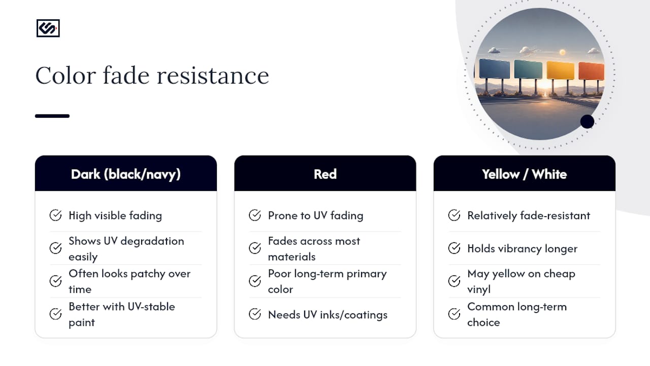
Color choice isn't just about first impressions. It's about how your sign looks in year three. Different materials fade at different rates, and some colors are far more fade-resistant than others regardless of the substrate.
Darker pigments, particularly deep blacks and navy blues, tend to show fading and UV degradation more visibly than lighter colors because the contrast between fresh and faded pigment is more noticeable to the eye. Reds are notoriously prone to UV fading across almost every sign material, which is part of why so many long-term outdoor signs favor yellow, white, or black instead of bold red as a primary color. Yellow itself holds up reasonably well on most substrates, though cheaper vinyl grades can yellow further or dull over several years of sun exposure.
Material matters as much as pigment. Carved cedar signs finished with UV-stable paints hold color longer than raw stained wood. Illuminated cabinet signs protect their face material from direct weathering, which helps preserve color vibrancy compared to flat printed panels exposed directly to rain and sun. Vinyl graphics on vehicles face an even harsher environment, road grime, washing chemicals, constant UV exposure, so higher-grade cast vinyl outperforms cheaper calendared vinyl for color retention over time.
If your sign lives somewhere with intense sun exposure, ask your fabricator directly about UV-stable inks or coatings for whatever color you've chosen. It's a five-minute conversation that can add years to how good your sign looks.
Why Font Choice Changes How Well Your Colors Perform
The same color pair can look sharp or sloppy depending entirely on the typeface carrying it. Thin, script, or highly decorative fonts undercut even a high-contrast color pairing because the letterforms themselves don't hold enough visual weight to register quickly.
That one-fifth stroke-to-height ratio mentioned earlier isn't just a legibility rule. It's specifically about giving your chosen colors enough surface area to actually be seen. A bold sans-serif font at the right stroke width lets black on yellow or white on navy do their job. A delicate serif font in the same colors, viewed at the same distance, often disappears into visual noise well before a driver or pedestrian can read it.
Size interacts with color the same way distance interacts with contrast. A general rule used by sign fabricators ties letter height to expected reading distance, roughly an inch of letter height for every 10 feet of viewing distance for reasonably confident legibility, though this shifts a bit based on font weight and color contrast. A high-contrast pair in undersized letters still fails. A moderate-contrast pair in properly sized, bold letters can outperform it.
The takeaway for a small business ordering signage: pick your font and your color pair together, not separately. A designer choosing colors in isolation from the typeface is solving only half the visibility problem.
What Years of Producing Signs Taught Us About Color Choices
The single most common mistake business owners bring to a sign order is leading with logo color instead of contrast. A brand guide with a pale gold on white might look sharp on a website and disappear entirely on a storefront. We've seen designs get reworked more than once because a color that read fine on a screen went flat the moment it hit an actual panel outdoors.
The fix is almost always the same: keep the brand hue as an accent, and let a high-contrast neutral pairing carry the actual message. One client's blue-on-blue lobby logo, technically on brand, got a second look once the background shifted to a neutral panel behind it. The logo didn't change. The contrast around it did, and the difference showed up immediately in how far away it could be read.
— Nick
Ready to Order Your Sign? Here's How Crispsign Helps You Get the Colors Right
Getting a color pairing right on a screen is one thing. Seeing it hold up on an illuminated cabinet sign bolted to your building is another, and that gap is exactly where a lot of signage orders go wrong. Crispsign built its production workflow around closing that gap: instant online estimates, saved design files you can revisit, and a faster turnaround than the traditional back-and-forth of a local sign shop.
If you're still weighing color options, request a sample panel in your top two pairings before committing to a full production run. A designer service can help you finalize a palette that holds contrast under real lighting, and artwork setup services prepare your file for production. For exterior projects like channel letters, carved cedar signs, or monument signage, start with the Beacon product line to see how your chosen colors render across materials. For lobby logos, wall panels, or interior vinyl, the interior sign hub covers those options directly. Businesses managing signage across multiple locations can also use a free portal to keep color specs consistent storefront to storefront. Start with an instant estimate to see what your color pairing looks like fabricated to spec.
Sources
- Arts & Science of Sign Design (Executive summary)
- Signage Color Combinations for Maximum Visibility — ColorFYI
- Penn State accessibility: color vision details
- The Art of Color Combinations in Sign Design — Apparel and Graphics
FAQ
What Is the 3-Color Rule for Signs?
The 3-color rule suggests limiting a sign design to three colors total, usually one background, one text color, and one accent, to keep the design legible and avoid visual clutter that slows down recognition.
What Color Sign Gets the Most Attention?
Yellow paired with black draws the most attention of any common combination, thanks to its extremely high luminance contrast, which is why it dominates warning signs and high-visibility roadside signage.
What Are Five Colors That Go Well Together for Signage?
Black, white, yellow, navy blue, and a single accent color like red work well together because each pairing among them maintains strong luminance contrast while still leaving room for one brand-driven accent hue.
What Color Are Most Yield Signs?
Yield signs use red and white, a combination chosen for high visibility and its widely recognized association with caution on roadways.
Does Crispsign Offer Sample Panels to Test Sign Colors?
Yes, Crispsign supports requesting sample panels and designer assistance through its design services, letting you check a color pairing on real material before committing to full production.