
Fabrication First: Channel Letter Sizes for Storefronts, 6 to 36 Inch
Most channel letters that work for storefronts fall between about 6 inches and 36 inches tall. Plan roughly 1 inch of letter height per 10 feet of viewing distance, and confirm minimum stroke width and lighting-specific depth before you sign off on art. The three constraints that trip up most orders are minimum stroke for LED illumination, standoff clearance for halo-lit letters, and whether your landlord or local code caps your maximum height before you even get to fabrication.
TL;DR:
- Most storefront channel letters are between 6 and 36 inches tall, with larger metal options suitable for highway visibility reaching up to 96 inches.
- Minimum practical letter height is about 3 inches for front-lit signs, constrained by LED module fit and stroke width, which should be over one inch to ensure proper illumination.
- Depth and lighting type determine size needs: front-lit letters need 3 to 5 inches of return depth, while halo or reverse-lit types require wall clearance instead of depth.
- Calculating letter height based on viewing distance follows the rule of roughly 1 inch per 10 feet, but adjustments are needed for decorative fonts or poor contrast.
- Oversized letters above 36 inches often require reinforced materials, sectional transport, and longer lead times, with installation complexity increasing at larger sizes.
Table of Contents
- What Are Typical Channel Letter Sizes and Their Limits?
- What Is the Smallest Practical Channel Letter Height?
- How Do Depth and Lighting Type Change Size Requirements?
- How Do You Calculate the Right Letter Height for Viewing Distance?
- Which Mounting Method Fits Your Sign Size Best?
- What Are the Fabrication and Shipping Limits for Oversized Letters?
- What Should You Check Before Ordering Channel Letters?
- Which Materials Support Larger or Smaller Channel Letter Sizes?
- How Does CrispSign Deliver Permit-Ready Channel Letters?
- What Are the Standard Spacing Rules Between Channel Letters?
- How Does Letter Size Affect Long-Term Maintenance?
- What I'd Tell You Before You Finalize a Size
- Get Sizing Help and a Shop Drawing From CrispSign
- Where These Size Figures Come From
- Sources
- FAQ
What Are Typical Channel Letter Sizes and Their Limits?
Fabricators build to spec, but catalog defaults exist for a reason. Most shops quote acrylic front-lit letters within a small to medium height range suitable for many common applications, while metal trimless options commonly cover a moderate to larger size range, with some backlit metal designs extending to larger dimensions, according to NOVA's size guidancecom/faq/metal-signs/general/channel-letter-sizes/). Anything outside those bands isn't impossible. It just changes the material, the price, or both.
Metal is where the real ceiling moves. Painted aluminum channel letters can be specified from small to very large sizes, with variable depths depending on specifications, according to Signs & Branding Products. That 96 inch figure isn't a novelty spec. It's what lets a car dealership or a big-box retailer run letters visible from a highway on ramp, something acrylic simply isn't built to do at that scale.
A few practical size notes worth locking in before you draw up artwork:
- Standard catalog range: 6 inches to 36 inches covers the vast majority of storefront orders, from boutique retail to quick-service restaurants.
- Acrylic ceiling: front-lit acrylic tops out around 24 inches before impact-modified material or a switch to metal becomes necessary.
- Metal extended range: trimless metal options run 5 inches to 40 inches for most standard jobs, with specialty builds reaching 96 inches.
- Logo boxes are different math: a logo cabinet's overall footprint is governed by its own crate and mounting limits, not the height rules that apply to a single letter. So treat a logo box size request as a separate conversation with your fabricator.
If your storefront sits somewhere between a strip mall unit and a stand-alone pylon, the standard range will almost certainly fit. If you're chasing highway visibility, start the metal conversation early.
What Is the Smallest Practical Channel Letter Height?
Small letters run into practical limitations for LED illumination, with anything very small often unsuitable without design adjustments because the channel itself becomes too narrow to hold a module and still cast an even glow, per Direct Sign Wholesale's production notes. Below that height, you're often choosing between a dimmer, patchier lit face or dropping illumination altogether.
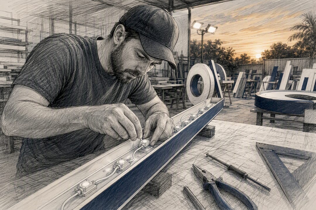
Stroke width, not just overall height, is usually the real bottleneck. Most shops need a minimum stroke width is required to fit LED modules adequately, often over one inch. and still route wiring cleanly. Fonts with thin strokes or tight counters, think a script typeface or a lowercase "e" and "a" with narrow interior openings, often can't hold that minimum without visibly bulking up the letterform.
Fixes exist, and none of them require abandoning your brand font:
- Thicken the outline slightly in the sign-specific artwork file, separate from your print or web logo.
- Add a solid acrylic backer behind thin-stroke letters so light diffuses evenly even with a narrow channel.
- Swap decorative or script fonts for a bolder weight in the sign version of your logo, keeping the display version untouched elsewhere.
Pro Tip: Specify your minimum stroke requirement in the design brief before your fabricator starts cutting. Catching a script logo's counters at the artwork stage costs you an email; catching it after the channels are cut costs you a reorder.
How Do Depth and Lighting Type Change Size Requirements?
Depth isn't a cosmetic choice. It's dictated by how the letter is lit. Front-lit channel letters typically use a return depth of 3 inches to 5 inches, with a finished depth around 3 5/8 inches to 5 3/8 inches for most standard builds, according to design fabrication guidelines. That depth houses the LED modules and gives the face enough separation from the backing to glow evenly.
Halo-lit, or reverse channel, letters flip the setup: the face stays dark and light washes out from behind onto the wall, which means the letter needs standoff clearance from the mounting surface instead of depth for illumination.
- Front-lit: 3 to 5 inch return is standard; face illuminates directly, works with most mounting types.
- Halo/reverse: requires clear wall area behind the letter for even light wash; incompatible with raceway mounting because the raceway blocks the glow.
- Open face: exposed neon or LED tube with no acrylic face; depth needs vary by tube diameter and typically require more service access.
- Combination: front-lit plus halo in one letter set, which roughly doubles the wiring runs and often needs a dedicated backer panel.
One production detail catches a lot of first-time sign buyers off guard: halo-lit letters generally require direct or backer panel mounting to allow the halo illumination effect. because the raceway housing sits flush against the wall and physically blocks the light wash the halo effect depends on. If you want that glow, budget for a backer panel or direct wall mounting instead.
How Do You Calculate the Right Letter Height for Viewing Distance?
The sign industry's go-to shortcut is simple: figure roughly 1 inch of letter height for every 10 feet of intended viewing distance. It's a starting point, not a formula that accounts for contrast, ambient lighting, or how ornate your font is.
- Storefront window, 20 feet: a 2 inch to 3 inch letter height reads comfortably for pedestrians on the sidewalk directly in front of the store.
- Sidewalk approach, 40 feet: bump up to roughly 4 inches, which covers someone walking toward your entrance from mid-block.
- Parking lot or roadside, 100 feet: you're now in 10 inch territory at minimum, and often larger if drivers are moving past at speed rather than approaching on foot.
Increase height beyond the rule of thumb when your logo uses a decorative or thin-stroke font, or when your building's facade has poor color contrast against the letter face. A dark bronze letter on a dark brick wall needs more height than the same letter on white stucco, even at identical distance.
Which Mounting Method Fits Your Sign Size Best?
Mounting choice isn't just an installation detail. It changes how deep your letters can be, whether halo lighting is even on the table, and how easy the sign is to service later.
- Raceway mounting: the electrical components sit in a metal box behind the letters, which simplifies wiring and speeds up service calls, but the visible raceway housing rules out halo lighting and can look bulky on a clean facade.
- Flush or direct mounting: letters attach straight to the wall with individual wiring runs hidden inside, giving the cleanest look and supporting halo effects, but making future bulb or module swaps more labor intensive since there's no single access panel.
- Backer panel: a painted aluminum or acrylic panel sits behind the letters, hiding wiring and supporting halo glow while still giving technicians one unified surface to service, often the preferred middle ground for reverse-lit installs.
Larger letters, especially anything pushing past 36 inches, often need dedicated mounting brackets or even scaffolding during installation rather than a simple lift and attach. Plan that labor cost into your budget conversation before production starts, not after the crate arrives.
What Are the Fabrication and Shipping Limits for Oversized Letters?
Beyond a moderate letter height, fabricators switch to impact-modified materials or reinforced construction to maintain durability.. Standard acrylic gives way to impact-modified acrylic or metal reinforcement, and the letter itself frequently gets sectioned into pieces for transport, since standard pallet and truck dimensions simply can't move a single 8-foot letter face intact, per Direct Sign Wholesale's production guidance.
- Sectioning adds field-seaming work on-site, which extends installation time beyond a typical single-day mount.
- Impact acrylic and metal reinforcement both add weight, which can trigger a structural review of your mounting surface.
- Oversized elements need longer lead times than standard catalog sizes, so build extra weeks into your project timeline if you're specifying anything near the upper size limits.
Budget conversations should happen before final art approval, not after the quote lands, since sectioning and reinforcement both move the price meaningfully.
What Should You Check Before Ordering Channel Letters?
Size decisions made in a design file don't always survive contact with local code, your lease, or the actual wall. Run these checks before shop drawings get final approval:
- Confirm local sign code limits. Most municipalities cap maximum letter height, projection from the wall, or total sign area, and permit review can take several weeks depending on your building department's backlog.
- Get your landlord's sign criteria in writing. Many retail leases and shopping centers have their own house rules on size, color, and mounting method that are stricter than city code, so written approval avoids a rework after fabrication.
- Survey the actual mounting wall. Check for flatness, existing conduit, HVAC obstructions, or parapet clearance issues, and if you're unsure, ask your installer to take field measurements before finalizing the shop drawing. Trade groups like Arizona's sign association directory are a useful starting point for finding a local professional to handle a site survey if you don't have one already lined up.
Skipping any one of these three steps is the single most common reason a finished sign sits in a warehouse instead of on a wall.
Which Materials Support Larger or Smaller Channel Letter Sizes?
Material choice sets your practical size ceiling more than any other single decision. Acrylic handles small to medium letters well, stays lightweight, and keeps cost down, but it's genuinely not built for the largest sign faces. Aluminum and stainless steel, by contrast, support much larger single letters and hold up better under structural stress, which is exactly why manufacturer catalogs show metal options running to 96 inches while acrylic tops out closer to 24 inches.
- Acrylic: best for letters under 24 inches, lightweight, cost-effective, limited structural capacity at scale.
- Aluminum and stainless steel: support letters up to 96 inches, higher upfront cost, significantly more durable under wind load and impact.
- Coastal or freeze-thaw environments: favor corrosion-resistant finishes and stainless hardware regardless of letter size, since salt exposure and repeated temperature swings degrade standard finishes faster.
- Weight considerations: larger metal letters require reinforced mounting brackets and sometimes structural review of the wall itself, an added step acrylic installs rarely need.
Match the material to your exposure and your size ambitions together, not one or the other. A 40 inch letter in coastal Florida needs a different spec sheet than the same size in a dry inland climate.
How Does CrispSign Deliver Permit-Ready Channel Letters?
CrispSign builds every channel letter order to spec, verifying stroke minimums, lighting depth, and mounting method before production starts, so sizing surprises don't show up after the crate ships. Shop drawings get reviewed against your local code and landlord criteria before fabrication, and installation coordination is built into the process rather than handled as an afterthought.

That combination, sizing validation plus coordinated installation, is what keeps a finished sign from becoming a warehouse item instead of a storefront asset.
What Are the Standard Spacing Rules Between Channel Letters?
Tighter spacing works for bold, blocky sans-serif fonts where letterforms are visually dense. Looser spacing suits script or serif fonts with more visual weight variation, since cramming those letters together makes the word harder to parse at a glance rather than easier.
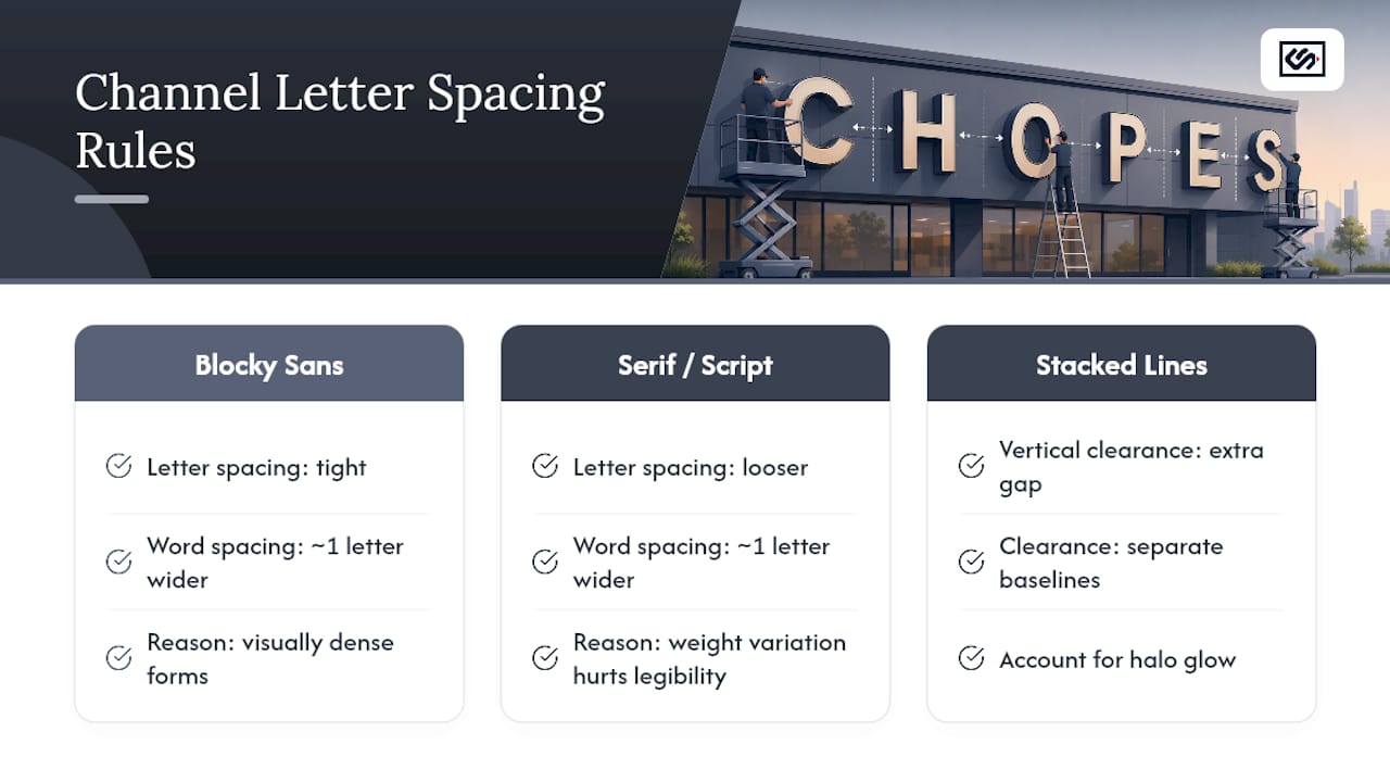
Word spacing follows a similar logic but scaled up: the gap between separate words in a sign should read distinctly larger than the gap between letters within a single word, usually somewhere around one letter-width's worth of blank space. Get this wrong and a two-word business name starts reading as one long unfamiliar word from across a parking lot, which defeats the entire purpose of paying for illuminated signage in the first place.
Vertical stacking, when a logo runs two lines instead of one, needs its own breathing room too. Leave enough clearance between the baseline of the top line and the cap height of the bottom line that the two rows don't visually merge at distance, particularly under halo lighting where the glow itself adds visual bulk beyond the letter's physical edge.
How Does Letter Size Affect Long-Term Maintenance?
Bigger letters aren't just a bigger upfront build. They're a bigger long-term maintenance commitment, and that's worth factoring into your size decision before you order rather than after the first bulb fails.
Larger channel letters house more LED modules per letter, which mathematically means more individual points of potential failure over the sign's lifespan. A 36 inch letter has meaningfully more linear channel than a 12 inch letter, and each additional foot of channel is another few feet of wiring and another handful of modules that could eventually need replacing.
Access matters just as much as module count. Letters mounted with a raceway system centralize the electrical components in one accessible box, which makes bulb or module swaps a fast job for a technician with a ladder. Flush-mounted letters without that centralized access point often require more labor per repair, since each letter's wiring is individually routed rather than gathered in one serviceable location.
Cleaning follows the same logic in reverse. Larger acrylic faces show dust, grime, and UV yellowing more visibly than small letters simply because there's more surface area to catch the eye, particularly on light-colored faces. A professional sign cleaning service on a routine schedule keeps large-format letters looking sharp instead of letting years of buildup dull the illumination you paid for.
If you're weighing a larger size purely for visual impact, ask your fabricator upfront how service access is planned. It changes what a repair call actually costs you five years from now.
What I'd Tell You Before You Finalize a Size
Legibility and permit compliance should drive your size decision, not how big a letter looks impressive on a rendering. A striking 3D mockup means nothing if the local sign code caps your height at 24 inches or your landlord's lease criteria won't budge.
Here's the tip most people skip: mock up your proposed letters at actual scale on-site, using printed paper templates taped to the wall, before you approve final art. It's a low-cost step that catches viewing-distance miscalculations and halo clearance problems long before they become an expensive fabrication mistake. Ask your fabricator for a shop drawing and precise wall measurements as part of that process. It's a fast request, and it's the single best insurance policy against a sign that looks perfect on screen and wrong on the building.
— Nick
Get Sizing Help and a Shop Drawing From CrispSign
CrispSign is the direct route to a channel letter sign built right the first time, no back-and-forth with a general contractor or a separate installer trying to interpret someone else's spec sheet. Every order gets sizing verified against your stroke, depth, and mounting requirements before fabrication starts, and shop drawings are prepared so you can check code and landlord compliance before anything goes into production.
If you manage signage for multiple locations, the Crisp Corporate portal gives you one place to request quotes, submit measurements, and track shop drawings across every storefront instead of juggling separate vendor conversations for each site. Request a quote and a shop drawing today, and get a size recommendation back before you commit to final art.
Where These Size Figures Come From
Size ranges and fabrication minimums throughout this guide come from NOVA's channel letter size limits, Direct Sign Wholesale's production parameters, Coda's design toolkit guidelines, Signs & Branding Products' aluminum letter specs, and Tectonics' 3D channel letter catalog, each covering a different piece of the size and lighting puzzle.
Sources
- What are the size limits of Channel Letters/Logo Signs? - NOVA
- Channel Letter Business Sign Sizes Guide | Direct Sign Wholesale
- Channel Letters · Design Toolkit
- Painted Aluminum Channel Letters | Built-to-Spec | Lifetime Guarantee – Signs & Branding Products
FAQ
What Are the Different Types of Channel Letters?
The main types are front-lit (illuminated face), halo or reverse-lit (light washes onto the wall behind the letter), open face (exposed LED or neon tube), and combination letters that use both front and halo illumination in one build.
How Are Channel Letters Fabricated?
Fabricators cut the letter face and return from aluminum or acrylic, form the sides into a channel shape, install LED modules inside, wire them, and seal the face with a translucent acrylic panel or leave it open depending on the lighting type.
What Is the Difference Between Channel Letters and Raceway Letters?
Channel letters are the illuminated letterforms themselves; a raceway is a metal housing mounted behind them that holds the electrical components, meaning "raceway letters" refers to channel letters mounted using that specific housing method rather than a different letter type.
What Is the Difference Between Channel Letters and Reverse Channel Letters?
Standard channel letters illuminate through the face for direct readability, while reverse channel letters (halo-lit) keep the face dark and project light backward onto the wall, creating a glow outline that requires wall clearance and generally rules out raceway mounting.
What Size Channel Letters Should I Order for My Storefront?
Most storefronts do well with letters between 6 inches and 36 inches tall, sized using the 1 inch per 10 feet of viewing distance rule and adjusted for your building's actual sign code limits and facade contrast.