
Choosing the Right Color Temperature for Signage
For maximum cut-through in daylight, specify around 6500K. For color-accurate product graphics or mixed-tenant displays, 5000K is your safe neutral. For hospitality and brand warmth, drop to 3000K. Whatever band you pick, request CRI and Duv/bin data plus a lit sample before production. Ambient light and sign materials shift how any Kelvin number actually reads, so testing isn't optional.
TL;DR:
- Mixing CCTs across a multi-panel sign can cause noticeable color clashes; standardize on one Kelvin for consistency across a property or brand.
- Ambient light conditions and surrounding materials significantly alter how a sign's color temperature appears, making on-site testing crucial before approval.
- Requesting a lit sample built behind the exact face material, viewed at the real location and lighting conditions, prevents costly reworks and ensures accurate color matching.
- CRI should be at least 80 for general signage and higher for color-critical displays, while Duv and bin codes help ensure consistent color quality across modules.
- Selecting the correct Kelvin depends on sign purpose: 6500K for maximum daylight visibility, 5000K for color accuracy, and 3000K for warm, inviting brand ambiance.
Table of Contents
- What Color Temperature Should You Choose for Signage?
- How Do Ambient Light and Materials Change How Your Sign Looks?
- What Specs Should You Request Before You Order?
- How to Test and Approve a Lit Sample Before Production
- What Signmakers Get Wrong About Color Temperature
- Get a Lit Sample Made to Your Exact Spec
- Where to Learn More About Signage Color Standards
- Sources
- FAQ
What Color Temperature Should You Choose for Signage?
Correlated color temperature, or CCT, measures how warm or cool a light source appears, expressed in Kelvin. Lower numbers (2700K to 3000K) look amber and inviting, like an old incandescent bulb. Higher numbers (5000K and above) look crisp, blue-white, closer to daylight at noon. There's no universal "best" Kelvin for signage. The right pick depends on what the sign needs to do.
Here's how the ranges break down by common goal:
- 3000K: Warm and flattering. Ideal for restaurants, hotels, spas, and boutiques where you want the sign to feel like an extension of a cozy interior. Trade-off: it loses punch against bright daylight and can look dim on a busy street corner.
- 4000K: A middle-ground warm white. Works for offices, professional service signage, and medical or dental practices that want approachable but businesslike. It's less common in exterior signage because it sits awkwardly between "cozy" and "crisp."
- 5000K: Neutral daylight white. This is the default for mixed-content networks, multi-tenant retail centers, and any job where product-accurate color matters. Designers standardize near 5000K specifically because it minimizes color bias across varied creative and different advertisers on the same display.
- 6500K: Cool, bright, high-contrast. The go-to for roadside signs, big-box retail, and anything competing for attention in full sun. The trade-off is that skin tones and warm brand colors can look slightly clinical under this light.
If you're running several sign faces at one location, don't mix Kelvin ranges panel to panel. A channel letter set glowing 3000K next to a 6500K illuminated cabinet will look like two different businesses installed them on two different days. Standardize on one CCT per property or per client vertical.
Avoid the extremes unless you have a specific reason. Below 3000K starts to look yellow and dated rather than warm. Above 7500K drifts toward a blue tint that reads as artificial or even clinical, which most retail and hospitality brands want to avoid.
How Do Ambient Light and Materials Change How Your Sign Looks?
The Kelvin number on a spec sheet is only half the story. What surrounds your sign, and what it's built from, changes how that number actually looks to a person driving by at 40 miles per hour.
Daytime sunlight sits around 5500K to 6500K depending on time of day and cloud cover, and it pulls the eye's sense of "white" toward whatever's ambient. A 3000K sign that looks rich and golden at dusk can look muddy and underpowered at noon next to daylight-balanced storefronts. Nearby streetlights, competitor signage, and even parking lot lighting all shift the comparison.

Distance matters too. Higher CCTs often read as brighter than their lumen rating suggests, because of how the human eye's scotopic sensitivity responds to cooler wavelengths at low light and long viewing distances. That's part of why 6500K sign faces seem to "cut through" traffic better than a 3000K face rated at the same brightness. It's a perception effect, not just a photon count.
Materials add another layer. Acrylic diffusers, vinyl overlays, and frosted panels all filter LED output differently, and a lit module can shift the perceived color temperature once it's behind your actual face material.

Pro Tip: Never approve a color temperature from a spec sheet alone. Always request the module lit behind the exact face material, viewed at the distance and time of day your customers will actually see it.
What Specs Should You Request Before You Order?
CCT tells you the color, not the quality of that color, and it says nothing about brightness. Requesting three additional data points before you sign off on an order prevents most of the surprises that lead to reworks.
Color Rendering Index (CRI) measures how accurately a light source reveals true colors compared to natural light, on a scale up to 100. Aim for a CRI of at least 80 for general signage, and push to higher CRI levels for anything color-critical, like backlit product photography, brand-color-specific graphics, or menu boards where food needs to look appetizing rather than washed out.
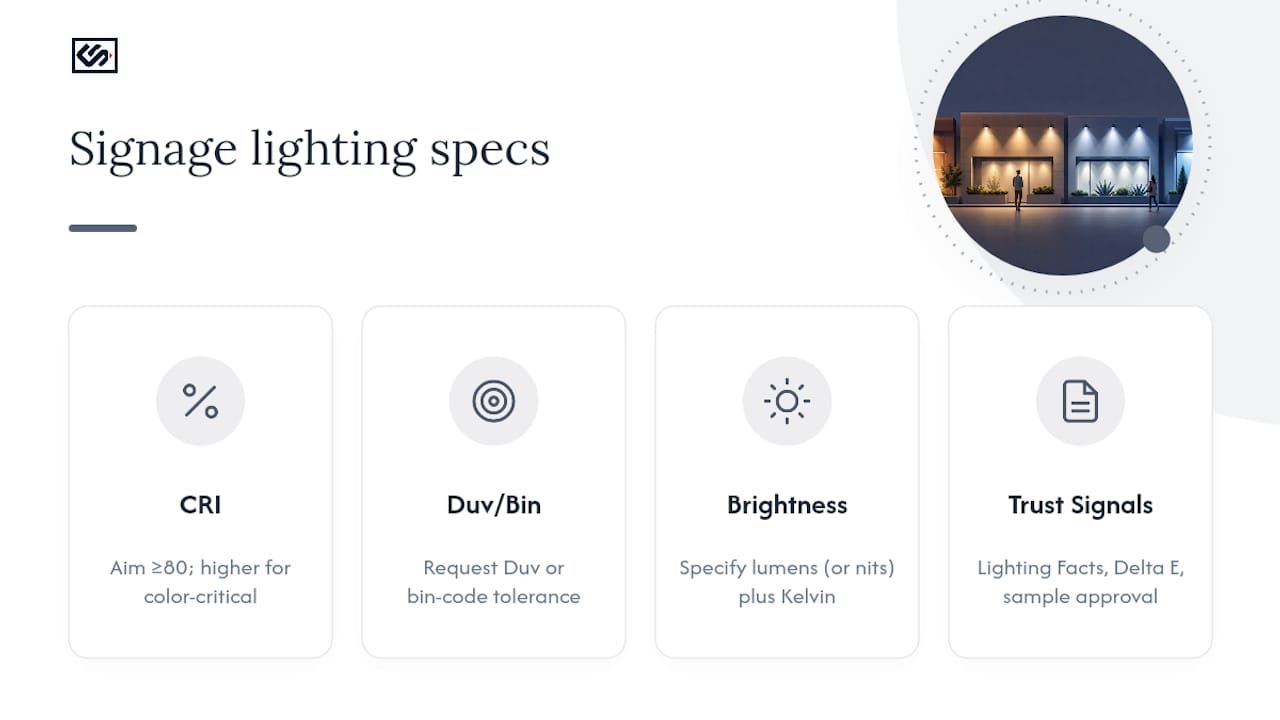
Duv and binning explain why two modules can share the same Kelvin number and still look noticeably different side by side. Duv measures how far a light source's chromaticity sits from the pure blackbody curve. Two 5000K LEDs with different Duv values can lean slightly green or slightly pink, even though both are technically "5000K." Ask suppliers for a Duv or bin-code tolerance, not just a Kelvin figure.
Lumens or nits tell you brightness, which CCT does not. A 6500K module and a 3000K module can be rated at identical lumen output and still appear different in perceived brightness, so specify both the Kelvin target and the light output figure together.
The U.S. Department of Energy's Lighting Facts program label reports lumens, watts, efficacy, CRI, and CCT on one sheet, and it explicitly recommends visual evaluation whenever color appearance is critical to the buyer. Treat that label, along with a manufacturer's Delta E data and an actual sample approval, as your three trust signals before you commit to production.
How to Test and Approve a Lit Sample Before Production
Skipping sample approval is the single most common reason signage jobs get reworked. Here's the workflow to follow instead:
- Request a lit module built behind the exact face material, color, and thickness you're ordering, not a generic swatch.
- View it at the real distance and time of day your customers will see the finished sign, both in daylight and after dark if it's illuminated at night.
- Photograph it with a fixed white balance so you have a consistent visual record rather than a phone camera auto-correcting the color for you.
- Collect the spec sheet: CCT, CRI, Duv or bin code, and nit or lumen output, alongside your photos.
- Sign off formally, recording who approved it and on what date, before the supplier starts full production.
Reject the sample if you see visible green or pink tinting, a color shift that doesn't match your brand palette, or noticeable Delta E variation between panels meant to match.
Pro Tip: Keep every approved sample's spec sheet on file. If you reorder the same sign type in two years, you'll have a documented reference instead of guessing what "the usual warm white" meant.
What Signmakers Get Wrong About Color Temperature
The most expensive mistake in signage lighting isn't picking the "wrong" Kelvin number. It's picking any number without a face-sample to confirm it. A spec sheet Kelvin figure is a starting point, not a guarantee.
The second most common error is mixing CCTs across a multi-panel job, usually because two batches came from different production runs without a shared bin code. Keep one CCT standard per client vertical, and require bin-compatible modules whenever a job spans multiple panels or locations. Lumen numbers alone won't catch this. Two panels can match on brightness and still clash visibly in color.
— Nick
Get a Lit Sample Made to Your Exact Spec
Crispsign is the practical alternative to ordering signage on Kelvin numbers alone. Every custom sign, from illuminated cabinets to channel letters, gets produced to your specified CCT, CRI, and binning tolerance, so what you approve on a sample is what shows up at your storefront.
That matters most for businesses running multiple locations or vertical-specific branding, since a documented bin code keeps every panel consistent instead of leaving color matching to chance. For hospitality and restaurant brands especially, getting warmth right on the storefront sets the tone before a customer even walks in, something restaurant signage lighting choices directly affect. Crispsign coordinates optional installation and ships nationwide, so the sample you approve is the sign you get, wherever you're located. Start by requesting a quote and asking for a lit sample before your order goes into production.
Where to Learn More About Signage Color Standards
For deeper technical detail, the Department of Energy's LED color characteristics factsheet covers CCT and CRI fundamentals. Industry trade coverage like Signs of the Times explains perceived brightness trade-offs, while Principal Sloan details CRI thresholds for color-critical work.
Sources
- LED color characteristics factsheet — U.S. Department of Energy
- Which white is right? — Signs of the Times
- LED Billboard color temperature guide: 3000K vs 5000K vs 6500K - SoStron
- Key variables of color — Principal Sloan
FAQ
Is 3500K or 4000K Better for an Office Sign?
Both read as neutral warm white, but 4000K looks slightly crisper and more businesslike, while 3500K leans a touch warmer and more approachable; either works for interior office signage, so the choice comes down to whether you want a more clinical or more welcoming feel.
Is 3000K Color Temperature Warm or Cool?
3000K is warm, producing an amber, inviting glow similar to traditional incandescent lighting, which is why it's the standard choice for hospitality and boutique retail signage.
What Should My Sign's Color Temperature Be?
It depends on your goal: choose around 6500K for maximum daytime visibility, 5000K for neutral, color-accurate graphics or mixed-tenant displays, and 3000K to 3500K for warm, brand-forward hospitality signage.
Which Is Whiter, 4000K or 6000K?
6500K is whiter and cooler, with a visible blue cast, while 4000K stays in warm white territory with a softer, more neutral tone.
Do I Need to See a Lit Sample Before Ordering?
Yes. Requesting a module lit behind your actual sign face is the only reliable way to confirm the final CCT and CRI will match what you expect, since materials and ambient light change perceived color, and Crispsign builds sample approval into its production process for exactly this reason.