
How to Create a Cohesive In-Store Signage System
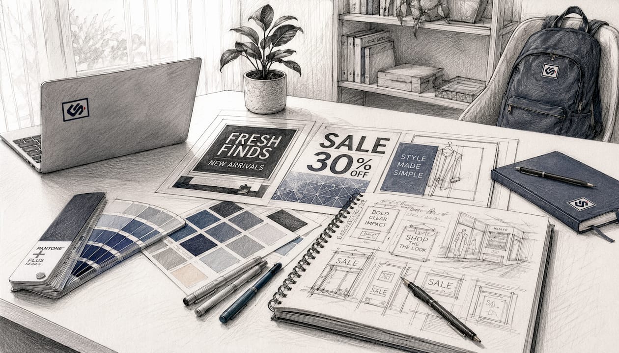
A cohesive in-store signage system is your store's silent sales team. When every sign shares the same fonts, colors, and visual logic, customers navigate faster, trust your brand more, and buy with greater confidence. The core elements are simple: clarity, consistency, strategic placement, branding integration, and a plan for keeping signs current. Get all five working together, and your store communicates like a single, unified voice from the parking lot to the checkout counter.
A well-built retail signage system delivers three measurable wins:
- Better navigation: Customers find what they need without asking for help.
- Stronger brand recognition: Consistent visuals reinforce your identity at every touchpoint.
- Higher engagement: Well-placed, readable signs influence purchase decisions at the exact moment shoppers pause to decide.
Table of Contents
- How to create a cohesive in-store signage system with strong design principles
- Where you place signs matters as much as how they look
- How to weave your brand identity into every sign
- Advanced strategies that research backs up
- Budgeting and cost considerations for your signage program
- Crispsign makes professional retail signage straightforward
- FAQ
- Key Takeaways
How to create a cohesive in-store signage system with strong design principles
Good signage design starts with one rule: one sign, one message. Trying to pack directions, a promotion, and your brand story onto a single panel guarantees that shoppers read none of it. Each sign should communicate one clear idea, structured as a headline, a short supporting detail, and a single call to action.
Typography and color do the heavy lifting after that. Stick to clean sans-serif or legible serif faces for body and directional text. Decorative fonts slow readers down, especially at a glance. Follow a strict visual hierarchy: the headline is largest, explanatory text is smaller, and the call to action is bolded or accented. Use mixed case rather than all-caps for anything longer than three or four characters. High-contrast color combinations aligned with your brand palette maximize readability. Red signals urgency or discounts; green suggests calm; blue conveys trust.
Visuals punch harder than words alone. Eye-tracking research confirms that imagery engages the nonconscious brain faster than text, so show the benefit rather than describe it. Unique shapes, faces, and familiar icons all draw automatic attention from shoppers moving through a busy aisle.
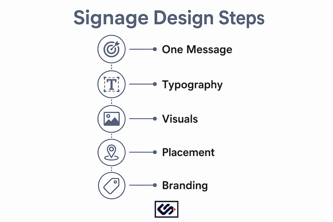
Pro Tip: Before printing any sign, apply the five-second test. If a shopper walking past cannot grasp the full message in about five seconds, simplify the copy or increase the contrast.
Here is a quick design checklist for every sign you produce:
- Single focus: one main message only
- Five-second readability: legible at a walking pace
- Clear call to action: one directive next step
- High contrast: dark text on light background or vice versa
- Hierarchy: headline, body, and CTA are visually distinct
- Illumination: LED-backlit or halo-lit options for low-light areas
- Brand alignment: fonts and colors match your store's visual identity
Where you place signs matters as much as how they look
Placement is where most retail signage systems fall apart. A beautifully designed sign hidden above a shelf or buried in visual clutter might as well not exist. Signs between 30 and 60 inches from the floor sit in the natural reading zone. Anything above that sightline or below knee level gets missed.
Placing signage at decision points like end caps, cross-aisles, and checkout counters is where persuasive and point-of-purchase signs earn their keep. These are the spots where shoppers naturally pause, which makes them the highest-value real estate in your store. For exterior signs, the general rule is one inch of letter height per 30–50 feet of viewing distance.
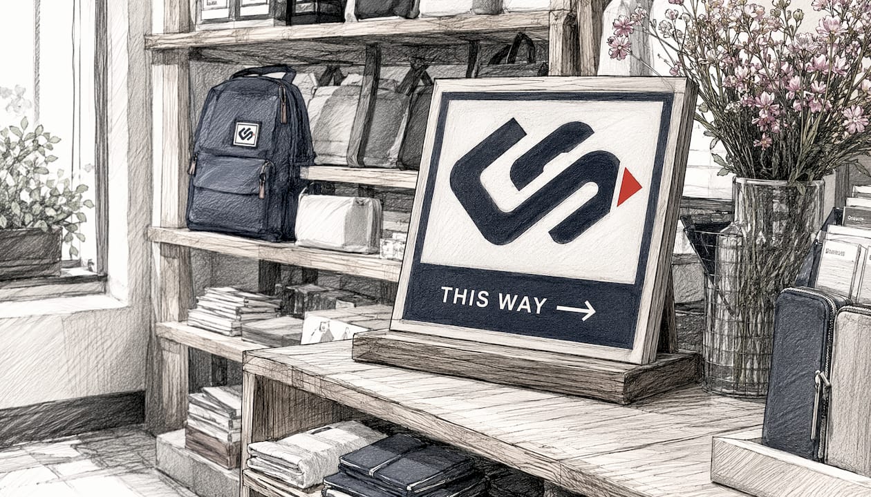
Floor graphics and mats are underused surfaces. They reinforce wayfinding, add branding, and call out promotions in areas where overhead signage is not practical.
| Placement zone | Sign type | Primary goal |
|---|---|---|
| Exterior / curbside | Fascia, blade, window vinyl | Attract and identify |
| Entry / decompression zone | Welcome, directional | Orient, avoid promo clutter |
| Aisles / focal walls | Wayfinding, promotional | Navigate and engage |
| End caps | Point-of-purchase | Convert at decision point |
| Checkout | Add-on, loyalty, services | Upsell and reinforce brand |
Pro Tip: Map your store's foot traffic before finalizing sign locations. High-traffic corners and natural pause points deserve your strongest messaging; low-traffic walls do not.
How to weave your brand identity into every sign
Branding integration is not about slapping your logo on everything. It means building a visual language that shoppers recognize before they consciously register your name. Use your brand color palette consistently across every sign type, from large wayfinding walls to small countertop promotions. A modular design framework with consistent grids, colors, and typography lets you apply that language flexibly across different sign formats without losing cohesion.
Logos and familiar imagery should appear purposefully, not reflexively. A well-known logo on a wayfinding sign helps shoppers confirm they are in the right place. Overusing it on every promotional panel dilutes its impact. Balance brand identity with functional clarity.
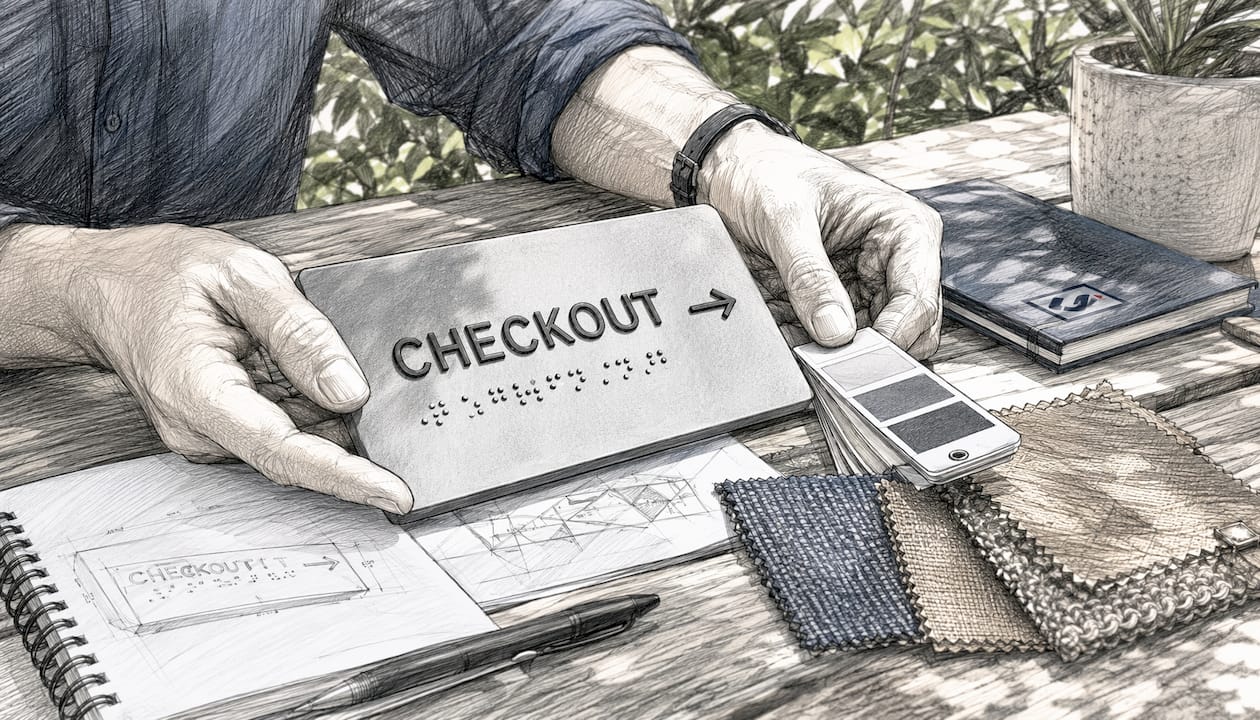
ADA compliance belongs inside your branding plan, not as an afterthought. ADA-compliant signage requirements cover tactile characters, Braille, mounting heights, and contrast ratios. Meeting these standards protects you legally and makes your store accessible to every customer.
Staff training closes the loop. Your team needs to understand the brand standards behind your signage so they can hang replacement signs correctly, flag damaged panels, and avoid improvising with off-brand materials.
Advanced strategies that research backs up
The most effective retail signage programs treat signs as a system, not a collection of individual projects. A modular approach standardizes components so any new sign fits the existing visual framework automatically. For multi-location retailers, digital verification with geo-tagged, time-stamped photos from site teams confirms that every location matches brand specifications.
Eye-tracking research from a Lowe's store study produced a striking result: navigation signs optimized for visual salience helped customers find the correct aisle 40% faster compared to traditional signage. The culprit in the original design was a campaign sign hanging directly beneath the navigation sign, pulling shoppers' eyes away from the wayfinding information they actually needed. Removing visual clutter from around critical signs is one of the highest-return changes you can make.
Visual salience algorithms like Neurons (formerly NeuroVision) predict what shoppers will automatically notice before a sign ever goes up. Testing mockups in the actual store environment before full rollout catches these attention problems early.
Key practices for an advanced signage program:
- Build a centralized digital profile for each store location, including fixture layouts and architectural dimensions.
- Test sign designs with physical mockups in the retail environment before committing to production.
- Use visual salience tools to predict automatic attention before printing.
- Keep promotional signs physically separated from navigation signs to avoid attention conflicts.
- Require geo-tagged proof-of-installation photos for any multi-location rollout.
For retailers working in tight spaces, small-space interior design principles apply directly to signage placement: prioritize vertical surfaces, use scale deliberately, and avoid crowding decision points with competing visual elements.
Budgeting and cost considerations for your signage program
Signage costs vary widely depending on materials, complexity, and whether you work with a professional designer or a full-service sign company. A professional designer typically charges $100–$1,000 per design, with higher fees for custom illustrations or 3D mockups. Physical production costs depend on sign type: simple vinyl graphics cost far less than illuminated channel letters or ADA-compliant tactile panels.
The smarter budget move is to treat signage as a system from day one. Designing a modular framework upfront costs more initially but saves money on every future update, because new signs slot into existing templates rather than requiring a full redesign. Prioritize your highest-traffic zones first: exterior signage, entry, and end caps deliver the most customer exposure per dollar spent.
Plan for maintenance in your annual budget. Signs fade, get damaged, and go out of date. A refresh cycle, whether quarterly for promotional signs or annually for wayfinding, keeps your store looking current without emergency spending. Tracking sales lift and traffic patterns against sign placement helps you identify which signs are earning their cost and which are not.
Crispsign makes professional retail signage straightforward
Getting your signage system right from the start saves you from costly reprints and off-brand improvisation later. Crispsign specializes in custom, quality-made signs fabricated to spec for retail environments, with faster turnaround times than traditional sign shops and no compromise on finish.
Whether you need wayfinding signage that guides shoppers through your floor plan or a full lobby and interior package that covers everything from ADA-compliant panels to branded wall graphics, Crispsign handles the production end so you can focus on your store. Small and mid-sized retailers get the same professional-grade results as national chains, without the agency overhead. Get your instant estimate at crispsign.com and see how fast a cohesive signage system comes together.
FAQ
What are the best practices for in-store signage?
Use one clear message per sign, follow a headline-detail-CTA hierarchy, place signs at eye level between 30 and 60 inches from the floor, and keep fonts and colors consistent with your brand palette. Avoid visual clutter near navigation signs.
What are the four types of in-store signage?
The four main categories are wayfinding signs (directional and navigational), promotional signs (point-of-purchase and sales), informational signs (hours, policies, product details), and brand identity signs (logos, window graphics, and environmental branding).
How do you measure whether your signage system is working?
Track navigation speed, sales lift at key sign locations, and customer feedback. Eye-tracking studies and visual salience tools like Neurons can quantify attention before and after a redesign, and geo-tagged installation photos confirm brand consistency across locations.
Can Crispsign help with ADA-compliant retail signage?
Yes. Crispsign produces ADA-compliant signs covering tactile characters, Braille, and required contrast ratios, making it straightforward to meet accessibility standards as part of your overall retail signage system.
Key Takeaways
A cohesive in-store signage system built on consistent design, strategic placement, and brand integration directly improves navigation, customer trust, and purchase behavior.
| Point | Details |
|---|---|
| One message per sign | Each sign should carry a single headline, supporting detail, and call to action to prevent shopper overwhelm. |
| Eye-level placement | Position signs between 30 and 60 inches from the floor and at natural decision points like end caps and checkouts. |
| Visual salience matters | Eye-tracking research shows that navigation signs optimized for visual salience helped customers find the correct aisle 40% faster than traditional signage by removing competing visual clutter. |
| Modular design saves money | A consistent grid, color palette, and typography framework reduces redesign costs every time you update signage. |
| Crispsign for retail | Crispsign produces custom, ADA-compliant retail signs with fast turnaround, covering wayfinding, lobby, and branded interior panels. |