
Design at Half Size to Cut File Weight: DPI for Large Prints
For close-up posters and retail signs, target 150 to 300 pixels per inch (PPI) at final size. Trade show banners need only 100 to 150 PPI. Building wraps run 72 to 100 PPI, and billboards can drop to 15 to 50 PPI. The rule that matters is to match PPI to how far away people stand, not to some fixed "high resolution" number. Printer DPI barely factors in. The next section breaks down each use case with real numbers.
TL;DR:
- Matching PPI to the actual viewing distance ensures optimal image quality and prevents overspending on unnecessary resolution for large-format prints.
- Effective PPI drops significantly when enlarging images; designing at 50% scale at 300 PPI helps maintain quality without huge file sizes.
- Printer DPI specifications describe ink placement precision, not the required image resolution, so focus on image PPI for sharpness.
- Materials' surface textures influence resolution needs, with glossy finishes requiring higher PPI for fine detail and fabrics tolerating slightly lower resolutions.
- Confirming actual viewing distance and target PPI with your fabricator before printing reduces reprint costs and ensures consistent quality.
Table of Contents
- Recommended DPI by Print Type: Posters, Banners, Wraps, and Billboards
- How to Calculate the Exact PPI You Need for Any Print Size
- DPI, PPI, and Printer Resolution Aren't the Same Thing
- Preparing Files That Print Sharp Without Crashing Your Computer
- Handling Massive Files Without Breaking Your Workflow
- Does the Print Material Change How Much Resolution You Need?
- Does Printer Technology Change What Resolution You Need?
- The DPI Myths That Waste File Size and Money
- What Twenty Years of Sign Production Teaches You About Resolution
- Getting Your Artwork Right Before It Goes to Print Collateral and Capability Statements Production
- Where These Numbers Come From
- Sources
- FAQ
Recommended DPI by Print Type: Posters, Banners, Wraps, and Billboards
Every large-format project has a viewing distance built into its purpose, and that distance should set your resolution target before anything else. A retail poster gets studied from three feet away. A billboard gets glanced at from a moving car. Treating both the same way wastes either quality or money.
Here's how the ranges break down by use case, based on typical viewing distances for each format:
Retail posters and close-view graphics (viewed at 2 to 6 feet): 150 to 300 PPI. This is where fine detail, small text, and photographic quality still register to the eye.
Trade show banners and pop-up displays (viewed at 6 to 10 feet): 100 to 150 PPI. Attendees walk past at a moderate distance, so you get away with less density.
Storefront window graphics and lobby signage (viewed at 3 to 8 feet): 100 to 200 PPI, depending on how close foot traffic actually gets.
Building wraps and large wall graphics (viewed at 20 feet or more): 72 to 100 PPI. At this distance, the human eye can't resolve anything finer.
Highway and outdoor billboards (viewed at 100 feet or more): 15 to 50 PPI, according to large-format printing guidelines. Anything higher is invisible to a driver at speed.
Gallery-style prints and retail walls where shoppers linger and inspect closely are the exception worth flagging. If a print will be viewed at arm's length, even inside a "large format" category, push toward the top of the range or beyond, especially for photographic imagery with fine gradients.
That extra margin covers cropping, retouching, or a last-minute layout change without forcing a resubmission. It's a small insurance policy against reprint costs, and it costs you almost nothing in file weight at these PPI ranges.
How to Calculate the Exact PPI You Need for Any Print Size
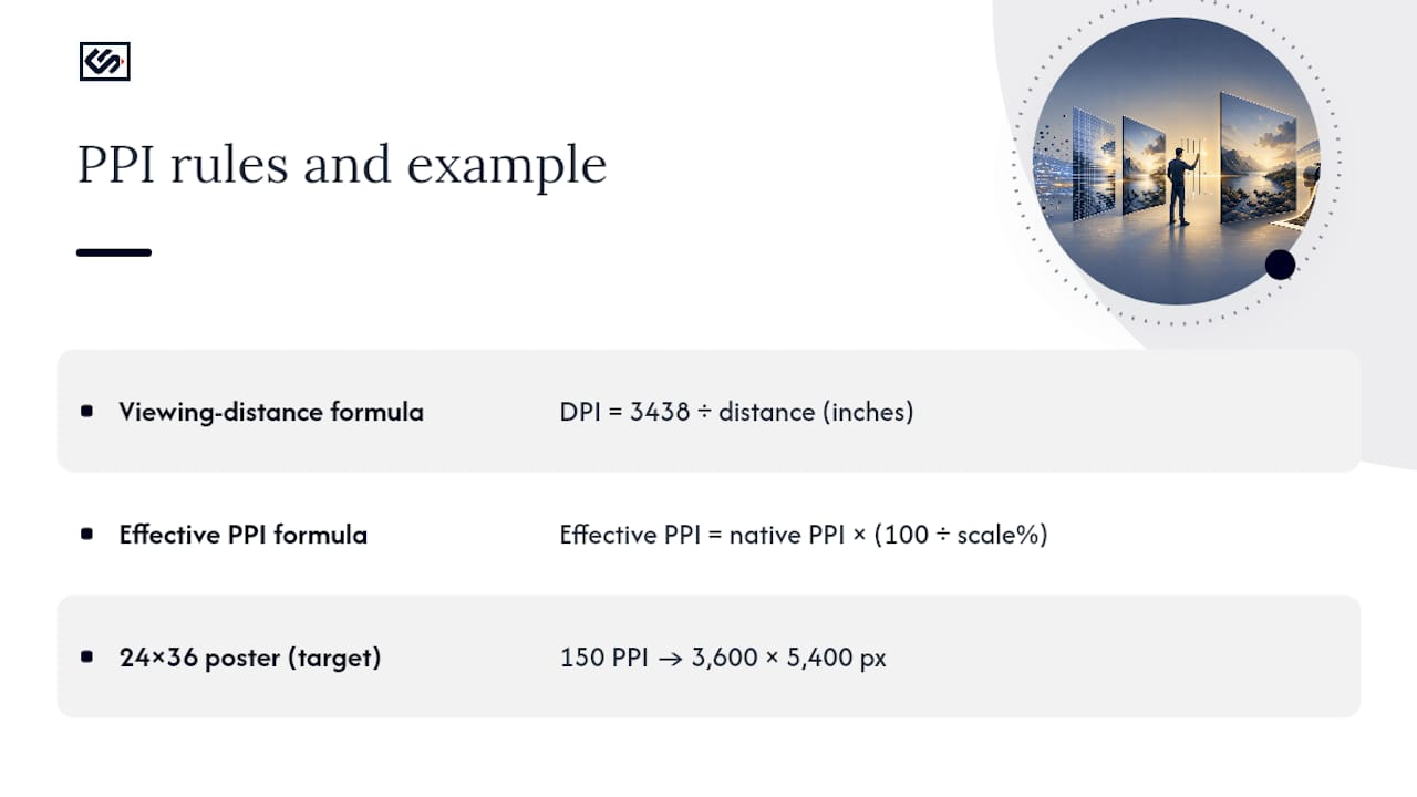
The industry's go-to shortcut is simple: DPI = 3438 ÷ minimum viewing distance in inches. This viewing-distance formula gives you a practical minimum PPI, not a ceiling. Plug in the distance, get your number, and stop second-guessing yourself.
Here's how that plays out across three common jobs:
Notice the gap between the formula's bare minimum and the practical target. The formula tells you the point below which quality visibly degrades. The industry heuristics build in a safety cushion for edge cases, close approaches, and less than perfect print conditions. For a 24×36 poster, that means designing your file at 3,600 by 5,400 pixels if you're targeting 150 PPI at full size.
The trickier variable is effective PPI, which changes the moment you scale artwork. If you place a 300 PPI image at 200% size in your layout software, the effective PPI drops to 150, because you're stretching the same pixels over twice the area. The math is straightforward: Effective PPI = native PPI × (100 ÷ scale%). Design programs like Adobe InDesign display this number automatically next to placed images. It's the number that actually matters at output, not whatever PPI the file was originally saved at. Check it before you export, every time.
DPI, PPI, and Printer Resolution Aren't the Same Thing
PPI (pixels per inch) describes your image file. DPI (dots per inch) describes what the printer physically lays down. Confusing the two is the single most common mistake in large-format prep, and it's the one that leads people to over-supply resolution they'll never see.
A printer's RIP (raster image processor) takes your image's pixels and translates them into dot patterns, often using variable-size ink droplets rather than a fixed grid. A production printer might list a spec sheet DPI of 2400×1200, but that number describes ink placement precision, not the resolution you need to supply. As one breakdown of PPI versus DPI puts it, the printer can render a lower-PPI image at high DPI through resampling and halftoning. Your image's PPI is what controls how sharp the final print actually looks to a human eye at a given distance.
Here's what that means in practice:
- Perceived sharpness comes from image PPI at final size, not printer DPI specs.
- Printer DPI affects halftone smoothness and gradient quality up close, but not detail visible from normal viewing distance.
- A printer's rated maximum DPI (often 1200 or 2400) has nothing to do with what PPI you should export your artwork at.
Pro Tip: When you talk to a fabricator, skip the jargon entirely. Just say: "Final size is 48 by 96 inches at 120 PPI, please proof at scale before production." That single sentence tells them everything they need and avoids any confusion between image resolution and printer specs.
Preparing Files That Print Sharp Without Crashing Your Computer
Getting the PPI number right solves half the problem. The other half is building a file that reaches production without ballooning into an unmanageable size or falling apart under a RIP.
Start with format choice. Logos, wordmarks, and any text should live in vector formats, SVG, EPS, or PDF, because vectors scale infinitely without losing an edge. Raster elements like photos should be built to match your final pixel dimensions exactly, not upscaled after the fact. Before export, convert color profiles to CMYK using your vendor's specified ICC profile, since RGB files can shift color unpredictably once they hit a large-format press.
A technique worth adopting for oversized jobs: design at 50% of final size, working at a true 300 PPI. A wall graphic destined for 10 feet wide becomes a 5-foot working file, still detailed enough for close inspection on screen, but a fraction of the file weight. When scaled to full size on output, that 300 PPI file becomes an effective 150 PPI, which lands comfortably inside most large-format targets, per file-prep guidance from Printery.
Before you send anything to production, run this checklist:
- Export as PDF/X or a layered TIFF, whichever your fabricator specifies.
- Set compression to lossless or near-lossless (avoid aggressive JPEG compression on text-heavy art).
- Include bleed (typically 0.125 to 0.25 inches) and mark safe areas for text.
- Embed all fonts or convert text to outlines.
- Send a low-res proof first if the file is large, so everyone confirms layout before the full file transfers.
Pro Tip: Rather than chasing a maximum DPI number, focus on delivering a clean, high-fidelity source file, vector where you can. Proper artwork setup prevents pixelation far more reliably than simply cranking resolution up, according to HP's large-format guidance.
Handling Massive Files Without Breaking Your Workflow
Design a five-meter wall graphic at a flat 300 PPI, and you're looking at roughly 1.77 gigapixels, a file that chokes most computers and makes almost no visual difference at typical viewing distance, according to the gigapixel file-size breakdown. That's the moment to downsample or design at reduced scale instead of brute-forcing resolution you'll never see.
A few practical guardrails for oversized jobs:
- Downsample or design at half or quarter scale once the print exceeds roughly 10 feet in any dimension.
- Split extremely large graphics into tiles when a single image file becomes unwieldy for your RIP software to process.
- Supply RIP-ready files in the format your fabricator specifies, and confirm their software's practical pixel-dimension limits before you build.
- Request a scale proof and a color proof separately, especially on tiled jobs where seams need to align precisely.
- Coordinate directly with your fabricator on overlap and seam placement before finalizing tile boundaries.
Reserve true gigapixel-class files for specialized photographic murals viewed up close, where the extra detail actually earns its file size.
Does the Print Material Change How Much Resolution You Need?
Surface texture absorbs or reflects light differently, and that changes how forgiving a material is toward lower resolution. A matte substrate diffuses light across its surface, which softens sharp edges slightly and hides minor pixelation that would stand out on a glossier finish. Glossy vinyl or laminate, by contrast, reflects light more directly, making fine detail, and any resolution shortfalls, more visible at close range.
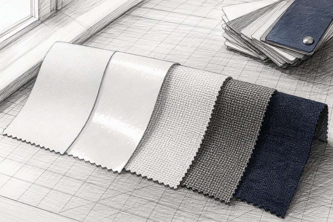
Fabric substrates, common on tension fabric displays and soft signage, behave differently again. The weave itself introduces texture that breaks up sharp pixel edges, so fabric prints tend to tolerate lower PPI than a rigid glossy panel at the same viewing distance. That's part of why fabric banners often ship at the lower end of the 100 to 150 PPI banner range without any visible quality loss.
The practical takeaway: if you're printing on a glossy or highly reflective material for close viewing, lean toward the top of your use case's PPI range. If you're on matte, textured, or fabric substrates, or anything viewed from a distance, the lower end of the range holds up fine. Material choice won't override the viewing-distance math, but it does shift where in the range you should land, and it's worth flagging to your fabricator before you finalize a file, since they'll know how their specific substrate behaves under their press.
Does Printer Technology Change What Resolution You Need?
Inkjet, laser, and UV printers all interpret your supplied pixels differently, but none of them change the PPI you need to submit. What changes is how each technology renders fine detail and color once it receives your file.
Large-format inkjet presses, the dominant technology for banners, wraps, and posters, use variable-droplet technology to build gradients and fine lines from your image data. A production inkjet printer might carry a spec sheet rating of 2400×1200 DPI, similar to machines like the Epson SureColor P10000, but that number describes dot placement precision within the machine, not a resolution requirement for your artwork. UV printers, often used for rigid substrates like acrylic panels and dimensional signage, work similarly, laying down and curing ink almost instantly, which can produce crisper edges on fine detail than solvent inkjet.
Laser and toner-based large-format output, less common for banners but used for some rigid panel work, tends to produce very fine, consistent detail because toner particles are smaller and more uniform than ink droplets. In practice, this means laser output can sometimes hold up slightly better at lower supplied PPI than inkjet, though the difference rarely matters once you're already following viewing-distance guidance.
The bottom line stays consistent across all three: printer technology affects how well the machine renders what you give it, not how much you need to give it. Your PPI target still comes from viewing distance, not from the printer's spec sheet.
The DPI Myths That Waste File Size and Money
The biggest misconception in large-format printing is that 300 DPI is some universal quality floor. It isn't. That number comes from small-format offset printing, magazine pages and photo prints viewed at reading distance, and it has almost nothing to do with a banner viewed from across a parking lot, according to the DPI myth breakdown. Carrying that assumption into large-format work leads to needlessly massive files that slow down production without improving how the print actually looks.
A second myth: higher printer DPI specs mean you need to supply higher PPI artwork. Printer DPI and image PPI are separate measurements entirely, and a machine's rated dot density has no bearing on the resolution your file needs to be at final size.
A third misconception worth killing: that resolution is the only variable that determines sharpness. Sharp edges on text and logos come from vector artwork, not pixel density. A low-PPI raster photo will always look softer than a vector logo at the same file resolution, because the vector has no pixel grid to run out of. Chasing a higher DPI number on a raster file won't fix an artwork problem that vector formats solve outright.
Last one: bigger file always means better quality. Past a certain point tied to viewing distance, more pixels just mean more data to move, more time for a RIP to process, and no visible difference to anyone standing where the sign is meant to be seen.
What Twenty Years of Sign Production Teaches You About Resolution
The trade-off in large-format work always comes down to the same question: how much visible quality does this print actually need, versus how much file complexity are you willing to manage to get there? Viewing distance answers that question every time. Chasing maximum PPI on a billboard is wasted effort. Skimping on PPI for a retail poster viewed at arm's length is a visible mistake that gets pointed out immediately.
The practical approach that holds up across most projects: calculate your minimum PPI from viewing distance, build in a modest safety margin, use vector formats wherever text or logos are involved, and always request a scale proof before full production runs. Save the highest resolution files for the situations where someone will actually stand close enough to notice, gallery walls, retail counters, lobby signage, and nowhere else.
Before you finalize any large-format order, measure the actual viewing distance for your installation and confirm the target PPI with whoever is fabricating the piece. That five-minute conversation prevents far more reprints than any resolution chart ever will.
— Nick
Getting Your Artwork Right Before It Goes to Print Collateral and Capability Statements Production
This production workflow addresses the common problem of getting the resolution and file setup right the first time, reducing the risk of reprints due to PPI mismatches. Unlike sending a file into a black box and hoping for the best, an online design portal can give instant estimates and flag artwork issues before a job reaches production.
If you're building exterior channel letters, a carved cedar sign, an illuminated cabinet sign, or full vehicle wraps, upload your artwork through the Crispsign design portal and get a straightforward read on whether your file's ready for the size you need. Not confident in your file prep? The artwork setup service handles the technical side, checking effective PPI, color profiles, and bleed, so what you approve on screen matches what shows up on your storefront. Start by uploading your file and requesting an artwork check before you commit to a print run.
Where These Numbers Come From
- Crafting Pixels: the viewing-distance formula for minimum PPI.
- Gigapixel GmbH: why 300 DPI misleads large-format decisions.
- 1800 Office Solutions: practical PPI ranges by use case.
Run your own numbers through a DPI/PPI calculator before finalizing artwork, and confirm final specs with your fabricator.
Sources
- Viewing distances, DPI and image size for printing | Crafting Pixels
- Large Format Printing Resolution: Complete 2026 Guide to DPI & PPI
FAQ
How Many DPI Do I Need for a 24×36 Print?
For a 24×36 poster viewed at 3 to 5 feet, aim for 150 to 200 PPI at final size, which works out to roughly 3,600 by 5,400 pixels at the higher end. The viewing-distance formula puts the bare minimum lower, but the practical target builds in room for close inspection.
Is 300 DPI Better Than 1200 DPI for Print Quality?
Neither number tells you much on its own, since printer DPI and image PPI measure different things entirely. A printer's rated DPI, whether 300 or 1200, describes dot placement precision, not the resolution your image file needs to be at final size.
How Big Can I Print a 300 PPI Image?
It depends entirely on your source pixel dimensions and viewing distance, not just the PPI number. A properly sized high-resolution image prints cleanly for close viewing, but that same file can cover a much larger banner or wrap once you drop to the 72 to 150 PPI range appropriate for greater viewing distances.
What Resolution Do I Need for a 16×20 Print?
A print viewed up close, gallery style or on a retail counter, should land in the 150 to 300 PPI range, with larger source files required for close inspection. If that same graphic will be viewed from across a room instead of arm's length, you can comfortably drop toward the lower end of that range.
Does Crispsign Check My Artwork Resolution Before Printing?
Yes, Crispsign's artwork setup service reviews your file for effective PPI, color profile, and bleed before it enters production. Current pricing for artwork setup and design services is listed on the Crispsign builder site.