
How Signs Reinforce Brand Recognition for Your Store
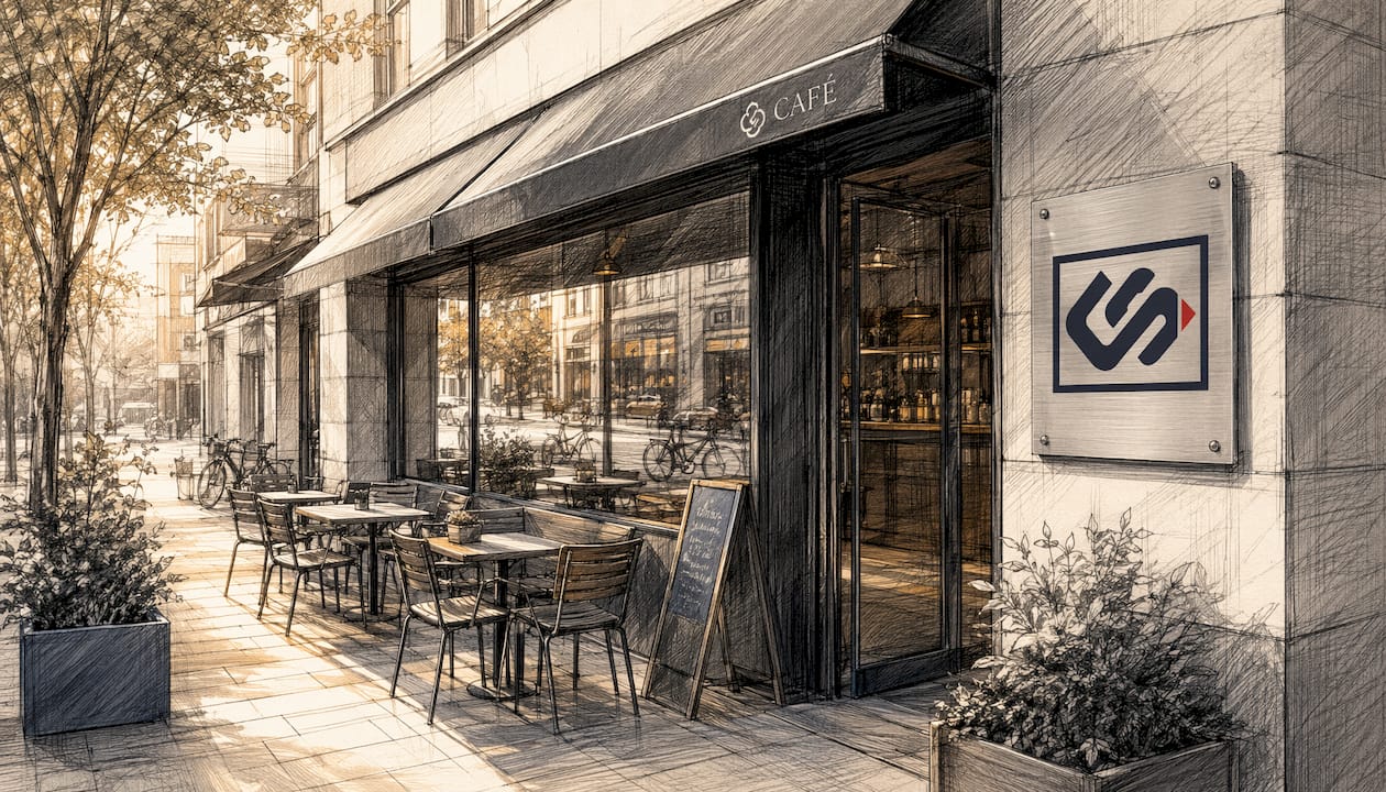
Signage is defined as the primary physical touchpoint through which a business communicates its brand identity to every person who walks past. Understanding how signs reinforce brand recognition gives small and medium-sized business owners a direct path to stronger visibility, higher foot traffic, and lasting customer trust. A poorly maintained sign can reduce a brand's trust score by 22%. That single number shows how much weight customers place on what they see before they ever walk through your door. Exterior signage is not decoration. It is a performance asset that affects customer acquisition and long-term loyalty.
How signs reinforce brand recognition through design principles
The visual design of a sign determines whether a customer registers your brand or walks past without a second glance. Two principles separate effective signage from forgettable clutter: whitespace and legibility.
Signage experts recommend a whitespace ratio of at least 60% to prevent cognitive overload and keep brand messaging clear. More whitespace means the eye moves directly to your logo, name, or core message without distraction. Crowded signs force the brain to work harder, and harder work means less retention.

Legibility follows the "Rule of 10." Retail signage should use one inch of letter height for every ten feet of viewing distance. A sign read from 50 feet away needs letters at least five inches tall. This rule applies to both exterior storefront signs and interior wayfinding panels.
Color works differently from text. Human brains process color in peripheral vision faster than they process text or shapes. That means your brand color registers before a customer consciously reads a single word. Treating your primary brand color as a "Brand Anchor" placed strategically in peripheral areas of a sign triggers instant recognition without requiring active reading.
| Design Element | Best Practice | Why It Works |
|---|---|---|
| Whitespace | Minimum 60% of sign area | Reduces cognitive overload, directs focus |
| Letter height | 1 inch per 10 feet of viewing distance | Maintains legibility at expected distances |
| Brand color | Placed in peripheral zones as a Brand Anchor | Triggers recognition before conscious reading |
| Typography | Consistent with brand style guide | Reinforces identity across every touchpoint |
Pro Tip: Test your sign design by standing at the farthest point a customer would realistically view it. If you cannot read the core message in under 1.5 seconds, the design needs simplification.
How do signage styles and messaging communicate brand values?
The materials and finishes you choose for a sign send a message before anyone reads the words on it. Brushed aluminum and backlit acrylic say "premium." Reclaimed wood and hand-painted lettering say "local and approachable." Glossy vinyl on a bright background says "affordable and energetic." Every material choice is a brand statement.
Clear, concise messaging reduces cognitive load. Signs that require more than 1.5 seconds of cognitive processing become liabilities rather than assets. The most effective signs carry one message, one logo, and one clear call to action. Anything beyond that competes with itself.
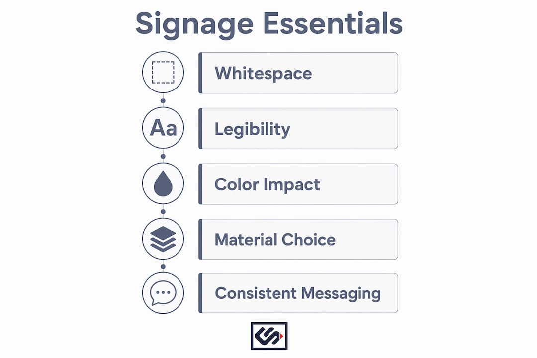
Consistent brand voice across signage builds memorability over time. Consistent use of color palettes, fonts, and logos across all signage strengthens brand identity and smooths the shopping experience. A customer who sees the same visual language on your storefront, your window graphics, and your interior panels builds a mental map of your brand faster than any ad campaign can create.
Emotional and cultural signals matter too. Signs that reflect the values of the local community, whether through language, imagery, or color associations, build affinity with the customers most likely to become regulars. Here is what effective brand messaging on signs looks like in practice:
- One primary message per sign. Never split attention between two offers or two calls to action.
- Logo placement above the fold. Position your logo in the upper third of the sign where the eye lands first.
- Brand slogan used consistently. A short tagline repeated across interior and exterior signs builds recall faster than rotating messages.
- Material that matches your price point. A luxury brand on cheap vinyl sends a contradictory signal that erodes trust.
- Cultural relevance in imagery. Local landmarks, color associations, or community references increase emotional connection.
Pro Tip: Write your sign copy as if you have three seconds and five words. If the message still works at that constraint, it will work at full size on the street.
In what ways does signage impact customer behavior in physical spaces?
Signage does more than identify a business. It shapes how customers feel the moment they approach your door. Exterior signage acts as a psychological tool that reduces customer heart rates and gives what researchers call "micro-permissions" to enter. A well-designed sign signals safety, legitimacy, and welcome before a single word is exchanged.
The behavioral effects extend inside the store. Branded wayfinding signs reduce shopper anxiety and can increase dwell time and average basket value by up to 15%. Shoppers who know where to go spend more time browsing and less time feeling lost or frustrated. That shift in emotional state directly affects purchase decisions.
Signage also drives digital behavior. Effective physical signage drives "Brand Search," where customers look up the business online after seeing it in person. Those branded search queries improve local SEO rankings, creating a feedback loop between your physical presence and your digital visibility.
The sequence of behavioral impact breaks down like this:
- First impression (0–3 seconds). The customer sees your sign from a distance. Color and shape register before text. Brand Anchors do their work here.
- Approach (3–10 seconds). The customer reads your name, logo, and primary message. Legibility and whitespace determine whether this step succeeds.
- Entry decision (10–15 seconds). The psychological "micro-permission" kicks in. A professional, well-maintained sign lowers resistance to entering.
- In-store navigation. Interior wayfinding signs reduce anxiety and guide the customer toward high-margin areas or featured products.
- Post-visit recall. A memorable sign creates a mental anchor that the customer associates with the brand when they search online or recommend the store to others.
How can businesses implement signage strategies that maximize visibility?
The most common mistake business owners make is treating signage as a one-time purchase. Signage requires a maintenance and update strategy just like any other marketing asset. Updating signage within three years without a psychological strategy risks losing an average of 14% of brand recognition equity. Customers build memory associations with your sign's look and feel. Sudden, drastic changes break those associations.
Prioritize quality over size. A smaller, well-crafted sign with clean typography and accurate brand colors outperforms a large, poorly printed banner every time. Brand authority comes from consistency and quality, not square footage.
Blending exterior and interior signage creates a cohesive brand experience. A customer who sees your brand colors and logo on the storefront, then walks into a lobby with matching interior panels, experiences your brand as unified and professional. That coherence builds trust faster than any single sign can on its own. Crispsign designs both exterior and interior solutions with this continuity in mind, so your brand reads as one consistent identity from the curb to the counter.
Hybrid signage technology offers a practical middle ground for businesses that want flexibility without screen fatigue. Combining physical sign structures with digital elements like E-Ink displays or AR triggers gives brand authority and the ability to update messaging without replacing the entire sign. This approach works well for businesses with seasonal promotions or rotating product lines.
| Signage approach | Best for | Key advantage |
|---|---|---|
| Static exterior sign | Permanent brand identity | High durability, strong first impression |
| Interior wayfinding panels | Retail and service spaces | Reduces anxiety, increases dwell time |
| Hybrid digital-physical | Seasonal or promotional messaging | Flexible content, consistent brand frame |
| Window graphics | Storefronts with high foot traffic | Low cost, high visibility, easy to update |
Key Takeaways
Signage is a psychological asset that shapes customer perception, drives foot traffic, and builds brand recognition through consistent visual cues applied across every physical touchpoint.
| Point | Details |
|---|---|
| Whitespace drives clarity | Use at least 60% whitespace on signs to prevent cognitive overload and direct attention. |
| Legibility follows the Rule of 10 | Size letters at one inch per ten feet of viewing distance for effortless readability. |
| Color anchors recognition | Place primary brand colors in peripheral sign zones to trigger recognition before reading. |
| Consistency builds trust | Match colors, fonts, and logos across exterior and interior signs to reinforce brand identity. |
| Maintenance protects equity | Update signage with a clear strategy to avoid losing brand recognition built over time. |
Why I think most businesses underestimate their signage
Most business owners I talk to treat their sign as a checkbox. Get it made, put it up, move on. That thinking costs them more than they realize. Your sign is working 24 hours a day, seven days a week, in rain, sun, and foot traffic. No employee does that.
What I have seen repeatedly is that the businesses with the strongest local brand recognition are not the ones with the biggest signs. They are the ones with the most consistent signs. Same colors inside and out. Same font on the window as on the menu board. Same logo on the door as on the receipt. That repetition is what builds a mental shortcut in the customer's brain.
The other thing most people miss is the update trap. You refresh your sign after a few years, and suddenly loyal customers feel slightly disoriented. They do not know why. They just feel like something changed. That disorientation is real, and it has a measurable cost. Small, gradual updates preserve the visual equity you have already built while keeping the brand feeling current.
My honest advice: treat your signage budget the way you treat your rent. It is not optional, and cutting it has consequences that show up slowly and then all at once.
— Nick
Crispsign's lobby signage solutions for brand consistency
Your lobby is the first interior space a customer experiences, and it sets the tone for everything that follows. Crispsign's CrispLobby line covers ADA-compliant signage that meets legal standards without sacrificing visual appeal or brand alignment.
ADA compliance is not just a legal requirement. It signals to every customer that your business is professional, inclusive, and detail-oriented. CrispLobby panels are fabricated to spec with your brand colors, typography, and logo, so the visual language your customer saw on the street continues seamlessly inside. Explore CrispLobby ADA signage options that balance regulatory compliance with the brand consistency your business needs to build lasting recognition.
FAQ
How do signs reinforce brand recognition?
Signs reinforce brand recognition by delivering consistent visual cues, including color, typography, and logo placement, that customers process and remember across repeated exposures. The faster a sign communicates a brand's identity, the stronger the recognition it builds over time.
What is the recommended whitespace ratio for retail signage?
Signage experts recommend a minimum of 60% whitespace on retail signs to prevent cognitive overload and keep the brand message readable. More whitespace directs the viewer's eye to the core message without distraction.
How does signage affect local SEO?
Effective physical signage drives branded search queries when customers look up a business after seeing it in person. Those branded searches improve local SEO rankings by signaling relevance and recognition to search engines.
What is the Rule of 10 in sign design?
The Rule of 10 states that letter height should be one inch for every ten feet of expected viewing distance. A sign viewed from 30 feet away needs letters at least three inches tall to be read effortlessly.
How often should businesses update their signage?
Businesses should update signage with a deliberate strategy rather than on a fixed schedule. Updating without a plan risks losing brand recognition equity built through years of consistent visual exposure.