
Designers: Use GU and Crispsign Proofs to Pick Matte vs Gloss Laminate
Pick gloss when the job lives or dies on color impact and shelf visibility, like packaging, photo-heavy brochures, and point-of-sale cards. Pick matte when the piece gets handled constantly or read under bright light, like business cards, menus, and lobby signage. Both hold up fine over time; the real difference is how each one looks and wears. Keep reading for the Gloss Unit numbers and proofing steps that make the choice easy.
TL;DR:
- Gloss lamination, measured at 60 GU or higher, enhances color saturation and shelf impact but is more prone to glare and visible fingerprints.
- Matte lamination, typically below 10 GU, diffuses light to reduce glare and hide fingerprints, but it may slightly mute colors and contrast on photographic pieces.
- For high-touch items like menus or lobby signs, matte avoids glare and maintains readability under bright lighting conditions.
- Reordering or matching finishes benefits from requesting physical samples with measured GU ratings and inspecting cured samples under actual lighting.
- Neither finish is inherently more sustainable; choosing based on durability and minimizing reprints can indirectly extend the lifespan of printed materials.
Table of Contents
- Matte vs Gloss Laminate: The Numbers Behind the Look
- Color, Texture, and Wear: What Actually Changes Between Finishes
- Which Finish Fits Which Printed Job?
- How to Proof and Order the Right Finish
- Is Matte or Gloss Laminate Better for the Environment?
- Does Gloss or Matte Cost More?
- Understanding the Gloss Unit Scale
- Author Perspective: Three Rules That Cut Through the Confusion
- How Crispsign Helps You Get the Finish Right the First Time
- Sources
- FAQ
Matte vs Gloss Laminate: The Numbers Behind the Look
The difference between matte and gloss comes down to a measurable property called sheen, which describes how much light a surface reflects versus scatters. Sheen is scored in Gloss Units (GU) using a gloss meter, and that single number predicts almost everything else about how a laminate will behave in the real world.
Matte laminates typically measure below 10 GU, which scatters light instead of bouncing it straight back at the viewer. High-gloss laminates commonly land at 60 GU or higher, reflecting light directly and making colors read brighter and deeper.
That gap plays out in a few concrete ways:
- Glare: gloss throws hard reflections under overhead or direct light; matte stays readable from almost any angle.
- Color saturation: gloss pushes reds, blues, and blacks to look richer; matte mutes the same colors slightly.
- Fingerprint and smudge visibility: gloss shows every touch; matte hides light contact almost completely.
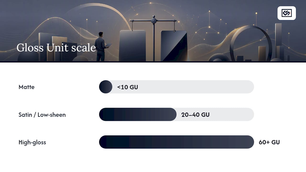
Gloss Unit reference: Matte finishes sit under 10 GU. Satin and low-sheen laminates typically fall in the 20 to 40 GU range. High-gloss finishes run 60 GU and above. Knowing where your target sample lands on that scale takes the guesswork out of a side-by-side comparison.
Color, Texture, and Wear: What Actually Changes Between Finishes
Matte lamination softens color and lowers contrast slightly, which matters most on photography-heavy pieces. Designers who work with matte regularly note that it can noticeably mute saturation compared to the same file printed gloss, so a proof approved on screen can look flatter once it's laminated matte. Gloss does the opposite: it deepens blacks, sharpens contrast, and makes photography and bold branding colors pop under store lighting.
Fingerprints and scratches behave differently too, but not because one finish is inherently tougher. Surface finish changes how visible wear is, not how durable the material actually is underneath — the substrate and resin system do the real work of resisting scuffs, moisture, and abrasion. Gloss just shows every mark because light catches scratches and oils directly; matte diffuses that same light and hides the same damage.
Cleaning follows the same logic. Glossy surfaces wipe clean faster because of their smooth, non-porous surface, but every smudge shows up instantly until you wipe it. Matte resists showing fingerprints but can hold onto oily residue longer, so it sometimes needs a slightly more thorough wipe rather than a quick pass.
For routine care on either finish:
- Use a microfiber cloth, never paper towels, which can leave micro-scratches over time.
- Stick to mild soap and water or a laminate-safe cleaner. Skip ammonia-based glass cleaners.
- Wipe gloss daily in high-touch areas like menus or lobby panels; matte can go longer between cleanings.
Pro Tip: If your artwork leans on deep photography or a saturated logo color, request a laminated proof, not just a printed one. Matte can shift a Pantone-matched color enough that it reads differently in the final piece than it did on the digital file.
Typography and fine detail also react to finish. Small serif text or thin line art can look slightly softer under matte because of light diffusion, while gloss keeps hard edges crisp. If you're combining a spot varnish or spot-laminate accent over a base finish, test that combination specifically. The interaction between a glossy accent and a matte base can create a visible texture line that either looks intentional or like a printing error, depending on registration accuracy.
Which Finish Fits Which Printed Job?
Matching finish to job matters more than picking a personal favorite. Here's how it breaks down by common print and packaging categories:
- Retail packaging: Gloss wins when the goal is shelf pop and color saturation, especially for food, beverage, and beauty packaging competing for attention. Matte works better for premium or minimalist brands that want a tactile, understated feel and don't want fingerprints showing on every box a customer picks up.
- Business cards and brochures: Matte, or soft-touch matte, gives cards a tactile quality that feels more premium in hand and resists smudging in a wallet or pocket. Gloss makes sense for photography-driven brochures or cards where a headshot or product image needs to pop.
- Menus and point-of-sale materials: Full gloss under bright restaurant or retail lighting creates glare that makes text hard to read from an angle. Matte or satin finishes cut that glare and stay comfortable to read under overhead lighting, while gloss works fine as a small accent on a logo or featured dish photo.
- Signage and outdoor-facing panels: Outdoor and storefront pieces need sign-grade coatings built for UV and weather exposure, not standard print laminate. Crispsign builds exterior signage, carved cedar panels, and lobby graphics with finish options suited to each install environment rather than a one-size-fits-all coating.
- Mixed-finish designs: Combining a matte base with gloss accents on a logo or key graphic is a proven way to get both easy maintenance and visual contrast in a single piece, whether that's a packaging box or a lobby sign.
How to Proof and Order the Right Finish
Never approve a finish decision from a screen or a swatch book alone. Order a physical sample and view it under the lighting your final piece will actually live in, whether that's fluorescent office light, warm restaurant lighting, or direct sun on a storefront window.
Coatings shift during production. Some finishes change sheen level during a curing stage like UV curing, so a proof that looks glossy fresh off the press can settle into something closer to satin once fully cured. Always inspect the cured sample, not the wet one.
Before you finalize a production run:
- Confirm the Gloss Unit target or sample code with your printer or fabricator.
- Ask what substrate and resin system pairs with that finish, since durability depends on both.
- Run a fingerprint and wipe test on the actual sample.
- Check a photo or logo-heavy area for color shift under matte.
- Do a light abrasion check by rubbing the surface gently with a cloth to see how marks show.
Pro Tip: Keep a labeled sample of every finish you've approved on past projects. Reordering the same GU range consistently, project after project, saves you a proofing round every time.
Is Matte or Gloss Laminate Better for the Environment?
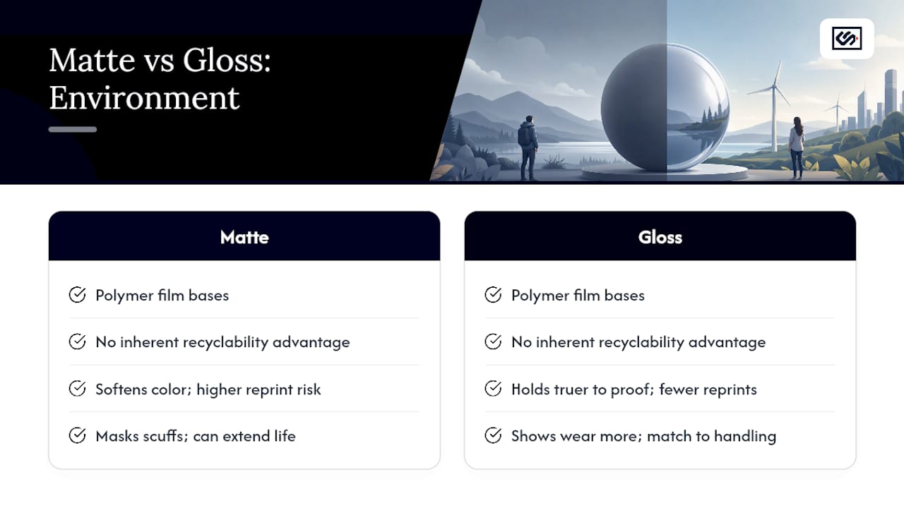
Neither finish carries an inherent sustainability advantage over the other; the environmental footprint of a laminate comes mostly from the film material, the adhesive system, and how the finished piece gets disposed of or recycled, not from whether it reads matte or glossy. Both finishes are typically produced from similar polymer film bases, so choosing one sheen over the other rarely changes the material's recyclability or biodegradability on its own.
Where sustainability differences do show up is in production waste and reprint rates. Because matte softens color and can shift a proof's appearance more than gloss, a mismatched matte order sometimes leads to a reprint if the color miss is significant enough to reject. Gloss tends to hold truer to the proofed color, which can mean fewer wasted runs on color-critical packaging jobs.
Longevity also plays into the sustainability picture indirectly. A finish that resists visible wear, like matte hiding scuffs on a heavily handled menu or lobby sign, can extend the usable life of a printed piece before it needs replacing. That's less about the finish itself and more about matching the right sheen to how much handling a piece will realistically see, which cuts down on how often materials get thrown out and reprinted.
If sustainability is a priority for your business, ask your print or signage provider about recyclable film options and water-based adhesive systems regardless of which finish you choose. The finish decision and the material sourcing decision are separate questions, and treating them that way gets you a better answer on both.
Does Gloss or Matte Cost More?
Base material costs between matte and gloss laminate film run close to each other for most standard print jobs, so finish choice alone rarely swings your budget by much. What actually drives cost differences is production complexity: specialty finishes like soft-touch matte, textured matte, or spot-gloss accents over a matte base require extra tooling, dies, or a second pass through finishing equipment, and that added step is where the price climbs.
Standard gloss lamination is often the cheaper default option simply because it's the most commonly run finish across commercial printers, which keeps setup costs and turnaround times low. Matte, especially soft-touch varieties, sometimes carries a modest premium tied to specialty film costs rather than the lamination process itself.
For packaging and signage specifically, cost differences widen more with substrate and coating system than with sheen level. A rigid board with a UV-cured matte coating costs more to produce than a standard laminate film in either finish, so when you're comparing quotes, ask whether the price difference you're seeing comes from the finish or from the underlying material and coating method. That distinction determines whether switching finishes will actually save you money or just shift where the cost shows up.
If your project mixes finishes, like a matte base with gloss spot accents, expect a line-item cost for that extra pass. It's a small addition on most runs, but worth confirming before you lock in a quote, especially on high-volume packaging orders where that per-unit cost multiplies fast.
Understanding the Gloss Unit Scale
Every gloss versus matte decision eventually comes back to one number: the Gloss Unit reading measured by a gloss meter at a standard 60-degree angle, the industry benchmark for comparing sheen across materials. That single measurement tells you more about how a laminate will behave than any visual guess under office lighting.
Here's how the GU scale typically breaks down for laminated print and packaging finishes:
| Finish type | Typical GU range | Visual effect |
|---|---|---|
| Matte | Below 10 GU | Diffuses light, hides fingerprints, muted color |
| Satin/low-sheen | Roughly 20 to 40 GU | Balanced reflection, moderate glare |
| High-gloss | 60 GU and above | Strong reflection, deep color, visible marks |
A matte reading under 10 GU is what allows the surface to scatter light instead of bouncing it directly at the viewer, which is the physical reason fingerprints and minor scratches diffuse rather than catch the eye. On a high-gloss surface at 60 GU or more, that same light reflects in a tight, mirror-like pattern, which is exactly why identical scratches or smudges look far more obvious on gloss than on matte, even on the same base material.
Ask your printer or fabricator for the specific GU rating or sample code of any finish you're considering, especially if you're trying to match an existing piece or reorder a finish from a previous run. A verbal description like "semi-gloss" means different things to different vendors, but a GU number is exact.
Author Perspective: Three Rules That Cut Through the Confusion
If you remember nothing else: gloss for shelf impact, matte for handling, and satin when you can't decide. Bright, high-traffic lighting almost always favors matte, no matter how good gloss looks in a mockup. And durability is a substrate question, not a sheen question. Test a cured physical sample under your actual lighting before you commit to a production run.
— Nick
How Crispsign Helps You Get the Finish Right the First Time
The physical proofing step is built into the process instead of leaving it to guesswork, so you're not betting a full production run on a screen mockup. Whether you're finishing lobby graphics, exterior panels, or vehicle branding, you can pull real samples and confirm how a finish reads under your actual lighting before anything goes into fabrication.

For interior work, the LobbyLogo and LobbyPanel product lines give you finish options for lobby signage and acrylic wall panels, and the design hub lets you set up artwork and request finish guidance in one place. If your branding extends to fleet vehicles, the Vehicle Decals and Vehicle Magnets hub covers finish and durability questions specific to outdoor, weather-exposed graphics. Businesses managing signage across multiple locations can also use the free Crisp Corporate portal to keep finish specs consistent storefront to storefront.
Start by requesting a finish sample through Crispsign and check it against your lighting before you commit to a full order.
Sources
FAQ
Is Glossy or Matte Laminate Better?
Neither finish is universally better; it depends on the job. Gloss wins for color-driven packaging and photo-heavy pieces, while matte wins for frequently handled items and anything viewed under bright, glare-prone lighting.
Do Professional Photographers Use Matte or Glossy Finishes?
Many professional photographers prefer matte or satin finishes for prints because they reduce glare and make images easier to view from an angle without harsh reflections. Gloss is still chosen for portfolio pieces where maximum color punch and contrast matter more than glare control.
Is It Better to Use Matte or Gloss for Business Cards?
Matte, especially soft-touch matte, is generally the better pick for business cards because it feels more premium in hand and resists smudging in a pocket or wallet. Gloss makes more sense when the card leans heavily on photography or needs colors to look as saturated as possible.
Which Finish Is Better for Wardrobe or Panel Laminate, Glossy or Matte?
For wardrobe and panel surfaces, gloss tends to make small spaces look brighter and more reflective, while matte hides fingerprints and daily wear far better in high-touch areas like kitchen cabinets. Choose based on how much handling the surface will see and how much light exposure the room gets, not on appearance alone.
What's the Difference in Cost Between Matte and Gloss Laminate?
Standard matte and gloss laminate cost roughly the same for most print jobs, since the film materials are comparable. Cost differences usually come from specialty finishes like soft-touch matte or mixed-finish designs, which require extra production steps rather than the base sheen itself.