
4-Step Vendor Checklist for Medical Office Signage and Compliance
Prioritize door and room signs, reception and check-in signage, wayfinding, exit and life-safety markers, and privacy postings before any decorative branding goes up. The rule that governs every choice: clarity and compliance come first, style comes second. Get these right and the signage still leaves plenty of room to express your practice's personality. This guide covers what ADA, OSHA, and HIPAA actually require, plus the practical design choices that make a clinic feel organized instead of clinical.
TL;DR:
- Signage must prioritize clarity and compliance, with door, safety, and wayfinding signs installed before any decorative branding.
- ADA requirements mandate tactile, Braille, high-contrast, and properly mounted signs for all permanent room identifiers, with OSHA-specific illumination standards for exit signs.
- Posting HIPAA privacy notices near reception in a prominent, easily accessible location is essential, while digital screens should be used only for temporary or non-safety-critical information.
- Durable, wipeable materials like acrylic and aluminum are recommended for high-traffic signs, with regular inspections to ensure signs remain functional and legible.
- Budgeting varies: basic vinyl signs are low-cost, while premium carved or illuminated signs are more expensive, and exact estimates should be obtained through detailed vendor briefs.
Table of Contents
- Where to Use Each Type of Medical Office Sign
- Materials, Mounting, and Finishes That Hold Up in a Clinic
- What Do ADA and OSHA Require for Medical Signs?
- Where Should HIPAA Privacy Notices Go?
- How Should Wayfinding Signs Guide Patients?
- When Should You Use Digital Signage Instead of Fixed Signs?
- Ordering Checklist: What to Send a Signage Vendor
- How Long Do Medical Office Signs Actually Last?
- What Should You Budget for a Medical Office Signage Project?
- How Does Signage Fit Into the Overall Patient Experience?
- How Do You Rotate Temporary Signs Without Breaking Compliance?
- A Note on the Most Common Signage Mistake
- Get Custom Clinic Signage Built to Spec
- Sources
- FAQ
Where to Use Each Type of Medical Office Sign
A clinic's signage plan is really a room-by-room inventory. Walk the floor plan mentally and match each stop to a sign type before you think about finishes or colors.
- Door and room signs: physician name plates, exam room numbers, and labels for specialty rooms (lab, imaging, pediatrics) so staff and patients can find the right door fast.
- Reception and check-in signs: posted hours, a short check-in sequence, and co-pay or payment notices. Keep this copy short. A wall of instructions at the front desk slows down the line it's supposed to speed up.
- Wayfinding signs: directional mounts at every hallway junction, plus corridor banners for long stretches where patients might second-guess the route.
- Safety and regulatory markers: Exit signs, Not an Exit labels, fire extinguisher locations, and any other OSHA-mandated marker in the building.
- Informational signs: hand-sanitizer station labels and hygiene reminders, kept visually separate from anything showing patient names or appointment details.
That last distinction matters more than it looks. Informational signage and protected health information should never share a sign panel or a screen.
Materials, Mounting, and Finishes That Hold Up in a Clinic
Acrylic panels give a clean, modern read for reception and directory signs. Aluminum and routed PVC hold crisp edges for exterior or high-traffic interior signs. Engraved plastic is the workhorse for door plates because it resists scuffing at eye level, and vinyl graphics let you brand glass doors or windows without touching the wall itself. Carved wood adds warmth to a lobby wall when you want something that reads as established rather than temporary.
Mounting depends on the sign's job:
- Flush mount for door and room signs where a low profile matters in tight hallways.
- Standoffs for lobby logos and directories, giving a dimensional shadow without full relief.
- Dimensional letters for exterior identification or a statement wall behind reception.
Finish choices carry real weight in a medical setting. A wipeable, non-porous surface holds up to repeated disinfectant wiping far better than a raw painted finish, and some vendors offer antimicrobial coatings for high-touch panels near entrances. Fabrication standards from groups like Signs are a useful reference when comparing material durability claims.
Pro Tip: Budget vinyl works fine for temporary or seasonal signs, but anything mounted for the long haul, like room numbers or a lobby logo wall, is worth the extra cost of a rigid, cleanable substrate. You'll replace vinyl twice before a carved or cast sign needs a second look.
What Do ADA and OSHA Require for Medical Signs?
The 2010 ADA Standards for Accessible Design set the tactile and Braille floor for permanent room signs, and medical care facilities get their own scoping provisions on top of the general rules, including guidance on dispersal of accessible spaces and accessible paths of travel when a facility is altered. Any permanent room identification sign, an exam room number or a restroom label, needs raised characters and Braille, mounted within the height and clear floor space the standards specify.
Legibility for low-vision patients depends on contrast and letter proportion, not just size. Sign associations and accessibility guidance consistently point to high contrast between text and background, paired with placement at decision points, as the difference between a sign that gets read and one that gets walked past.
On the safety side, OSHA is specific rather than general: exit signs need letters of a size regulated by OSHA, with specific minimum height and stroke width requirements, and each exit must be clearly marked and illuminated.
Where the direction to an exit isn't obvious, a directional sign is required, not optional.
A short checklist covers the essentials:
- Tactile and Braille signage on every permanent room ID, mounted per ADA height and clearance specs.
- High contrast lettering with adequate stroke width for anyone reading from a distance or with limited vision.
- Illuminated Exit signs at every required exit, with directional signs anywhere the path isn't self-evident.
- No decoration, plant, or brand panel obscuring an exit route door or sightline, a rule OSHA states plainly for evacuation routes.
Where Should HIPAA Privacy Notices Go?
Covered health care providers must post a Notice of Privacy Practices prominently at the facility and make it available to anyone who asks, per HHS guidance. "Prominently" doesn't mean buried in a rack of pamphlets near the door.
- Post a framed copy at or near reception, somewhere visitors pass on the way to check-in.
- Never display patient names, appointment lists, or other identifying details on public-facing signs or waiting room screens.
- A dedicated poster or board near intake works better than mixing the notice into a rotating digital display, since HHS guidance notes many providers pair a framed poster with a digital copy available online for anyone who wants to review it later.
Keep this notice visually distinct from marketing material. It's a compliance document, not a design opportunity.
How Should Wayfinding Signs Guide Patients?
Color zones help patients orient quickly, a blue path to imaging, a green path to lab services, but color alone is a weak signal for patients with low vision or color-vision differences. Pair every color zone with plain text and a simple pictogram.
- Assign a color and a short label to each department or wing, and repeat that same label wording on every sign along the path.
- Place directional signs at every decision point, doorways, corridor junctions, elevator lobbies, not just at the entrance.
- Keep mounting height and sightlines consistent throughout the building so patients build a mental pattern for where to look.
- Use arrows and universally recognized icons (restroom, elevator, exit) instead of custom symbols that need explaining.
CDC and industry guidance both point to high-contrast signage placed at decision points as the strongest lever for readability among diverse patients, including older adults and anyone with low vision.
Pro Tip: Meeting the ADA minimums is not the same as good wayfinding. Walk the actual patient path from the parking lot to the exam room and check whether required signs are visible before a patient reaches the point of confusion, not after.
When Should You Use Digital Signage Instead of Fixed Signs?
Digital displays earn their place for content that changes daily: queue updates, check-in instructions, health education loops, or a temporary notice about a provider's schedule. They're a poor substitute for anything safety-critical.
Exit signs, room IDs, and required regulatory postings need to stay on permanent, durable fixtures. A digital screen showing "Exit" is useless the moment the power drops or the display glitches, which is exactly the moment it matters most, a principle rooted in OSHA's exit-route requirements. If you add a screen, keep the type large, the dwell time short, and the motion minimal so patients can read it at a glance without stopping to decode it.
Ordering Checklist: What to Send a Signage Vendor
A clean brief saves rounds of revisions and gets proofs back faster. Build a simple spreadsheet before you contact anyone.
- Room inventory: list room name, sign type, exact text, dimensions, mounting location, and a photo of the mounting wall.
- Accessibility specs: note where tactile/Braille is required, target mounting height, finish (wipeable versus standard), and any clearance the door swing demands.
- Approval and proofing: ask for digital proofs at scale, along with a mounting template, and confirm turnaround time and whether installation is included or coordinated separately.
- Budget and timeline: state your budget tier upfront and the delivery or installation window you need, so the vendor can flag conflicts before production starts.
Pro Tip: Photograph every mounting wall before you request quotes. A vendor can spec the wrong bracket or panel size from a floor plan alone, but a photo with a tape measure in frame removes almost all the guesswork.
How Long Do Medical Office Signs Actually Last?
Clinics run harder on signage than most retail environments because of disinfectant wiping, high foot traffic, and constant hand contact near doors and reception counters. A sign that looks fine in a showroom can dull, peel, or discolor within a year under a daily bleach-wipe routine.
Non-porous, wipeable substrates like acrylic and aluminum tolerate repeated disinfecting far better than painted wood or uncoated PVC. If a room regularly gets cleaned with stronger solutions, an antimicrobial-rated finish is worth the added cost, since it resists the surface breakdown that eventually makes text illegible or lets grime collect in engraved lettering.

Mounting hardware matters just as much as the sign face. Standoffs and flush mounts in high-traffic corridors take a beating from carts, wheelchairs, and rolling equipment, so stainless or powder-coated hardware outlasts standard mounting screws in these spots. Vinyl graphics on doors or windows have the shortest realistic lifespan, typically a few years before edges start lifting, and they're the easiest and cheapest to refresh, which makes them a smart choice for anything you expect to update.
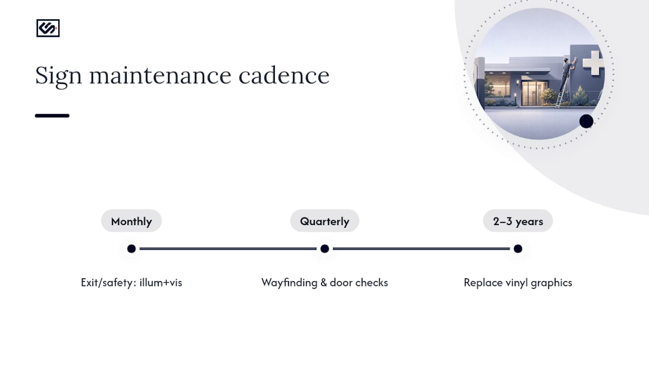
Set a simple maintenance rhythm: check exit and safety signs monthly for illumination and visibility, inspect wayfinding and door signs quarterly for peeling or fading, and plan on replacing high-touch vinyl every two to three years regardless of how it looks. Catching a cracked tactile panel or a dimmed exit sign during a routine walk-through is far cheaper than discovering it during an inspection.
What Should You Budget for a Medical Office Signage Project?
Signage costs split roughly into three tiers, and most clinics end up mixing all three across a single project. Vinyl graphics and basic engraved door plates sit at the low end, ideal for interior wayfinding, room numbers, and directional signs where the volume of individual pieces adds up faster than the complexity. Mid-tier options, acrylic panels, standoff-mounted lobby signage, and illuminated reception signs, cost more per unit but carry the bulk of a practice's first impression. Premium items, carved wood lobby features, dimensional exterior letters, or fully illuminated cabinet signs, cost the most but are typically a one-time purchase for the building's main identification.
A practical way to estimate a budget is to separate compliance-required signage from brand signage in your planning. ADA-compliant room signs and OSHA-required exit markers are non-negotiable line items regardless of budget tier, so price those first using vendor quotes rather than assumptions. Whatever remains in the budget goes toward the reception wall, exterior identification, and wayfinding style choices, where a few thousand dollars in either direction changes the visual impact more than the compliance outcome.
Get itemized quotes broken down by sign type rather than a single lump sum. A vendor's per-unit pricing on door signs, for instance, might make sense to order in bulk, while a lobby feature wall is worth pricing separately since it's the piece most likely to shift in scope as design ideas develop.
How Does Signage Fit Into the Overall Patient Experience?
Signage is often the first tangible touchpoint a patient has with a practice, arriving before the receptionist says a word and often before the patient even reaches the parking lot. Exterior identification sets the tone: a dated, hard-to-read sign at the building entrance creates uncertainty before a patient walks in, while a clean, well-lit sign signals that the practice is organized and current.
Inside, the lobby logo wall and reception signage carry the brand identity, but the same signage doing double duty as wayfinding and compliance infrastructure is where the patient experience actually gets built or broken. A patient who can find the restroom, the check-in desk, and the correct waiting area without asking staff twice walks away with a smoother impression of the visit, regardless of how the exam itself went.
Consistency across sign types reinforces this. Matching fonts, a repeated color palette, and a consistent logo treatment from the exterior sign through the lobby wall to the exam room door plates make a multi-location practice feel like one coherent brand rather than a set of mismatched offices. That consistency also makes future signage orders faster, since a vendor working from an established spec sheet doesn't have to guess at font, color, or material choices for every new location.
How Do You Rotate Temporary Signs Without Breaking Compliance?
Temporary signage, a provider on leave, a seasonal flu-shot promotion, a construction detour, needs its own set of rules so it never overlaps with the permanent compliance signage discussed earlier.
Keep temporary signs physically and visually separate from anything required by ADA, OSHA, or HIPAA. A paper notice taped over a room number sign or draped near an exit door is a common shortcut that creates a real compliance gap, since it can obscure tactile lettering or block a sightline to an exit marker.
Use a dedicated bulletin board, easel sign, or designated wall section for anything temporary, so staff have one place to update and nobody is tempted to tape a flyer over a permanent fixture. Set a review date for every temporary posting, even informal ones, so outdated notices don't linger for months. A simple sign-out log, who posted it, what it says, when it comes down, keeps this from becoming an afterthought.
Before reprinting any permanent sign for a wording change, check whether the update affects mounting height, tactile content, or required regulatory language. A minor text change on a decorative sign is low risk; the same change on an ADA-scoped room sign may require reordering to spec rather than a quick swap.
A Note on the Most Common Signage Mistake
Confirm every required sign is visible from its natural approach line before you add a single decorative panel. The mistake we see most often is a low-contrast brand panel placed where legibility actually matters, style winning over function on a sign that needed to be read fast. Use the checklist above, and let a vendor walk you through proofs before anything gets fabricated.
— Nick
Get Custom Clinic Signage Built to Spec
Crispsign is the alternative to guessing at materials and mounting from a generic template. Every sign is designed online to your exact room list, with instant estimates and saved design assets so a multi-room clinic order doesn't mean starting from scratch on every panel.
For interior work, LobbyLogo, LobbyPanel, and LobbyVinyl cover reception walls, directory panels, and window graphics, while dedicated ADA-compliant signage options handle the tactile and Braille specs this guide walks through. For exterior identification, BeaconLetters and BeaconCarved give you dimensional or carved options depending on whether you want a modern or a warmer, established look.
The ordering checklist from this guide maps directly onto CrispSign's process: submit your room inventory and accessibility specs, get a digital proof with scale and mounting templates, and confirm turnaround before anything goes to production. Installation coordination is available for an added fee if you'd rather not handle mounting yourself. Start by requesting a proof through the lobby signage hub and attach your checklist so nothing gets missed on the first pass.
Sources
- 2010 ADA Standards for Accessible Design
- 1910.37 - Maintenance, safeguards, and operational features for exit routes. | Occupational Safety and Health Administration
- Hhs
FAQ
What signs are legally required in a medical office?
You need ADA-compliant tactile and Braille room signs, OSHA-compliant illuminated Exit signs with correct letter height, and a posted HIPAA Notice of Privacy Practices near reception. Everything else, wayfinding, branding, decorative panels, is optional but strongly recommended for patient experience.
How high should exit sign letters be?
OSHA requires exit sign letters to be at least 6 inches high with principal strokes at least 3/4 inch wide, and the sign must be illuminated and clearly visible. If the path to the exit isn't obvious, a directional sign is required in addition to the exit marker itself.
Where should the HIPAA privacy notice be posted?
Post it prominently near reception or intake, somewhere every visitor passes, and make it available on request as HHS guidance requires. A framed poster near the front desk paired with an online copy covers both the physical and on-demand requirement.
Can I use digital screens for exit or compliance signage?
No. Keep exits, room IDs, and required regulatory postings on permanent, durable fixed signs since a screen failure removes safety information exactly when it's needed most. Digital displays work well for queue updates, check-in instructions, and temporary health education content instead.
How much does custom medical office signage cost?
Costs vary by material and sign type, with vinyl graphics and basic door plates at the low end and carved or illuminated exterior signs at the premium tier. Crispsign provides instant online estimates for specific product lines like LobbyLogo and BeaconLetters so you can price your exact room list rather than working from a general range.