
Ready in a Week, Built to Last: Office Directory Design for Facilities
The fastest way to a clear, professional office directory is to pick a legible template and either customize it for print or brief a fabricator for a branded panel. Choose a template first if you need something up this week. Choose custom fabrication if the directory needs to last for years and carry your brand. Either way, the templates section below gets you moving, and the promo section connects you to professional help when you're ready for a permanent installation.
TL;DR:
- Choosing a readable font and maintaining high contrast are crucial for quick comprehension, especially for visitors viewing from a distance.
- Placement at key decision points like entrances and hallways greatly improves directory effectiveness and user experience.
- Digital directories are more suitable for buildings with frequent tenant changes, while static print is better for stable office layouts.
- Materials like acrylic and aluminum composites are recommended for durability, with anti-glare finishes and secure mounting methods to withstand daily wear and vandalism.
- Using templates and structured update methods like CSV files or vinyl overlays reduces long-term costs and keeps directories current without repeated full replacements.
Table of Contents
- What Makes Office Directory Design Work?
- Which Templates and File Formats Work Best?
- What Materials Should a Physical Directory Use?
- Where Should You Place and Size the Directory?
- How Do You Meet ADA and Legibility Standards?
- DIY, Custom Fabrication, or a Hybrid Path?
- How Production Workflow Shapes the Final Design
- How Do You Keep Directories Secure From Damage?
- What Actually Matters in Office Directory Design
- Ready for a Directory That Won't Need Replacing?
- Where to Check Standards and Find Templates
- Sources
- FAQ
What Makes Office Directory Design Work?
A directory only works if someone can find their answer in about three seconds. That comes down to hierarchy, type, contrast, and spacing working together instead of fighting each other.
Start with hierarchy. The building or zone name goes at the top, floor numbers come next, and individual tenant lines with suite numbers sit at the bottom of the visual stack. A visitor scanning a lobby panel should read top to bottom without backtracking.
Type choice matters more than most people expect. A humanist sans-serif (think Frutiger, Myriad, or Helvetica Neue) reads faster at a distance than a serif or a display font. Match cap height to viewing distance, and never drop below readable minimums for the farthest point someone will stand.
Contrast is where a lot of directories quietly fail. Aim for WCAG AA-level contrast or better between text and background, and never rely on color alone to separate departments. Someone with color blindness needs to read the directory just as easily as anyone else.
- Keep whitespace generous between rows so the eye has a resting point between entries
- Use a consistent column grid for suite numbers, so numbers align vertically down the page
- Stick to standard icons for restrooms, elevators, and stairs instead of custom pictograms nobody recognizes
Effective directories also lean on a simple map or "you are here" marker rather than text alone, according to guidance on designing effective building directories.
Pro Tip: Print a test page at actual size and tape it to the wall where the directory will hang. Walk toward it from your farthest expected viewing point. If you squint, your visitors will too.
Which Templates and File Formats Work Best?
Most offices don't need a designer on retainer to get a clean directory started. A handful of formats cover nearly every use case.
- Printable PDF, AI, or PSD templates for one-time or occasionally updated directories you'll print yourself or send to a local print shop.
- Online editors like Canva's directory templates or Template.net's administrative office directory signage templates, which let non-designers drag in tenant names and export instantly.
- CSV-driven templates for digital boards, where content lives in a spreadsheet separate from the layout so updates don't require touching the design file.
Static print makes sense for offices that rarely change tenants. Digital makes sense for buildings with frequent turnover, multiple floors, or a need for search and wayfinding beyond a flat list.
When you adapt a template, work through this checklist before you hit export:
- Replace placeholder entries with real tenant names and suite numbers, keeping the same character count where possible so text doesn't overflow
- Preserve column alignment; a shifted grid is the first thing a visitor notices
- Recheck type sizes after edits, since longer company names can shrink to fit and break your minimum legibility rule
- Export with bleed included and all fonts embedded or outlined
For fabricators, send vector logos (not flattened raster images), specify CMYK color builds, and call out the intended material directly on the file. TurnkeyDirectories' design guide makes the same point: consistent naming and mobile-responsive layouts separate directories people actually use from ones they give up on.
What Materials Should a Physical Directory Use?
Material choice shapes both how the directory looks and how long it survives daily wear. Lobbies see a lot of hands, carts, and sunlight, so the finish decision is not cosmetic only.
- Acrylic gives a clean, modern look and works well for backlit or layered lobby panels.
- Dibond and other aluminum composites resist warping and hold up in higher-traffic entryways.
- Brushed metal signals a premium, corporate feel and resists scratching better than painted surfaces.
- Wood veneers suit offices going for a warmer, hospitality-style lobby.
- Vinyl overlays are the cheapest way to update tenant names without replacing the whole panel.
Matte finishes cut glare under fluorescent lighting, while gloss adds depth but shows fingerprints faster. Anti-glare coatings help in lobbies with large windows. Edge treatments, whether beveled, polished, or capped, affect both durability and how "finished" the sign looks up close.
For mounting, flush-mounted panels read as sleek and modern, while standoff mounting (with visible spacers) adds a dimensional shadow line that reads as more upscale from a few feet away.
Where Should You Place and Size the Directory?
Placement matters as much as the design itself. A beautifully designed directory tucked in a corner nobody walks past is wasted money.
- Put directories at decision nodes: main entrances, elevator lobbies, and hallway intersections where people naturally pause to reorient
- Leave clearance so the sign doesn't crowd primary walking paths or create a bottleneck near doors
- Size character height to the farthest expected reading distance rather than to what looks proportional on your screen
A workable rule of thumb: text needs roughly one inch of character height for every 10 feet of intended viewing distance. Office space planning guidance on zoning and circulation backs this up. Directories placed off the main circulation path get ignored regardless of how legible they are, because visibility depends on foot traffic patterns, not just sign size.
Lighting deserves a specific check. Position directories away from direct glare off windows or overhead fixtures, and confirm the finish you picked (matte versus gloss) actually performs under the building's real lighting, not just showroom lighting.
How Do You Meet ADA and Legibility Standards?
ADA-relevant directories need reachable mounting heights, adequate contrast, and, where the directory functions as permanent room or facility identification, tactile characters and Braille. These are baseline items to check with your local building code before fabrication, since exact requirements vary by jurisdiction and directory type.
For digital directories, accessibility means touch targets large enough for people with limited dexterity, plus a voice or alternate-access option for visitors who can't use a touchscreen at all.
Testing doesn't require expensive tools:
- Run text and background colors through a free contrast checker before finalizing artwork
- Print a scale mock-up and do a real-world distance read, standing exactly where a visitor would stand
- Ask a colleague with low vision to read your test print and flag anything that's a strain
If it's readable there, the full-size version at full distance will read the same way.*
DIY, Custom Fabrication, or a Hybrid Path?
Your budget and timeline decide the route faster than your design preferences do.
- DIY: Pick an online template, test legibility at the actual mounting scale, then export to a print-ready PDF with bleed and embedded fonts. This works when speed matters more than a fully custom look.
- Custom fabrication: Send a vendor brief covering materials, mounting method, ADA requirements, finished artwork, and site access for install. Expect fabrication and install lead times to run longer than a DIY print job, so build in a buffer for a growing office.
- Hybrid: Build your tenant list in a CSV so updates stay easy, then hand that structured file to a fabricator for the final panel. This keeps future changes cheap without sacrificing the finished look.
Before signing with any fabricator, ask directly about warranty coverage, who handles installation, and what the process looks like when you need to update three tenant names next year.
How Production Workflow Shapes the Final Design
The gap between a directory that looks good on a screen and one that holds up on a wall usually comes down to workflow, not creativity. A design that ignores production reality (unsupported overhangs, fonts that won't outline cleanly, finishes that scratch under normal cleaning) creates problems after installation, when they're expensive to fix.
An optimized production process lets a business change a tenant name without waiting weeks or accept a genuinely custom finish without paying a custom-shop premium. That balance, fast turnaround without cutting corners on materials, addresses the needs of small and midsize offices that need a directory that looks like it belongs in a much larger building.
The best directories are the ones nobody thinks about twice. They just work, they match the brand, and stay legible over time without a scratch or a faded panel to show for it.
Getting there means treating the design file and the fabrication brief as one connected decision, not two separate steps handled by two different people.
How Do You Keep Directories Secure From Damage?
Lobby directories take more physical abuse than most signage. Carts bump them, hands touch them constantly, and in some buildings, vandalism is a real concern.
Material choice is your first line of defense. Acrylic scratches more easily than brushed metal or dibond, so high-traffic lobbies in public-facing buildings often do better with a metal or composite panel over acrylic, even if acrylic looks sleeker on day one.
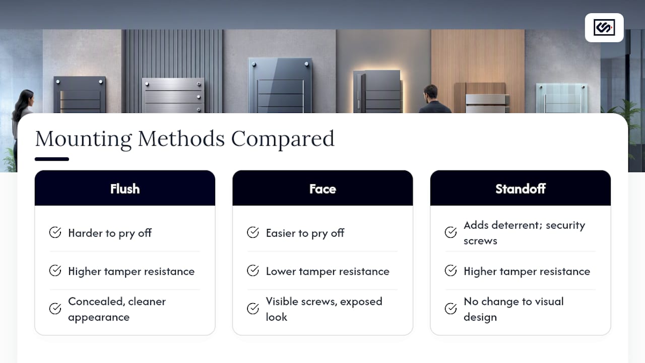
Mounting method affects tamper resistance directly. Flush-mounted panels with concealed fasteners are harder to pry off than face-mounted signs with visible screws. For buildings with a history of vandalism, standoff mounting with security screws (which need a specialized bit to remove) adds a real deterrent without changing the visual design.
Vinyl overlays offer a practical middle ground. If vandalism or wear is a recurring issue, a removable vinyl name layer over a durable substrate lets you swap damaged sections without replacing the entire panel. This also solves the update problem: a scratched or defaced name plate costs far less to fix than a full directory replacement.
Anti-graffiti laminates exist for buildings in higher-risk areas, adding a sacrificial clear layer that can be stripped and reapplied if someone marks the surface. For most office buildings, this is overkill. For ground-floor lobbies with public street access, it's worth the small added cost.
What Actually Matters in Office Directory Design
Most advice on this topic treats directory design as a pure aesthetics problem: pick a nice font, add your logo, done. That misses the actual failure point. Directories fail because of placement and update friction, not bad typography.
A gorgeous panel mounted where nobody walks is wasted spend. A legible, plain directory sitting at the exact decision point where visitors pause will outperform it every time. If you only fix one thing this week, fix placement before you touch fonts.
The second overlooked issue is update cadence. Offices change tenants, departments merge, and people move floors. A directory that requires a full reprint for a one-line change gets ignored within a year, because nobody bothers keeping it current. A CSV-driven layout or a removable vinyl overlay solves this at the design stage, not after the fact.
Start with a template to prove out your layout and hierarchy. Move to custom fabrication once you know exactly what you need permanently mounted. Skipping the template step usually means paying twice, once for a rushed first version and again for the one you actually wanted.
— Nick
Ready for a Directory That Won't Need Replacing?
A template gets you a working directory fast, but a professionally fabricated panel is the version that still looks sharp after years of hands, carts, and cleaning crews. Some sign companies build lobby directories with production workflows similar to those for exterior channel letters and monument signs, aiming for consistent quality whether you're ordering one panel or coordinating signage across several floors.
Crispsign's lobby signage lineup covers lobby logos, acrylic wall panels, vinyl overlays, tabletop tents, and wayfinding pieces designed to work together as one system instead of mismatched one-off orders. Every design is built to your specifications online, with ADA-aware production and optional coordinated installation so you're not managing a separate installer on your own.
If you're ready to move past the template stage, request a quote on ADA-aware lobby signage and get a real production timeline instead of a guess.
Where to Check Standards and Find Templates
- Canva directory templates and Template for quick starts
- SmartDraw's office layout planner for scaled test prints
- A free online contrast checker before finalizing any artwork file
Sources
- Digital Directory Boards: Design, UX & Wayfinding
- Free and customizable directory templates
- Company Directory Templates: 8 Best Examples & Complete Design Guide
FAQ
How Big Should an Office Directory Be?
Size depends on viewing distance, but a common rule of thumb is roughly one inch of character height for every 10 feet a visitor will stand from the panel.
Is a Digital Directory Worth the Extra Cost?
Digital boards cost more upfront and need ongoing maintenance, but they pay off in buildings with frequent tenant turnover or a need for search and route handoff to mobile devices, according to digital directory board guidance.
How Often Should a Directory Be Updated?
Update it as soon as a tenant or department changes; a CSV-driven layout or removable vinyl overlay keeps that update cheap instead of requiring a full reprint.
Can I Use a Free Template Instead of Hiring a Designer?
Yes, for smaller or temporary directories, tools like Canva let non-designers achieve solid legibility by following basic type and contrast rules and testing a printed sample before final production.