
Push Through Letters for Multi Location Brands: 6 Red Flags to Avoid
Push-through letters are acrylic inserts routed into a metal face panel so each letter sits proud of the surface, creating a dimensional, often backlit sign that reads as premium day and night. The main draw for business owners is durability paired with a polished, custom look that holds up on detailed logos that smaller shops and channel letters struggle to render cleanly. This guide covers the materials, lighting, sizing, cost, and installation questions that matter before you approve a design, plus where CrispSign fits as a fulfillment option.
TL;DR:
- Push-through letters are ideal for detailed logos under 7 inches in height and require high durability and premium appearance both day and night.
- Acrylic depth varies from eighth to quarter inch, affecting light diffusion and cost, with thicker acrylic providing more even LED illumination.
- For outdoor signage, UV-stable acrylic, sealed edges, and corrosion-resistant hardware are essential to withstand weather, while interior signs can use lighter materials.
- Cost is largely driven by size, material choices, illumination, and installation complexity, with itemized quotes recommended for accurate comparison.
- Manufacturers should provide clear specifications, mockups, and warranty details to avoid common pitfalls such as poor material quality or vague project timelines.
Table of Contents
- What Are Push-Through Letters, Exactly?
- Materials and Finishes to Specify
- Lighting Options: LED Backlighting and Faux Neon
- Indoor vs. Outdoor: Durability and Mounting
- Push-Through Letters vs. Channel Letters: Which Fits Your Project?
- Design and Customization: Getting the Look Right
- Typical Costs and What Drives Your Quote
- Installation, Permits, and Ongoing Maintenance
- Common Red Flags When Buying Push-Through Letters
- Questions to Ask Before Choosing a Fabricator
- CrispSign's Take: Why Push-Through Earns Its Premium
- Order Push-Through Letters Through CrispSign
- Sources
- FAQ
What Are Push-Through Letters, Exactly?
A push-through letter starts as a routed metal face panel, usually aluminum, with the letterforms cut out. Acrylic inserts are then pushed through those openings from behind so each letter projects forward, creating the 3D effect that makes these signs pop against a flat storefront. Acrylic depth commonly varies depending on design preference, with the insert projecting about an eighth to a quarter inch beyond the face for that raised, tactile look.
Production follows a fairly consistent path across fabricators:
- Digital design and file prep, including font and stroke width checks
- CNC routing or laser cutting of the face panel
- LED integration behind the acrylic for backlighting
- Assembly, sealing, and bench testing before the sign ever leaves the shop
Because the acrylic is fitted piece by piece into a routed opening rather than bent into a channel, push-through handles small, detailed letterforms far better than traditional channel-letter fabrication.
Materials and Finishes to Specify
The quote you get depends heavily on what you specify, so it helps to know the vocabulary before you ask for pricing. Face panels are typically .063 or .090 aluminum, though ACM (aluminum composite material) is common for larger cabinet-style faces. Acrylic thickness affects both the depth of the 3D shadow and how much light diffuses evenly through each letter.
Specs worth locking in on any quote:
- Acrylic type and thickness (thicker acrylic diffuses LED light more evenly)
- Face material and finish: painted aluminum, brushed metal, or ACM
- Vinyl or printed backing on the acrylic for color, instead of costly painted faces
- Backing substrate and mounting hardware, sealed and corrosion-resistant for exterior use
Pro Tip: Ask your fabricator whether the acrylic is UV-stable. Cheaper cast or extruded acrylic can yellow within a couple of years outdoors, which dulls the exact brand color you approved in the mockup.
Lighting Options: LED Backlighting and Faux Neon
Most push-through signs are illuminated from behind with LEDs, which distribute light evenly through the acrylic and give the letters that soft, glowing edge people associate with premium storefronts. LEDs run cooler and draw less power than older lighting methods, and they're the standard choice for this construction.
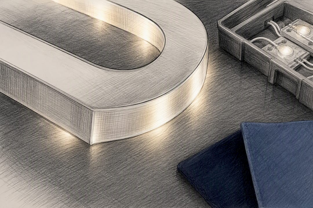
A popular variation is faux neon: thinner routed acrylic paired with LED strips mimics the look of glass neon tubing without the glass, the high voltage, or the fragility. Faux neon delivers a similar visual punch while running safer and more efficiently than real neon, which matters if you're weighing a retro sign concept against long-term maintenance costs.
A few things to plan around:
- LEDs need a power run to the sign location, so confirm electrical access early
- Faux neon strokes should stay thin and continuous for the cleanest glow
- Night visibility depends on acrylic thickness and LED spacing, not just brightness
- Check local sign codes before finalizing brightness or illuminated square footage, since municipalities regulate this differently
Indoor vs. Outdoor: Durability and Mounting
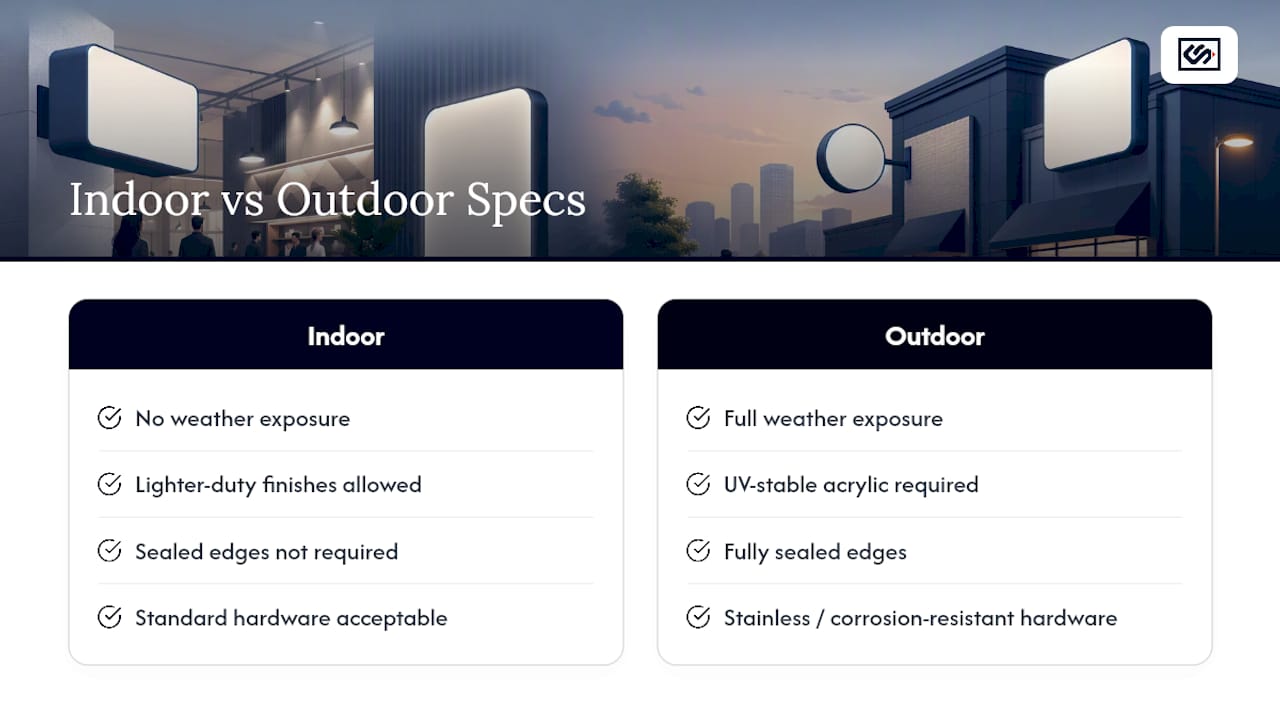
Interior lobby logos and exterior storefront signs face very different conditions, and the spec sheet should reflect that. Outdoor push-through letters need UV-stable acrylic, fully sealed edges, and stainless or otherwise corrosion-resistant mounting hardware to survive years of sun, rain, and temperature swings. Indoor signs can use lighter-duty finishes since they skip weather exposure entirely.
Mounting also depends on the wall itself. Brick, EIFS (synthetic stucco), and metal composite panels each call for different anchors and standoff depths. A well-built exterior sign typically holds its finish for eight to ten years before repainting or refinishing, while a comparable interior piece often goes longer with just occasional cleaning. If your location sees heavy coastal salt air or extreme heat, ask about upgraded coatings before you sign off on the base spec.
Push-Through Letters vs. Channel Letters: Which Fits Your Project?
Both methods illuminate storefront branding, but they solve different problems. Use this as a rule of thumb when deciding between them:
- Choose push-through for small or detailed letterforms. Anything under roughly 7 inches in height, or logos with fine script and tight curves, is mechanically easier to produce with routed acrylic than with bent channel metal.
- Choose channel letters for large-format exterior signage. Bigger letters on a pylon or high building face favor channel construction, which scales more economically at size.
- Choose push-through for a flush, unified brand wall. The letters sit within one continuous panel rather than as separate forms, which reads as more polished for lobby logos and boutique storefronts.
- Weigh lifecycle cost against upfront cost. Push-through often costs more per square foot up front but needs less structural maintenance over time than exposed channel returns.
Design and Customization: Getting the Look Right
Approving a push-through design means catching problems before they're routed into metal. Minimum stroke width matters most: thin serifs or delicate script can become fragile once cut, so most fabricators will suggest bumping stroke width or simplifying a glyph rather than risk a letter that snaps during handling.
Color comes from either vinyl-backed acrylic (fast, wide color range) or painted metal faces (more durable, slower to produce). Before production starts, confirm these items in your brief:
- Final font files with stroke widths reviewed against route tolerances
- Vinyl or paint colors matched to your brand's exact codes
- A rendered mockup approved in writing, not just a verbal sign-off
- Mounting points, power access location, and current site photos
Typical Costs and What Drives Your Quote
Price swings widely on push-through letters because so many variables stack on top of each other. The biggest levers are total square footage or letter count, acrylic thickness, whether the sign is illuminated, face material choice, and how complex the installation site is.
When you get a quote, ask for it broken down rather than as one lump number. Requesting itemized specs, material grade, LED brand and voltage, acrylic thickness, mounting hardware, lets you compare vendors on equal footing instead of guessing why one bid is half the price of another.
Statistic Callout: Acrylic depth alone ranges from a quarter inch to a full inch depending on the look you want, and that single spec can shift both material cost and production time significantly.
A few ways to control cost without cheapening the result:
- Skip illumination on interior signs where ambient lighting is already strong
- Use thinner acrylic on smaller letters where the 3D effect matters less
- Standardize letter height across a multi-location rollout to simplify tooling
Energy draw from LEDs is modest, but factor occasional LED replacement and periodic resealing into your long-term maintenance budget.
Installation, Permits, and Ongoing Maintenance
Installation method depends on the wall and the look you want:
- Raceway mounting attaches letters to a metal raceway that houses wiring, ideal for walls where you can't run conduit inside the substrate.
- Standoff mounting holds the panel slightly off the wall on studs, giving a shadow line that reads as more architectural.
- Flush mounting sets the face panel directly against the wall for the cleanest, most integrated look.
Electrical work and permits commonly come into play whenever a sign is illuminated, so ask your installer who's pulling the permit and whether local code review is included in their quote. Once installed, plan on periodic cleaning, an LED check every year or two, and resealing of exterior edges roughly on the same cycle as a repaint. Fast-turn vendors typically move from approved design to shipped product in a matter of weeks, not months, though multi-location orders take longer to sequence.
Common Red Flags When Buying Push-Through Letters
The biggest mistake business owners make is treating push-through letters as a commodity and shopping on price alone. A quote that's dramatically lower than competitors usually means thinner acrylic, unbranded LEDs, or a lighter-gauge aluminum face, none of which show up until the sign has been outside for a year.
Watch for these warning signs before you sign a contract:
- No material specs in writing. If a vendor won't put acrylic thickness, aluminum gauge, and LED brand on paper, you have no way to hold them to it later.
- Vague turnaround promises. "A few weeks" isn't a production schedule. Ask for a specific timeline from design approval to installation.
- No mockup approval step. You should see and sign off on a rendered proof before anything gets routed. Skipping this step is how businesses end up with a logo that looks wrong at scale.
- Unclear permit responsibility. Someone has to pull the electrical or sign permit. If the vendor is vague about who, expect delays or fines later.
- No mention of service access for LEDs. Push-through assemblies are tight by design, and if LEDs aren't planned for serviceability, a single failed strip can mean pulling the whole sign off the wall.
- Pressure to skip a site visit or photos. Mounting depends on your actual wall substrate. A vendor quoting blind, without site photos or measurements, is guessing.
None of these are dealbreakers on their own, but two or three together usually signal a fabricator optimizing for speed of sale rather than the sign's lifespan.
Questions to Ask Before Choosing a Fabricator
Vetting a push-through vendor comes down to a short list of pointed questions, not a gut feeling about their portfolio photos. Start with production capability: ask whether they cut and assemble in-house or subcontract the routing, since subcontracted work adds time and reduces accountability if something goes wrong.
Ask directly about materials. A fabricator should answer without hesitation when you ask for acrylic thickness options, aluminum gauge, and the LED brand they use, since that level of detail is what separates a sign built to last from one built to ship fast and cheap.
Confirm their process for multi-location consistency if you're rolling signage out across several storefronts. Do they keep your file, color codes, and stroke-width standards on record so location three matches location one? Ask how they handle installation, whether it's in-house, subcontracted, or left entirely to you, and what happens if a wall substrate turns out different from what was quoted.
Finally, ask about warranty terms on both the acrylic and the LEDs specifically, not just a blanket "our signs are guaranteed" line. LED strips are the part most likely to need service, and a vendor who can't answer how service access works probably hasn't built many of these before.
CrispSign's Take: Why Push-Through Earns Its Premium
Push-through letters solve a specific problem: brand-first businesses need signage that looks custom without looking fragile. CrispSign builds toward that standard, aluminum faces, properly specced acrylic, LED backlighting placed for even light and easy service, emphasizing durability. A production workflow built for speed doesn't mean cutting corners on the parts your storefront leans on every day.
— Nick
Order Push-Through Letters Through CrispSign
Once you know your specs, the process shouldn't be complicated. CrispSign built its ordering path around getting you from concept to installed sign without the back-and-forth typical of custom fabrication shops.
Here's how it works: request a quote with your logo and rough dimensions, upload final artwork and confirm material specs, approve a rendered mockup, and CrispSign moves into production and shipping, with installation coordination available if you'd rather not manage a crew yourself. If you're outfitting more than one location, the Crisp Corporate portal lets multi-site brands manage specs, colors, and ordering across every storefront from one place, so location twelve matches location one exactly. Every order goes through the same testing and QA steps before it ships, and turnaround times are built around weeks, not months. Start by requesting a quote and see what your exact specs come back to.
Sources
- Push-Thru Letters (Push-Through) | Direct Sign Wholesale
- A Brief Guide to Push-Through Letters | FT Signage
- Custom Push Through Letters | AnyLEDLetters
FAQ
What are push-through letters?
Push-through letters are acrylic inserts routed through a metal face panel so each letter projects forward, creating a dimensional, often backlit sign used for storefronts and interior branding.
How much does letter signage cost?
Cost depends on square footage, acrylic thickness, illumination, and face material, with thicker acrylic and painted metal faces pushing the price higher than vinyl-backed or non-illuminated options.
Where can I find changeable letters for signs?
Changeable letter systems are a different product category from push-through, typically track-mounted panels for marquees or menu boards, and most sign fabricators, including CrispSign, can quote them alongside permanent signage.
How much do channel letter signs typically cost?
Channel letters generally scale more economically than push-through at large exterior sizes, though exact pricing depends on letter height, illumination, and installation complexity, so an itemized quote is the only reliable way to compare.
When should I choose push-through over channel letters?
Push-through works best for letters under roughly 7 inches or logos with fine detail, since routed acrylic handles small, intricate forms more cleanly than bent channel metal.