
Push Through vs Flat Cut Signs: LED Acrylic Can Skip Sanding

Choose push-through letters when you want a refined, backlit architectural look. Choose flat-cut letters when you need a low-profile, lower-cost option without illumination. The right pick comes down to viewing distance, whether you want illumination, your budget, and how much permitting and electrical work you are ready to handle.
TL;DR:
- Push through suits signs viewed from cars or across parking lots after dark; flat cut works better for close range and well lit interiors.
- Flat cut generally costs less because it skips the lightbox and wiring, while versions without lighting also need less upkeep than illuminated signs.
- Electrically powered signs generally need permits and licensed electrical work; before requesting quotes, prepare sign dimensions, mounting drawings, material details, and the power feed location.
- Test a small push through panel with the chosen letter depth and LED spacing, and verify lumen output and beam angle to prevent uneven illumination.
Table of Contents
- Visual Differences and Typical Use Cases
- Materials and Fabrication Differences
- Lighting and Illumination: What to Expect Visually
- Cost, Lead Time, and Maintenance Considerations
- Installation, Permits, and Electrical Code Considerations
- Quick Decision Checklist: How to Choose Between Push-Through and Flat-Cut
- Our Take on Picking a Letter Style
- How We Build Push-Through and Flat-Cut Signs at CrispSign
- FAQ
- Sources
Visual Differences and Typical Use Cases
Push-through letters create depth. Acrylic inserts sit flush with or slightly proud of an aluminum face, so the letter glows from within when lit and reads as a dimensional, almost sculptural element during the day. Flat-cut letters sit on the surface instead of passing through it. They are shallow, clean, and usually unlit, which makes them a natural fit wherever a business wants dimension without the cost of a lightbox.
Where each style lands depends heavily on the space and the viewing distance:
- Push-through letters suit exterior corporate signage, bank branches, and hospitality fronts where a premium, architectural feel matters.
- Flat-cut letters work well for interior lobby logos, directory signs, and boutique storefronts viewed at close range.
- Push-through performs best when the sign needs to read clearly from a distance after dark, since the illuminated face carries visibility that flat-cut cannot match without added lighting.
A boutique with foot traffic and strong interior lighting rarely needs the backlit drama of push-through. A corporate headquarters sign facing a parking lot usually does.
Materials and Fabrication Differences
Push-through construction starts with an aluminum face panel, CNC-routed with letter-shaped cutouts. Acrylic letters are then inserted through those openings from behind, usually sitting inside a lightbox so LEDs can illuminate the acrylic from the inside. Push-through acrylic inserts vary in depth, and that depth affects how much the letter face glows versus how much it simply catches ambient light.
Flat-cut letters skip the cabinet entirely. They are cut from a single sheet, acrylic, PVC, metal, or wood, and mounted directly to a wall or panel with standoffs or adhesive. There is no face to route, no lightbox to build, and finishing is limited to edge treatment and surface coating.
- Push-through needs precision routing, insert fitting, and lightbox assembly before any lighting goes in.
- Flat-cut needs only cutting, edge finishing, and mounting hardware.
- Material choice changes both the look and the labor: acrylic diffuses light differently than metal reflects it.
One material swap changes the whole labor picture: ACRYLITE® LED optimized letter block is engineered for backlighting, which means it transmits and diffuses light evenly enough to skip sanding, painting, or diffuser film, steps that otherwise add time to every push-through order.
Lighting and Illumination: What to Expect Visually
Push-through letters deliver controlled, even glow because the acrylic insert diffuses LED light from behind, producing a soft architectural face rather than a hot spot. Fabricators mount LEDs inside the cabinet, spaced and aimed so the light spreads evenly across each letter before it reaches the acrylic.
Flat-cut letters have more flexible lighting options precisely because they do not rely on a lightbox: they can stay fully non-illuminated, get a halo effect from LEDs mounted behind the letter against the wall, or sit in front of a backlit panel. None of these options produce the same even face glow as push-through, which is why flat-cut signs read differently at a distance, especially after dark.
- Non-illuminated flat-cut letters rely entirely on ambient or architectural lighting to stay legible at night.
- Halo-lit flat-cut letters produce a rim glow around the letter edges rather than a lit face.
- Push-through letters are the only option here engineered specifically for even face illumination.
Getting that even push-through glow right takes testing, not guesswork. ACRYLITE's own technical guidance recommends test cuts paired with LED lumen output and beam angle checks before committing to routing depth, since depth and light output interact directly.
Pro Tip: Run a small test panel with your chosen letter depth and LED spacing before locking in the full order, it's the cheapest way to avoid uneven hot spots across a whole sign face.

Cost, Lead Time, and Maintenance Considerations
A handful of factors drive price on either style: material choice, routing complexity, lighting components, electrical installation, and finishing work. Push-through typically costs more and takes longer because it layers several of these at once, routed aluminum, fitted acrylic inserts, an internal lightbox, and LED wiring. Flat-cut skips the cabinet and lighting components entirely in its simplest form, which keeps both price and turnaround lower.
- Push-through pricing climbs with letter depth, LED density, and cabinet size.
- Flat-cut pricing climbs mainly with material thickness and cutting complexity, not lighting.
- Illuminated signs of either style add ongoing maintenance: LED access panels for replacement, periodic cleaning, and weatherproofing on exterior installs.
Non-illuminated flat-cut letters need the least upkeep of the two. Once mounted, there is no wiring to maintain and no diffuser film to clean or replace.
Installation, Permits, and Electrical Code Considerations
Any sign wired to an electrical source, push-through included, generally needs a sign permit and licensed electrical contractor work to meet code. Seattle's sign-permit guidance/sign-awning-and-billboard-permit), as one municipal example, lists application drawings, square-foot calculations, and electrical fees tied directly to illuminated signage, which is the kind of paperwork buyers should expect to prepare before ordering.
Building codes add their own layer on top of permitting. Los Angeles building code excerpts require signs to meet material and fire-safety standards, restrict combustible materials in ornamental features, and call for grounding and clearance on metallic sign parts, rules that apply whether the letters are push-through or flat-cut, as soon as metal framing or electrical components are involved.
Before requesting quotes, it helps to have a few things ready:
- Measured square footage of the proposed sign, since many permit thresholds are size-based.
- Elevation or site drawings showing where the sign will mount.
- A plan for electrical feed location and a licensed installer if the sign will be illuminated.
Permit applications commonly ask for the same core details: total square footage, whether the sign is illuminated, material composition, and contractor licensing information.
Quick Decision Checklist: How to Choose Between Push-Through and Flat-Cut
Narrowing this down takes a few quick decisions:
- Define your typical viewing distance; long sightlines favor push-through's illuminated face.
- Decide whether illumination matters at all, or whether daytime visibility is enough.
- Set a realistic budget range before falling in love with a look that exceeds it.
- Note your mounting surface and any depth constraints from the wall or cabinet.
- Confirm whether your sign will trigger permit or electrical requirements.
A corporate office lobby with strong overhead lighting and foot traffic within a few feet typically does best with flat-cut letters, clean, dimensional, and budget-friendly without any wiring to coordinate. A retail storefront on a busy street, viewed from cars at dusk, usually justifies the push-through investment because the backlit face carries visibility that flat-cut alone cannot.
When you request quotes, ask vendors about letter and lightbox materials, LED specs and expected lumen output, warranty terms, who handles permit paperwork, and realistic lead time.
Pro Tip: Ask for a written lead-time estimate that separates fabrication time from permit approval time, the two rarely move at the same pace.
Our Take on Picking a Letter Style
Most sign buyers overthink the aesthetic decision and underthink the operational one. The real question is not which style looks sharper on a mockup, it is whether your location, budget, and timeline can absorb the permitting and electrical work that illumination brings along with it.
We have seen businesses choose push-through for its look and then discover mid-project that their building's electrical capacity or local permit timeline adds weeks they had not planned for. Flat-cut letters get dismissed as the "budget" option, but for interior lobbies and daytime-dominant storefronts, they are often the smarter architectural choice, not just the cheaper one.
The styles are not strictly competitors, either. Plenty of storefronts mix flat-cut directory signage inside with a push-through feature sign outside, using each where it earns its keep.
— Nick
How We Build Push-Through and Flat-Cut Signs at CrispSign
We create custom signage, which means you do not have to pick a vendor based on which style they happen to specialize in. Our BeaconLetters and BeaconCarved product lines cover channel letters and carved signs, while our online design tools let you configure an option just as easily if that is the better fit for your space.
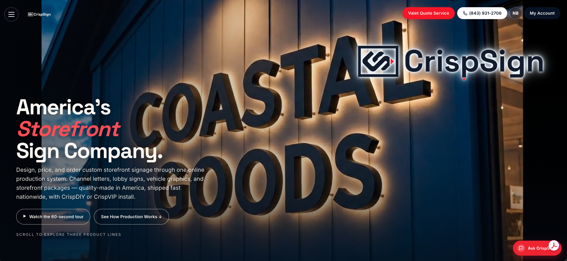
Current prices are on our website, so you can check pricing before committing. Upload your artwork, and our production workflow handles fabrication to spec with nationwide shipping. If your sign will be illuminated, we can discuss installation and permit requirements with you. For buyers who want more information about electrical safety documentation, our sign information page covers the details.
- Configure signage through our online builder.
- Upload artwork directly, no back-and-forth file requests.
- Ask about installation or permit coordination.
Start your quote at Crispsign and see both options priced side by side for your project.
FAQ
What is the main difference between push-through and flat-cut letters?
Push-through letters use acrylic inserts routed through an aluminum face so light passes through from behind, creating a glowing, dimensional look. Flat-cut letters are cut from a single sheet of material and mounted on the surface without any lightbox or illumination built in.
Do push-through signs always need a permit?
Any sign connected to electrical power, including illuminated push-through letters, generally needs a sign permit and licensed electrical installation to meet code, as shown in Seattle's municipal sign-permit guidance. Non-illuminated flat-cut letters often avoid this requirement entirely, though local rules vary.
Which style costs less to make?
Flat-cut letters generally cost less because they skip the lightbox, acrylic inserts, and LED wiring that push-through requires. Push-through pricing rises further with letter depth and LED density, while flat-cut pricing is driven mainly by material thickness and cutting complexity.
Can flat-cut letters be illuminated too?
Yes, flat-cut letters can be paired with halo lighting or a backlit panel, though this produces a rim glow around the edges rather than the even, lit face that push-through delivers. Fully non-illuminated flat-cut letters remain the simplest and lowest-maintenance option.
Does CrispSign build both styles?
Yes, our BeaconLetters and BeaconCarved lines offer custom signage configured online and shipped nationwide. If you want a simple low-cost interior sign first, resources like queue signage ideas for small businesses can help you scope smaller flat-cut setups before scaling up to an illuminated storefront piece.