
How Tall Should Sign Letters Be for Clear Visibility?
Use 1 inch of capital letter height for every 10 feet of readable distance, then size up for comfortable reading and real-world conditions. That's the sign letter height rule signage professionals have relied on for decades, and it still holds up: a common industry baseline puts maximum readable distance at roughly 10 feet per inch of capital letter height.
Here's the shortcut: take your target viewing distance in feet, divide by 10, and you have your letter height in inches. A sign meant to be read from 100 feet away needs letters around 10 inches tall, at the outer edge of legibility.
But maximum readable distance isn't the same as comfortable reading distance, and that gap trips up a lot of sign planning. Comfortable distance runs about 30 to 50% shorter than the theoretical max, since nobody wants to squint at the edge of their vision to catch a business name while walking or driving. A practical fix: multiply your calculated height by roughly 1.3 to land in comfortable territory. So that 10 inch letter for 100 feet becomes closer to 13 inches if you want people to read it without strain.
A few factors affect readable distance:
- Low contrast between letters and background reduces readable distance.
- Decorative or thin-stroke typefaces often require larger letters.
- Motion, such as a driver moving past, requires bigger letter sizes for comfort, according to recommendations on digital signage for restaurants where legibility of dynamic content is essential.
The rest of this guide breaks down exactly how much bigger, and for which applications.
Key Takeaways
Correct sign letter height comes from matching capital letter size to viewing distance, then sizing up for contrast, typeface, angle, and motion.
| Point | Details |
|---|---|
| Use the 1:10 baseline | One inch of capital letter height reads clearly from about 10 feet at maximum distance. |
| Design for comfort, not max | Multiply the baseline height by about 1.3 for a comfortable, strain-free read. |
| Contrast can outweigh size | Poor color contrast can defeat even oversized letters, so fix contrast before increasing height. |
| Match sizing to sign type | Wayfinding, storefront, and traffic signage each call for different height ranges and rules. |
| Verify before fabrication | Crispsign checks proofs against target viewing distance and lighting before production begins. |
Table of Contents
- Sign Letter Height Chart: Distance to Letter Size
- What Factors Change Real-World Sign Legibility?
- How Big Should Letters Be for Different Sign Types?
- How Do You Calculate the Right Letter Height?
- Spacing, Margins, and Pre-Production Checks
- How Crispsign Applies These Sizing Rules
- What the Sizing Rules Actually Mean for Your Sign
- Get Your Letter Height Right Before You Order
- Sources
- FAQ
Sign Letter Height Chart: Distance to Letter Size
Once you know your target viewing distance, a visibility chart turns that number into a real spec. The ranges below reflect the 1 inch to 10 feet baseline alongside applied examples from visibility chart data that signage specialists use daily.
| Letter Height | Comfortable Distance | Maximum Readable Distance |
|---|---|---|
| 1" | roughly half to slightly less of 10 feet | 10 feet |
| 1.5" | somewhat less than 15 feet | 15 feet |
| 2" | about 15 feet | 20 feet |
| 3" | a bit below 30 feet | 30 feet |
| 4" | around 30 feet | 40 feet |
| 6" | slightly below 45 feet | 60 feet |
| 8" | about 60 feet | 80 feet |
| 10" | about 75 feet | 100 feet |
| 12" | near 90 feet | 120 feet |
| 24 inches | near 180 feet | 240 feet |
Which column matters depends on how the sign gets used. A pedestrian directory a few feet from foot traffic can lean on the comfortable-distance column, since readers have time to stop and look. A highway-adjacent monument sign, where drivers glance for two or three seconds at speed, should be sized against maximum readable distance and then padded further, not treated as the ceiling. Safety and wayfinding signage should almost always favor the more generous comfortable numbers, because the cost of a missed read is higher than the cost of a slightly larger sign.
Pro Tip: If your install location has low light, glare, or an angled approach, jump up one row on this chart. It's cheaper to oversize the letters now than to reprint a sign that nobody can read.
What Factors Change Real-World Sign Legibility?
The chart above assumes ideal conditions: strong contrast, a clean typeface, a straight-on view, and good light. Real installations rarely offer all four at once, which is why the baseline is a starting point, not a finish line.
Contrast does more work than most people expect. Signage industry guidance treats contrast as a primary driver of legibility, sometimes outweighing size entirely. Dark green letters on a forest backdrop or pale gray on white can erase the benefit of a larger sign; black or dark navy on white, or white on deep red, hold up far better at distance.
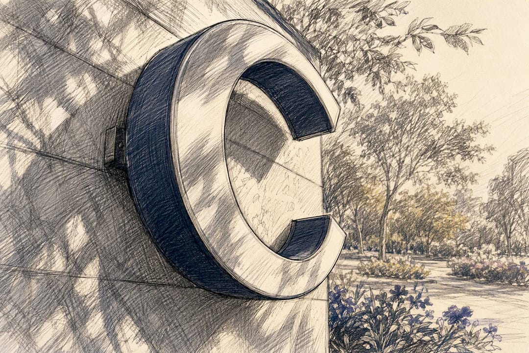
Typeface and stroke width matter because thin, ornate letterforms lose their shape before bold ones do. A script font that looks elegant up close can turn into a blur at 50 feet, so a face with heavier strokes usually needs less overall height to read at the same distance as a light, decorative one.
Viewing angle and glare cut readable distance even when height and contrast are correct. A sign viewed at a sharp angle, or hit by direct sun glare on a glossy surface, can lose a meaningful chunk of its effective range, which is why placement and finish deserve as much attention as the letter spec itself.

Lighting and weather shift the math further: overcast days, dusk, and backlit storefronts all reduce apparent contrast, and illuminated channel letters need a night test to confirm they read as well after dark as they do at noon.
Motion changes the whole equation. A pedestrian sign gives readers several seconds to process a message; a driver moving at 35 miles per hour gets a fraction of that. Vehicular signage should always be sized toward the generous end of the comfortable range, never the bare minimum.
How Big Should Letters Be for Different Sign Types?
Different signs solve different problems, and the right letter height depends on how far away the reader stands and how much time they have to look.
- Pedestrian-focused signs. Headings usually run 1 to 3 inches, with body copy at 0.4 to 1 inch, sized for someone standing within a few feet to 20 feet.
- Storefront identity and channel letters. Primary business name letters typically start at 8 to 12 inches for a street-facing facade, with secondary tagline or hours copy kept smaller, often 2 to 4 inches, since it's read only by people already close enough to care.
- Wayfinding and directional signage. Decision-point sizing matters more than raw distance: a sign meant to be read and acted on from 15 feet needs roughly 1.5 inch letters, from 30 feet closer to 3 inches, and from 60 feet around 6 inches, so drivers or walkers have time to react before reaching the turn.
- Trail and interpretive panels. Headings should sit around 2 to 4 inches for readability from a few paces away, while body text can drop to 0.5 to 0.75 inch since visitors typically stand still to read these. Outdoor durability (UV-stable inks, weatherproof substrates) matters as much as size here, since faded letters shrink effective contrast over time.
- Traffic and safety signage. Any regulated roadway or safety application must follow FHWA and MUTCD standards rather than a general rule of thumb. Where a sign falls outside strict regulation but still serves a safety function, such as a private parking lot warning sign, err toward the FHWA's engineered minimums as a practical benchmark, since safety signage carries a stiffer margin for error than a retail sign.
How Do You Calculate the Right Letter Height?
The everyday formula covers most projects: take the viewing distance in feet, divide by 10, and that's your capital letter height in inches. Multiply by 1.3 if you want a comfortable read rather than the bare maximum.
A few worked examples:
- 30 feet away: 3 inches for maximum readability, about 4 inches for comfortable reading.
- 100 feet away: 10 inches maximum, roughly 13 inches comfortable.
- 250 feet away: 25 inches maximum, close to 32 to 33 inches comfortable.
For projects where precision actually matters, engineers lean on a more rigorous method. A technical report on stroke width and visual angle ties required letter size to viewing distance and a viewer's visual acuity, then works backward from a specified stroke width to a final letter height using a height-to-stroke-width ratio. Practitioners commonly use a ratio between 6:1 and 10:1, choosing a higher ratio for a leaner, more modern letterform and compensating with slightly larger overall size.
The stroke-width approach starts with the smallest visible detail, the stroke, and scales outward. It's the right call for warehouses, stadiums, and any space where viewer acuity or distance falls outside typical pedestrian or driver assumptions.
For anything touching public roadways, the FHWA's sign calculator verifies word length and letter series against the Standard Alphabets, which is worth running even on a borderline private project.
Spacing, Margins, and Pre-Production Checks
Letter height only does its job when spacing and layout support it. Cramped kerning or tight borders can undo the benefit of a well-calculated size.
- Interletter and interline spacing: give letters room to breathe, tightening spacing hurts legibility more than most designers expect, and interline spacing should scale with letter height rather than staying fixed.
- Border clearances: keep margins proportional to letter height so the message doesn't feel cramped against the sign's edge; state DOT guidance often specifies sign dimensions in multiples of six inches partly for this reason.
- Font choice: avoid heavily decorative faces for anything read at distance, and if a stylized font is non-negotiable for branding, increase its stroke width or overall height to compensate.
- Contrast testing: photograph a mockup from the actual target distance, and check it again in simulated glare or dim light to catch failure modes before fabrication.
- Pre-production checklist: build a scale mockup, verify it on-site against the real sightlines, run a night test for any illuminated element, and coordinate sizing with your installer before locking the final spec.
Pro Tip: Print a full-scale paper version of your letter height and tape it to the install wall before ordering. Ten minutes of standing at the target distance catches sizing mistakes that no chart can.
How Crispsign Applies These Sizing Rules
Every custom sign order at Crispsign starts with the same question this guide answers: how far away does this need to read, and under what conditions? The design team checks proposed letter heights against target viewing distances before a single proof gets approved, then builds in a size buffer for lighting, angle, and contrast issues specific to the storefront or facility in question.
- Design proofs are checked against both maximum and comfortable distance targets, not just the smaller of the two.
- Illuminated cabinet signs and channel letters get evaluated for daytime and nighttime legibility separately.
- Installation coordination accounts for mounting height and viewing angle, since a perfectly sized letter can still underperform if it's hung wrong.
A letter height calculation only holds up if the sign actually gets installed at the angle and height the math assumed. That's why sizing and installation planning happen together, not in separate steps.
What the Sizing Rules Actually Mean for Your Sign
The 1 inch to 10 feet rule earns its staying power because it's easy to remember and rarely wrong by much. Where the conventional advice falls short is in treating that maximum distance as the target instead of the ceiling. Most storefronts and wayfinding projects should design toward the comfortable distance, not the theoretical max, since a sign that's technically readable at 100 feet but strains the eye is a worse business outcome than one sized for effortless recognition.
The stroke-width method gets treated as an engineering afterthought, but it deserves more attention outside highway signage. Any project with atypical viewers, distances, or lighting benefits from starting at the stroke and working outward rather than guessing at an overall height and hoping the font holds up.
If you take one thing from this guide, prioritize contrast and typeface before you finalize height. A well-sized sign in the wrong colors will underperform a smaller sign with sharp contrast every time. Get the contrast and font right first, then let the distance math set the final number.
— Nick
Get Your Letter Height Right Before You Order
Crispsign builds every sign around the sizing math this guide covers, so you're not left guessing whether your storefront letters will actually read from the street or parking lot. Rather than handing you a generic size chart and walking away, the design process checks your specified letter height against your real viewing distance, lighting, and mounting angle before anything goes into production.
That matters most for exterior channel letters and illuminated cabinet signs, where a size that looks right on screen can underperform once it's twenty feet up and lit at night. Crispsign's online design tool lets you enter your target viewing distance and see a size recommendation before you commit, with options for DIY or coordinated professional installation once the design is locked. If you're planning a storefront sign, start a custom quote and get a size recommendation matched to your actual location.
Sources
- Letter Height Visibility Chart: Understanding Maximum Outdoor Sign Readability
- FHWA sign word length calculator
- Technical report: letter stroke-width / visual angle analysis
- Design & placement of signs (International Sign Association)
FAQ
What height should a sign be mounted at?
Mounting height depends on the viewer: pedestrian signage typically sits at eye level, around 5 to 6 feet, while vehicular signage needs to clear sightlines and often mounts higher to provide good visibility depending on local placement guidance.
What height should signage be at for storefronts?
Storefront identity letters usually mount above the entrance at a height that keeps them visible from the street or parking area, commonly 8 to 15 feet up depending on the building facade and setback distance.
What is the ideal height of a sign's lettering for a business front?
For most storefronts, primary identity letters run 8 to 12 inches tall to read comfortably from the street, with secondary details like hours or phone numbers sized smaller since they're read only up close.