
Storefront Signage Visibility Explained for Retail Owners
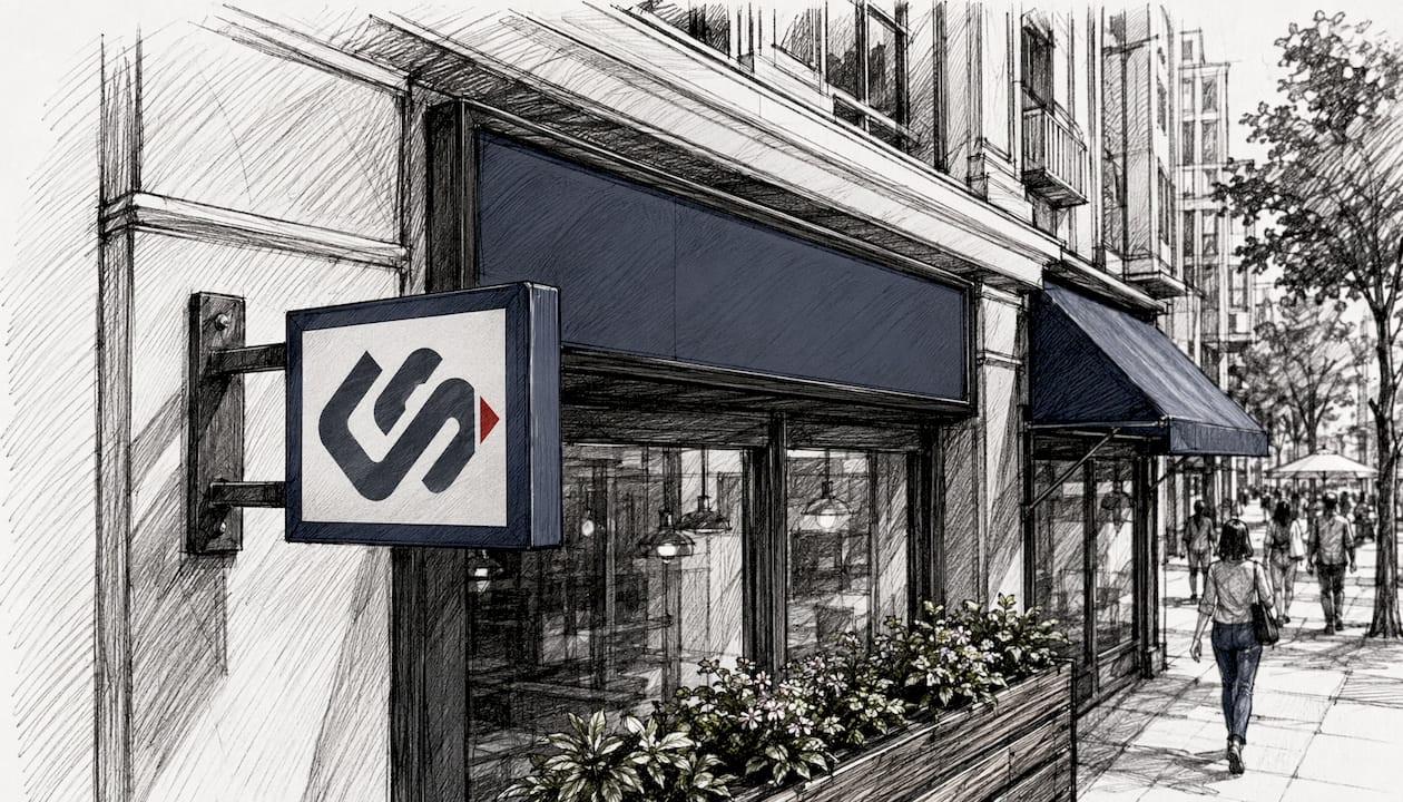
Your storefront sign is your best salesperson. It works every hour you're open, communicates your brand before a customer ever steps inside, and either pulls people in or lets them walk past. Storefront signage visibility, the measure of how clearly and effectively your signs communicate from various distances and angles, is one of the most direct levers you have for driving foot traffic and building brand recognition.
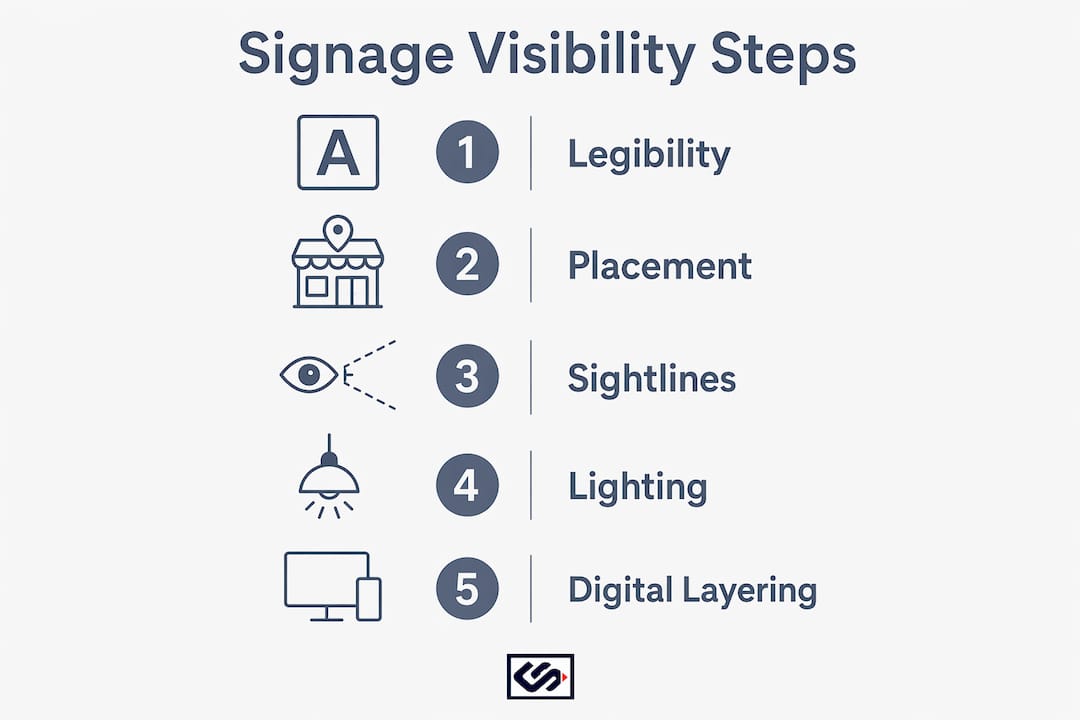
Here's what actually determines whether your sign works:
- Legibility at distance: Letter height rules require 1 inch of letter height per 30–50 feet of viewing distance, so, for example, a sign meant to be read at 150 feet should have letters at least 3–5 inches tall.
- Placement height: Pedestrian-focused signs perform best when mounted at a height that aligns with the natural sightline of passersby.
- Clear messaging: One strong message beats five competing ones. Simpler signs get more attention.
- Digital alignment: Your physical sign and your Google Business Profile must tell the same story. Inconsistencies erode trust fast.
- Compliance: ADA standards, local zoning codes, and security grille transparency rules all affect what you can legally display and how visible your storefront remains after hours.
Get these five factors right, and your storefront starts doing real work for you around the clock.
What storefront signage actually does for your business
Storefront signage covers every visual communication element on your exterior: the main fascia sign, window graphics, blade signs, A-frames, awnings with text, and illuminated channel letters. Each serves a distinct function, and together they form the first impression your business makes on anyone passing by.
The core jobs signage does:
- Branding: Communicates who you are and what kind of experience to expect before anyone reads a word.
- Wayfinding: Tells people where the entrance is, what floor you're on, and whether you're open.
- Promotion: Highlights current offers, seasonal products, or new arrivals to create urgency.
- Location confirmation: Confirms to both foot traffic and search engines that your business exists at this address.
Placement matters as much as design. Signs on facades catch drivers and pedestrians from a distance. Window graphics speak to people already standing close. Entrance signs close the deal. Each position targets a different stage of the customer's decision to walk in.
There's also an indirect local search benefit. Consistent business information across your physical signage and digital listings, matching name, address, phone number, and hours, increases search engine trust and reduces customer confusion. A sign that says "Open 9–6" while your Google listing says "Open 9–8" creates friction that costs you visits.
Design and placement strategies that maximize sign visibility
The most common mistake business owners make is treating signage as decoration. It's a communication tool, and it follows rules.

Legibility first. Sans serif fonts like Helvetica or Arial outperform decorative scripts for quick comprehension, especially from a moving vehicle. High contrast colors with matte finishes reduce glare and keep text readable in direct sunlight. Dark text on a light background, or vice versa, works better than mid-tone combinations.
Placement by audience. If your primary traffic is pedestrian, mount your main sign between 30 and 60 inches from the ground to align with natural sightlines. If you're on a road with vehicle traffic, go higher and larger. Blade signs mounted perpendicular to your facade catch both walkers and drivers from farther away than a flat panel ever will.
Sightline discipline. Uncluttered sightlines to your sign are worth more than a bigger sign. Trees, parked vehicles, competing posters, and window clutter all reduce effective visibility. Walk across the street and look at your storefront as a stranger would. Can you read the name, category, and main offer without slowing down?
Lighting as a multiplier. Lighting near entryways and along signage pathways extends visibility into evening hours and creates a welcoming atmosphere that encourages entry. A well-lit sign at 8 PM does more work than an unlit one at noon.
Pro Tip: Layer your physical signage with a fully optimized Google Business Profile. Stores with complete GBP listings receive significantly more customer engagement than those with incomplete profiles. Use the GBP readiness checklist from Metrix Score to audit your listing against your physical sign messaging.
Types of storefront signage and how each one performs
Different sign formats reach different audiences at different distances. Knowing which type to use, and where, is the foundation of any solid storefront advertising strategy.
- Fascia signs (flat panel signs): Mounted flat against the building between the cornice and awning. These are the most common format and work well for brand name visibility from across the street. Materials range from carved wood to metal and acrylic, each with different durability and aesthetic profiles.
- Channel letter signs: Usually internally lit and made from metal or plastic. They're highly visible day and night and can be mounted directly to a building or on a raceway panel. For businesses open in the evening, channel letters are one of the highest-performing formats available.
- Blade signs (projecting signs): Hang perpendicular to the building facade and are purpose-built for pedestrian and vehicle traffic. A pedestrian walking along a sidewalk sees a blade sign head-on from a full block away, while a flat sign is nearly invisible from that angle.
- Window graphics: Decals, vinyl lettering, and printed graphics applied directly to glass. They communicate promotions, hours, and brand personality to people already near the entrance. City regulations in many jurisdictions require at least 50% window transparency, so coverage must be planned carefully. In New York City, commercial security grilles must allow at least 70% visibility from the sidewalk as of July 1, 2026.
- A-frame and sandwich boards: Placed on the sidewalk directly in the path of foot traffic. Best used for daily specials, directional cues, or time-sensitive offers. They're low-cost and highly flexible.
- Illuminated signs (neon and LED): Simple neon signs are noticeable day and night and add a custom, memorable look. LED alternatives offer lower energy costs with similar visual impact. Both formats extend your effective selling hours well past sunset.
- Awning signage: Text or graphics on awnings provide shade and branding simultaneously. Most local codes limit awning lettering height and restrict content to the business name and address, so check your zoning before ordering.
How signage builds brand identity and shapes customer experience
A sign doesn't just label a location. It sets expectations. A bakery with a hand-lettered wooden sign signals artisan quality before anyone smells the bread. A repair shop with a clean, bold channel letter sign signals reliability before a customer checks a single review.
Consistent signage style and messaging reinforce brand personality and promise. When your exterior sign, window graphics, and interior wayfinding all share the same fonts, colors, and tone, customers read that as professionalism. Inconsistency, mismatched fonts, faded colors, outdated promotions, reads as neglect.
Signage also signals whether a store is active. Regular updates to window displays and exterior signs keep passersby engaged and returning. A window display that hasn't changed in three months tells a regular pedestrian there's nothing new to see. Swap it seasonally at minimum, and monthly if your product mix allows.
Accessibility matters here too. ADA-compliant signage, including tactile characters, Braille, and proper mounting heights, communicates that your business welcomes everyone. It's both a legal requirement and a trust signal.
Clear, timely information on your exterior, current hours, whether you're open today, any closures, prevents the frustration that turns a potential customer into a lost one. That detail costs nothing to update and pays back every time someone checks before making the trip.
Retail signage design principles and compliance you need to know
Good design and legal compliance aren't separate concerns. They reinforce each other.
Design principles that work:
- Use visual hierarchy: headline (who you are), supporting detail (what you offer), call to action (come in, call now, see today's special).
- Keep the message short. Cluttered signs are hard to read and easy to ignore. The simpler the sign, the more attention it gets.
- Choose high contrast color combinations and matte finishes to eliminate glare.
- Scale sign size to the building, not to your ambition. Oversized signs that cover architectural details look cheap and often violate local codes.
Compliance requirements US businesses must know:
- ADA standards: Interior and exterior signs in public-facing spaces must meet Americans with Disabilities Act requirements for tactile characters, Braille, color contrast, and mounting height. Non-compliance exposes you to federal liability.
- Local zoning codes: Sign area, height, illumination, and projection limits vary by zoning district. In New York City, for example, signs over 6 square feet require a permit, and signs on landmarked buildings need approval from the Landmarks Preservation Commission.
- Security grille transparency: As of July 1, 2026, commercial security grilles must permit at least 70% visibility from the sidewalk. Solid-panel gates are prohibited in occupancy groups B and M. Non-compliant businesses face fines of $250 for a first offense and at least $1,000 for each subsequent violation.
- Projection limits: In NYC, signage cannot project more than 12 inches over the sidewalk, and any projecting sign must be at least 10 feet above curb level. Similar rules exist in most major US cities.
Pull a permit before you install. It's faster than fighting a fine.
How to measure whether your storefront signage is actually working
Most business owners invest in a sign and never evaluate it. That's a missed opportunity. Measuring sign effectiveness doesn't require expensive tools, just consistent observation and a few trackable metrics.

Foot traffic counts. Use a door counter or a simple manual tally to track daily entries before and after a sign change. A new blade sign or a refreshed window display should produce a measurable lift within two to four weeks if it's working.
Conversion rate by entry point. If you know how many people enter versus how many buy, you can isolate whether signage is attracting the right audience. High entry, low conversion often points to a messaging mismatch: the sign promises something the interior doesn't deliver.
Google Business Profile insights. GBP shows you how many people searched for your business by name versus discovered you through category or location searches. A spike in discovery searches after a sign update suggests the new sign is generating awareness that carries over to online searches.
Customer surveys. Ask new customers how they found you. "I walked past and noticed your sign" is data. Track it over time. If that answer drops after a sign change, the new design may be less effective than the old one.
Competitor benchmarking. Walk your block and evaluate competing storefronts honestly. Are their signs more readable from 50 feet? Better lit at night? More current? Use that as a baseline, not a ceiling.
Signage effectiveness is not a one-time judgment. Lighting fades, vinyl peels, and messaging goes stale. Build a quarterly review into your operations calendar and treat your storefront as a living asset.
Key Takeaways
Effective storefront signage visibility depends on combining legible design, strategic placement, regulatory compliance, and consistent alignment with your digital presence.
| Point | Details |
|---|---|
| Legibility rule | Use 1 inch of letter height per 30–50 feet of viewing distance for readable signs. |
| Placement height | Mount pedestrian-focused signs between 30 and 60 inches from the ground. |
| Digital alignment | Match your physical sign details to your GBP listing to build search trust and reduce customer confusion. |
| Compliance | Security grilles must allow at least 70% sidewalk visibility as of July 1, 2026; ADA standards apply to public-facing signs. |
| Ongoing evaluation | Measure foot traffic, GBP discovery searches, and customer feedback quarterly to keep signage performing. |
The storefront as a real-world landing page
Most retail owners think about signage once, when they open, and then forget it. That's the wrong frame entirely. Your storefront is a real-world landing page. It needs the same discipline you'd apply to a website: clear headline, obvious value proposition, and a reason to act now.
What I see consistently is a gap between how business owners perceive their own signs and how a stranger actually reads them. You know what your business does. A first-time passerby doesn't. They're making a split-second decision based on what they can read from 30 feet away while checking their phone. If your sign doesn't answer "what is this place and is it for me" in under three seconds, you've lost them.
The more interesting shift happening right now is that physical signage and digital presence have become a single system. Someone spots your blade sign, pulls out their phone, searches your name, and decides whether to walk in based on what your Google listing looks like. If the hours on your sign say one thing and your GBP says another, the doubt that creates is enough to send them somewhere else. Visibility isn't just optical anymore. It's the full loop from physical sign to search result to front door.
The businesses getting this right aren't spending more. They're being more deliberate: better contrast, cleaner messaging, updated window displays, and a GBP that mirrors exactly what the sign outside promises. That combination, physical clarity plus digital consistency, is what actually moves the needle on foot traffic in 2026.
FAQ
What are the four main types of storefront signage?
The four primary types are fascia (flat panel) signs, projecting blade signs, window graphics, and illuminated signs. Each serves a different visibility purpose depending on whether your traffic is pedestrian, vehicle-based, or both.
What is retail visibility?
Retail visibility is how easily potential customers can identify, locate, and understand your store from the street or a search result. It covers physical sign legibility, storefront transparency, lighting, and consistency across digital listings.
What are the core principles of retail signage design?
Effective retail signage follows a clear hierarchy: one primary message, high color contrast, a legible sans serif font, and placement at the right height for your audience. Simplicity consistently outperforms complexity for quick comprehension.
Should storefront signage ever be obscured?
No. Blocked or cluttered signage reduces the information available to passersby and lowers the likelihood they'll enter. City regulations in many US jurisdictions also require minimum window transparency, typically at least 50%. In New York City, security grilles must allow at least 70% sidewalk visibility as of July 1, 2026.
How does Crispsign help with storefront signage?
Crispsign designs and fabricates custom ADA-compliant signage and exterior signs built to spec for small and medium-sized businesses. The production process is built for fast turnaround without sacrificing quality, so your storefront gets professional-grade results on a realistic timeline.