
Wayfinding Sign Design: WCAG and ADA Rules, 7:1 Contrast, and Sizing
Wayfinding sign design is the practice of planning, sizing, and placing signs so people can navigate a building or site without confusion or hesitation. The single most important rule: legibility and clear hierarchy always outrank decorative branding. If a sign looks good but reads slowly from a decision point, it has already failed its one job. Everything below builds standards-backed, implementable guidance on top of that principle.
TL;DR:
- Signs should prioritize clear hierarchy and legibility, with bold sans-serif fonts, high contrast ratios of 7:1, and minimal wording to ensure quick comprehension.
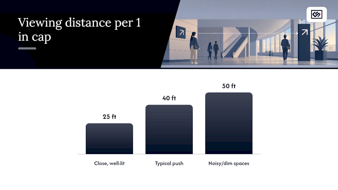
- Proper sizing depends on viewing distance, with about 1 inch of capital letter height for every 25 to 50 feet, adjusted for lighting and visual noise.
- Match sign types to their function, such as directional signs at decision points and identification signs at destinations, avoiding unnecessary clutter and confusion.
- Sign placement must consider sightlines and lighting conditions, with mounting heights and clear visibility verified through actual site walks during peak traffic hours.
- Use a standardized kit of parts, documented design guidelines, and strict fabrication controls to maintain consistency and durability across the entire wayfinding system.
Table of Contents
- What Are the Core Principles of Wayfinding Sign Design?
- What Are the Four Main Types of Wayfinding Signs?
- How Should Wayfinding Signs Be Sized, Mounted, and Placed?
- How Do Color, Icons, and Arrows Build a Learnable Visual System?
- What Materials Hold Up Best for Wayfinding Signs?
- How Do You Design a Complete Wayfinding Sign System?
- What Is the Right Process for a Wayfinding Sign Project?
- How Does CrispSign Apply These Standards in Practice?
- What's the One Mindset Shift That Fixes Most Wayfinding Mistakes?
- Get Your Wayfinding System Designed, Fabricated, and Installed
- Sources
- FAQ
What Are the Core Principles of Wayfinding Sign Design?
Every legible sign starts with three decisions: typeface, contrast, and word count. Get those wrong and no amount of clever iconography saves the sign.
Choose bold sans-serif faces with open counters and generous x-height. Cap height matters less than most designers assume. What actually governs legibility from a distance is how tall and open the lowercase letters read, which is why typography guidance for wayfinding recommends setting line spacing around 135 percent of text height and avoiding condensed tracking entirely, even under space pressure.
Contrast comes next, and it is not negotiable. The Web Content Accessibility Guidelines set baseline contrast ratios for digital text, but signage lives in tougher conditions: variable daylight, glare, aging eyes, and readers glancing at a sign while walking.
Pro Tip: Aim for a 7:1 contrast ratio between text and background whenever the substrate allows it. That buffer above WCAG's standard minimums covers the gap between a lab-tested contrast reading and how a sign actually performs at 5 p.m. with low sun hitting the panel.
Word count is the third lever, and it is the one designers cut last when they should cut first. A directional sign read at walking speed has room for a headline and maybe one qualifier, not a paragraph.
- Cap primary directional signs at one destination name plus an arrow, never a list of five.
- Use a headline and subline pattern: bigger type for the destination, smaller type for a qualifier like a suite number.
- Treat every extra word as a tax on comprehension speed, not a bonus for clarity.
On sizing, the field rule of thumb is roughly 1 inch of capital letter height for every 25 to 50 feet of viewing distance. That range is wide on purpose. Practitioners push toward the 40 to 50 foot end in visually noisy corridors or dim lighting, and toward 25 feet only in quiet, well-lit settings where readers have time to stop and look.
What Are the Four Main Types of Wayfinding Signs?
Most wayfinding failures trace back to the wrong sign type sitting at the wrong decision point. Match the type to the job.
- Directional signs point the way at decision points like corridor junctions and lobby splits; keep them arrow-forward with minimal text.
- Identification signs label a destination once you have arrived, such as a room number or department name mounted at the door.
- Confirmation signs reassure a reader mid-route that they are still on the correct path, useful in long corridors with no branch points.
- Informational signs carry supporting content like hours, maps, or emergency instructions and belong in low-traffic zones, not at a junction.
- Regulatory signs communicate rules (exit only, no entry, capacity limits) and need to stay visually distinct from directional signage so readers do not confuse a rule with a route.
A common misapplication: designers load a directional sign with regulatory text, which forces a reader to parse two unrelated messages while walking. Split them onto separate panels instead. Pictograms should supplement, not replace, text on any sign carrying legal weight, and multilingual copy works best stacked by priority language rather than crammed into one line.
How Should Wayfinding Signs Be Sized, Mounted, and Placed?
Placement decisions live or die on viewing distance and sightlines, not on where a wall happens to be empty.
- Calculate letter height from viewing distance. A sign meant to be read from 40 feet needs roughly 0.8 to 1.6 inches of cap height, depending on lighting and visual clutter, following the 25 to 50 foot rule of thumb.
- Mount at eye level for identification signs, typically 60 inches to center, and higher (7 to 9 feet) for overhead directional signs that need to clear foot traffic and sightlines.
- Place directional signs perpendicular to the path of travel at decision points, not flush against a wall a reader has already passed.
- Apply ADA tactile sign requirements for permanent room identification: raised characters, Braille, specific mounting height ranges, and placement adjacent to the door on the latch side. These apply narrowly to identification signage, not to every directional element, so confirm scope early rather than over-engineering the whole system.
- Run a sightline or isovist check before finalizing placement. Stand at the actual decision point and confirm the sign is visible and readable before a reader has to choose a direction, not after.
Pro Tip: Walk the space at the time of day your heaviest traffic occurs. A sign that reads clearly at 10 a.m. can disappear into glare by 4 p.m., and no spec sheet catches that.
How Do Color, Icons, and Arrows Build a Learnable Visual System?
Color coding speeds recognition, but it only works as a secondary cue. Build the system so it still functions in grayscale, because a meaningful share of readers have some form of color-vision deficiency and colorblind-friendly design has to be tested, not assumed.
- Assign each zone or building a distinct color, but pair it with a name or number every time, never color alone.
- Use standard pictograms (restroom, exit, elevator) instead of custom icons whenever a recognized symbol exists; familiarity beats originality here.
- Test custom icons with real users before finalizing, since an icon that seems obvious to its designer often reads as ambiguous to everyone else.
- Standardize arrow angles (up, down, diagonal, and turn) across the entire system so a 45 degree arrow means the same maneuver on every sign.
- Check every color pairing under a color-vision-deficiency simulator, not just against a brand guide, before it goes to fabrication.
What Materials Hold Up Best for Wayfinding Signs?
Material choice is where budget and durability collide, and the wrong call shows up as fading, glare, or cracked panels within a year or two.
- Aluminum resists weather well and works for exterior directional and identification signs, though it can add glare without a matte finish.
- Acrylic gives crisp edges and depth for interior lobby and identification signage but scratches more easily in high-traffic zones.
- Engineered plastic (HDU or similar) carves well for dimensional letters and holds up outdoors with minimal maintenance.
- Vinyl graphics are the most economical for temporary or frequently updated wayfinding but degrade faster under direct UV exposure.
- Painted metal offers a durable, vandal-resistant option for exterior monument and regulatory signage.
Anti-glare laminates matter more indoors under fluorescent lighting than most designers expect. For nighttime legibility, choose illumination that preserves contrast rather than washing it out, and build a maintenance cycle into the spec from day one instead of treating it as an afterthought.
How Do You Design a Complete Wayfinding Sign System?
A single well-designed sign means nothing if the next one in the sequence breaks the pattern. Systems, not signs, are what actually get people where they are going.
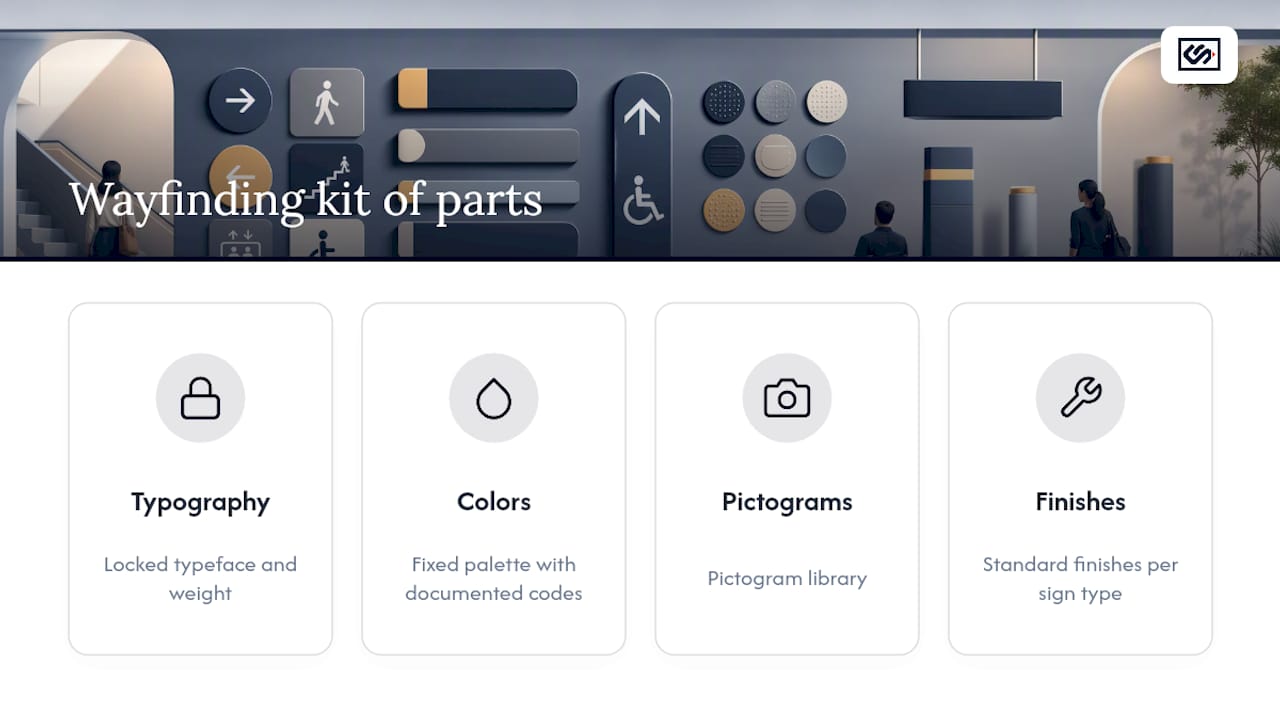
Start with a kit of parts: a locked typeface and weight, a fixed color palette with documented codes, a pictogram library, and standard finishes for each sign type. Every new sign gets built from that kit rather than designed from scratch, which is what keeps a 40-sign campus feeling like one coherent system instead of forty separate decisions.
Hierarchy rules should be explicit and written down, not left to instinct. Primary destinations get the largest type and the top position on a panel; secondary information (suite numbers, hours) sits smaller and below. Readers should never have to guess which line matters more.
Documentation is the unglamorous part that saves real money later. A facilities team maintaining the system for the next decade needs mounting templates, exact color codes (not "the blue one"), font files, and a source file library, not a folder of finished PDFs. Design guides for signage systems that scale across a campus consistently point to this documentation gap as the reason otherwise well-designed systems drift into inconsistency within a few years, forcing readers to relearn conventions at every new building.
What Is the Right Process for a Wayfinding Sign Project?
Good wayfinding systems get built in a sequence, not assembled from finished sign designs bolted onto a floor plan after the fact.
- Map user journeys and inventory decision points. Walk every path a visitor, employee, or delivery driver actually takes, and mark every spot where someone has to choose a direction.
- Run sightline and isovist analysis alongside a lighting audit. Confirm each sign will actually be visible from the approach angle and under the lighting conditions present at that location, not just on a rendered floor plan.
- Prototype with scaled mock-ups and in-situ test installations. A printed placeholder taped to the actual wall reveals sizing and placement problems that a digital rendering never will.
- Verify after install and hand off a maintenance plan. Walk the finished system with fresh eyes, confirm every sign reads correctly at its decision point, and leave the facilities team a document, not a memory.
Pro Tip: Budget for a second site walk after install, ideally with someone who has never seen the plans. Fresh eyes catch confusion the design team stopped noticing months ago.
How Does CrispSign Apply These Standards in Practice?
Some sign fabricators build wayfinding signage for retail, hospitality, and multi-location brands, and the process above is not theoretical. It reflects how a fabrication-to-installation workflow actually has to run when the goal is signage that reads correctly on day one and holds up for years.
Consistency across a sign family only survives contact with the real world when the fabrication partner treats the kit of parts as a rule, not a suggestion. That means locking font files, color codes, and finish specs before the first panel gets cut, so the tenth sign in a system matches the first exactly. A production workflow built around that discipline applies the same substrate, contrast, and mounting decisions across every sign in an order so a sign system stays coherent whether outfitting one storefront or multiple locations.
What's the One Mindset Shift That Fixes Most Wayfinding Mistakes?
Most sign failures trace to the same root cause: someone prioritized branding over legibility. Oversized logos crowd out directional text, type gets too small to save panel space, and nobody checks the sightline until installation day. The fix is a mindset shift, not a bigger budget. Design the message first, then let the brand live inside what remains legible.
— Nick
Get Your Wayfinding System Designed, Fabricated, and Installed
Some companies offer a direct route to a finished wayfinding system when you would rather work with one production partner than juggle a designer, a fabricator, and an installer separately. Where a full agency engagement means paying for concepting you may not need, CrispSign starts from your finalized design intent and carries it straight through fabrication and coordinated installation, nationwide.
To request a quote, prepare your sign schedule (quantities and locations), your kit of parts if one exists (fonts, colors, pictograms), and rough dimensions for each sign type. If you are still building the system itself, a resource on connecting brand identity to physical navigation can help align your visual language before fabrication begins, and a performance-based design framework is worth reviewing if you want your system tested against real user behavior before it goes to production. Multi-location brands can start directly through Crisp Corporate, CrispSign's portal built for managing signage across several sites from one order.
Sources
For specification work, keep the WCAG 2.1 guidelines for contrast, SignResearch's Arts & Science of Sign Design for legibility research, and ArchDaily's wayfinding principles for architectural integration close at hand.
- Web Content Accessibility Guidelines (WCAG) 2.1
- Wayfinding signage design principles: typography, contrast, placement — Plotstuff
FAQ
What Are the Four Types of Wayfinding Signage?
The four core types are directional (pointing the way at decision points), identification (labeling a destination), informational (supporting content like hours or maps), and regulatory (communicating rules). Confirmation signs are often treated as a fifth category for reassuring readers mid-route.
How Do You Design Wayfinding Signage?
Start with legibility fundamentals: bold sans-serif type, at least 7:1 contrast, and minimal wording, then size each sign to its viewing distance using the 1 inch per 25 to 50 feet rule of thumb. Build every sign from a documented kit of parts and validate placement with a sightline check before finalizing the design.
How Can I Design a Sign for Free?
Free design tools like Canva or Adobe Express can produce a basic layout, but wayfinding signs carry legibility and, in many cases, ADA tactile requirements that a template rarely accounts for. A fabricator like CrispSign can review a rough concept and confirm sizing and contrast before production, which matters more for wayfinding than for a decorative sign.
What Are the Rules for Sign Design?
The core rules are consistent hierarchy, adequate contrast (7:1 recommended for signage per WCAG-based guidance), correct letter sizing for viewing distance, and one clear message per sign. Regulatory and ADA-related signs carry additional placement and tactile requirements that apply on top of these general legibility rules.