
How Signage Increases Restaurant Foot Traffic
The right signs are your restaurant's best salesperson, working 24/7 without a paycheck. Signage increases restaurant foot traffic by making your location visible from a distance, triggering appetite, communicating value instantly, reducing entry friction, and building brand trust that turns a curious passerby into a paying guest. Yelp for Business recommends that exterior signs be legible from at least 50 feet, giving pedestrians enough time to process your offer and decide to walk in.
Here are the six core ways signage drives walk-ins:
- Visibility from a distance — channel letters, illuminated cabinets, and monument signs put your name on the map before someone is even close enough to read a menu.
- Appetite triggers — appetizing food photography and LED displays create an immediate craving that pulls people off the sidewalk.
- Value communication — A-frames and window graphics announce daily specials, price points, and happy hour deals at a glance.
- Friction reduction — wayfinding and ordering-process signs answer questions before guests ask them, making entry feel easy.
- Shareable moments — custom neon, split-flap boards, and mural-style wall graphics become photo backdrops that extend your reach on social media.
- Brand trust — clean, well-lit, professional signage signals quality before anyone tastes a bite.
Key Takeaways
Effective restaurant signage increases foot traffic when it combines high-visibility placement, specific messaging, and regular updates tied to tracked promotions and measurable experiments.
| Point | Details |
|---|---|
| Legibility from 50 feet | Exterior signs must be readable from at least 50 feet to give passersby time to decide to enter. |
| Match sign type to goal | Use A-frames for daily specials, digital displays for dayparted offers, and channel letters for permanent brand visibility. |
| Specificity converts | A sign with one specific offer and a promo code outperforms generic messaging and lets you track walk-ins directly. |
| Test before you invest | Run a 7–10 day A-frame or digital message test against a baseline before committing to permanent or expensive signage. |
| Crispsign for fast turnaround | Crispsign offers custom restaurant signage designed online, fabricated to spec, and shipped nationwide with optional installation. |
Table of Contents
- How does signage capture attention and turn a passerby into a customer?
- What sign types work best, and when should you use each?
- How can digital signage tactics drive more foot traffic?
- What design rules make a sign readable and persuasive?
- What copy and CTAs turn a look into a walk-in?
- What do you need to know about placement, permits, and installation?
- How do you measure whether your signage is actually working?
- What do restaurant signs actually cost, and how long do they take?
- When should you DIY signage, and when should you hire a professional?
- What do real restaurant signage case studies show?
- How does signage work alongside your other local marketing efforts?
- What most restaurant owners get wrong about signage
- Crispsign makes professional restaurant signage fast and straightforward
- Sources
- FAQ
How does signage capture attention and turn a passerby into a customer?
Visibility plus clarity equals a higher chance of a walk-in. That is the short answer. The longer one involves understanding how quickly people actually process a storefront.
A pedestrian moving at a normal walking pace covers roughly 4–5 feet per second. At 50 feet away, that gives them about 10 seconds to notice your sign, read it, and decide whether to change direction. Miss that window and you miss the customer. Research published in PLOS ONE confirms that visual cues and presentation influence attention and food choice, which is why an appetizing image or a bold color block can do more work than a paragraph of copy.
Three elements win the initial glance: contrast (light text on a dark background, or vice versa), motion (a digital display cycling through content), and appetizing imagery. Clutter kills all three. A window packed with competing messages, faded decals, and handwritten paper signs reads as noise, not information.
Quick storefront audit checklist:
- Stand across the street. Can you read the restaurant name in under three seconds?
- Photograph the facade from 50+ feet and zoom in on your phone. If the text blurs into the background, it will do the same for pedestrians.
- Check for competing visual elements (stacked flyers, old promotions, sun-bleached vinyl) that dilute the primary message.
- Confirm that lighting works at night. A dark sign after 6 PM loses the dinner crowd.
- Verify that the sign's color palette contrasts with the building facade behind it.
Pro Tip: Walk to the nearest intersection and time how long it takes you to identify your own restaurant name. If it takes more than three seconds, your sign needs more contrast or a larger character height.
What sign types work best, and when should you use each?
Every sign category serves a specific business objective: exterior signs build visibility, promotional signs drive impulse decisions, wayfinding signs reduce friction, and atmosphere signs create the environment that keeps guests coming back. Matching the right sign to the right goal is where most operators leave money on the table.
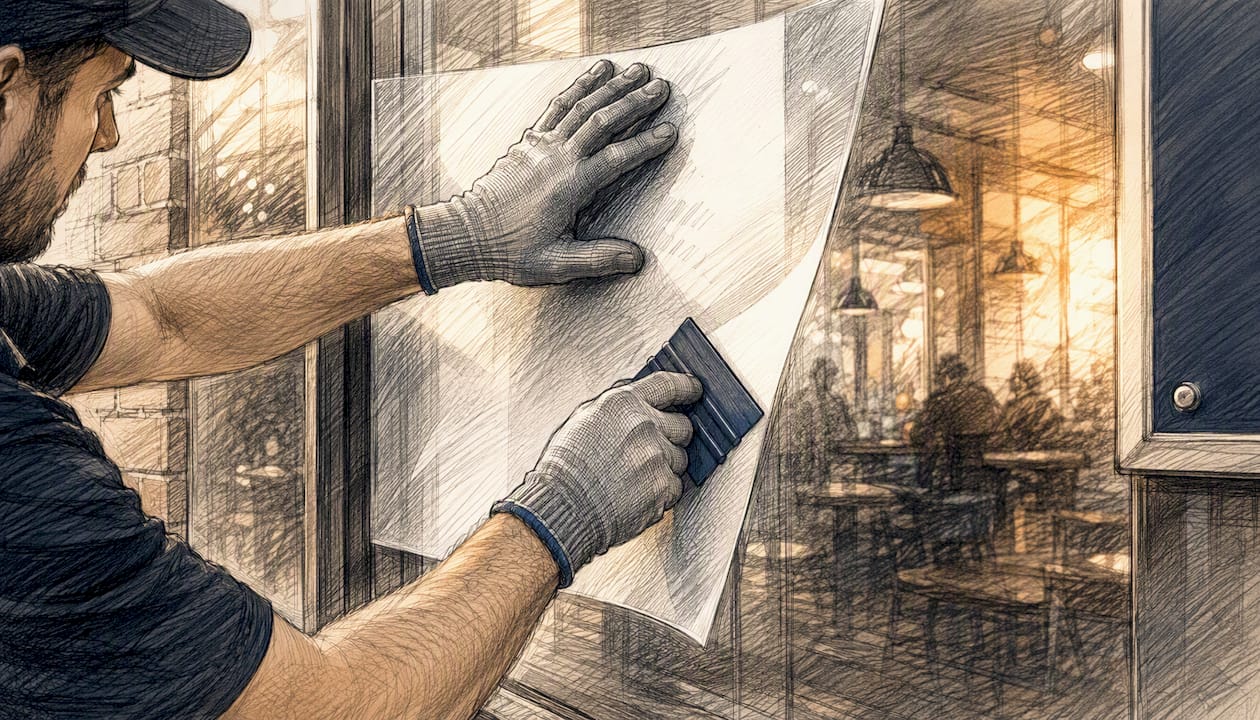
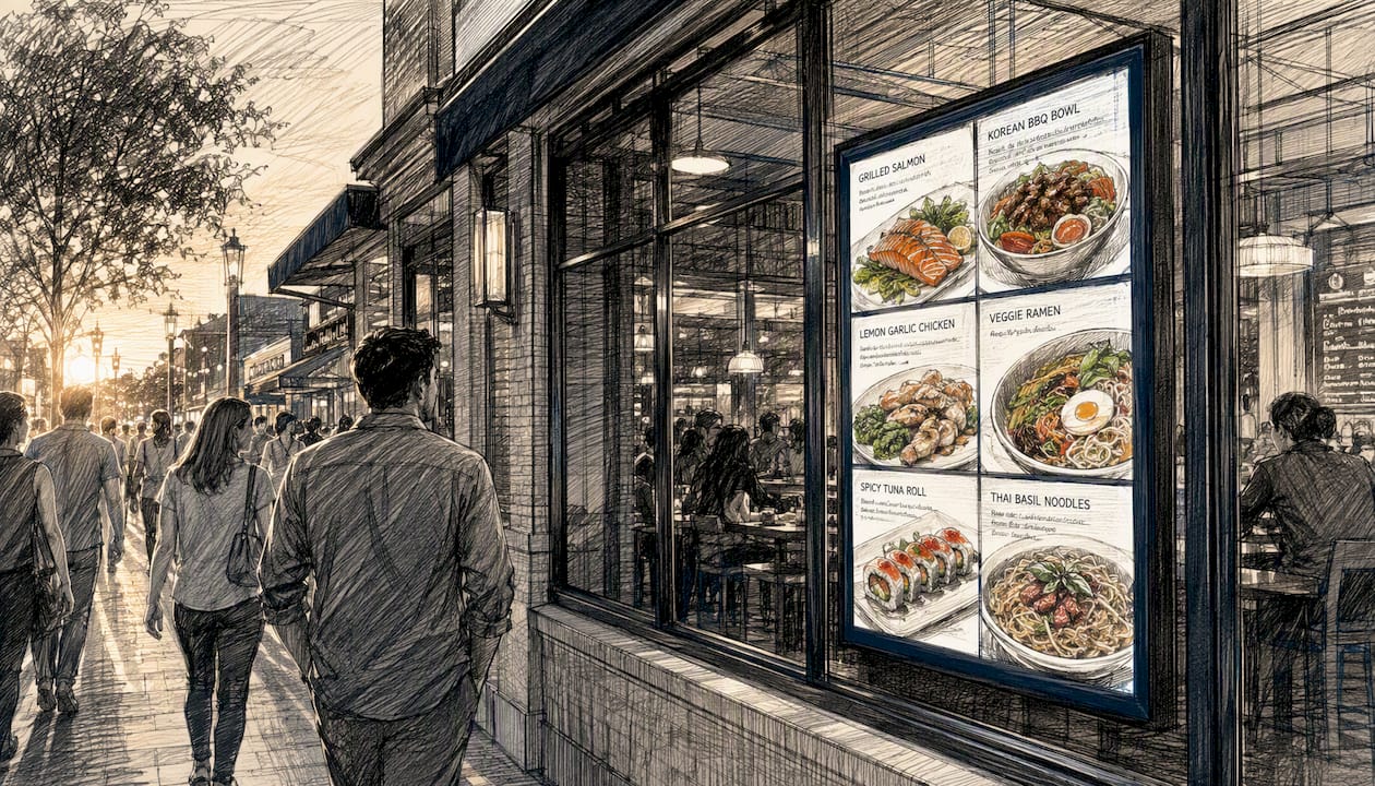
Sidewalk signs and thoughtful storefront displays are consistently cited as front-line tactics that reliably attract passing foot traffic, and appetizing food imagery on exterior displays can prompt impulse visits by creating immediate appetite cues.
Sign types and primary use cases:
- Channel letters — permanent exterior branding; best for visibility from a block away and building brand recognition over time.
- Illuminated cabinet signs — high-visibility day and night; ideal for locations on busy roads or strip malls where you compete with neighboring businesses.
- Monument signs — ground-level identification for freestanding buildings or multi-tenant properties; excellent for directing drivers.
- A-frames (sandwich boards) — daily specials, limited-time offers, and directional cues; the fastest sign to update and the cheapest to test.
- Window vinyl graphics — brand cues, hours, and promotional messaging; visible to pedestrians at close range and easy to replace seasonally.
- Neon and LED neon — atmosphere and social-media shareability; doubles as a photo backdrop that guests post organically.
- Digital displays — dayparted messaging, rotating specials, and social proof; highest flexibility, highest upfront cost.
- Menu boards — ordering clarity for counter-service and fast-casual formats; reduces perceived wait time by letting guests decide before they reach the counter.
- Wayfinding signs — entrance direction, restroom location, ordering flow; custom wayfinding frees staff from answering repetitive questions and keeps service moving.
Pro Tip: Pair one permanent exterior sign (channel letters or cabinet) with at least one updateable element (A-frame or digital display). The permanent sign builds recognition; the updateable one gives passersby a reason to stop today specifically.
How can digital signage tactics drive more foot traffic?
Digital signage increases relevance when it shows the right message at the right time. A static "Open" sign works every hour equally. A digital display that switches from "Fresh-baked croissants, $3.50" at 8 AM to "Lunch combo, $12" at 11:30 AM to "Happy hour 4–6 PM" at 3:45 PM is doing targeted marketing without any ad spend.
How to set up a basic daypart schedule:
- Identify your three to four highest-traffic windows (breakfast, lunch, afternoon, dinner).
- Write one clear message per window — one offer, one price, one image.
- Set the display to rotate content on a timer tied to those windows.
- Review performance weekly and swap underperforming messages.
Tactics that increase impulse decisions:
- Deadlines and limited-time framing. "Today only: soup + sandwich, $10" outperforms "Soup + sandwich, $10" because the deadline creates urgency.
- Social proof snippets. A short quote ("Best ramen in the city — Yelp reviewer") or a star-badge graphic next to your top dish builds trust at a glance.
- Wait-time display. Showing "Seats available now" or "Current wait: 10 min" reduces the uncertainty that causes undecided guests to walk past.
- Dynamic best-sellers. Rotate your top three dishes with high-quality photography. LED displays and appetizing food imagery create immediate appetite cues that static signs cannot match.
Quick experiment: Replace your morning digital message with "Coffee + pastry, $5 — until 10 AM" for one week. Track morning walk-ins against the prior week's baseline. That single swap often produces a measurable lift with zero additional cost.
Pro Tip: Use high-contrast text over a dark background for digital displays in direct sunlight. Motion (a slow pan or fade) attracts peripheral attention, but keep animations under two seconds so the message is readable before the cycle changes.
What design rules make a sign readable and persuasive?
Simple, high-contrast messaging outperforms busy, decorative signage every time. The most common mistake operators make is treating a sign like a brochure, cramming in the restaurant name, tagline, hours, social handles, and a special all at once. A passerby at 50 feet reads one thing. Make sure it is the right one.
A practical rule of thumb: one inch of letter height is readable from roughly 10 feet under good lighting conditions. For a sign meant to be read from 50 feet, your primary text needs letters at least 5 inches tall. Illuminated signs extend that range at night; unlit signs in shadow can cut it in half.
Design checklist for legible, persuasive signs:
- Use no more than two typefaces per sign. One for the headline, one for supporting text.
- Choose sans-serif fonts (like Helvetica, Futura, or similar) for exterior signs where legibility at distance matters more than personality.
- Maintain a contrast ratio that passes the squint test: squint at the sign from across the street. If the text disappears into the background, the contrast is too low.
- Limit copy to seven words or fewer on any single exterior sign.
- Use warm, saturated colors (red, orange, yellow) to trigger appetite associations; use cool colors (blue, green) for a premium or health-focused positioning.
- Faded or cluttered signs deter walk-ins even when the food is excellent, so schedule a quarterly visual inspection.
Pro Tip: Pick one typeface for all exterior-facing signs and stick with it. Consistency across your A-frame, window vinyl, and channel letters builds brand recognition faster than any individual design choice.
What copy and CTAs turn a look into a walk-in?
Short, benefit-driven CTAs with appetizing imagery and a clear next step perform best. The formula is simple: what you get + why now + what to do. "Lunch special, $11 — walk in, no wait" covers all three in six words.
Copy formulas that work on exterior signs:
- Limited-time: "Happy hour ends at 6 PM — come in now."
- Price anchor: "Dinner for two, from $28." (Sets expectation; removes the fear of the unknown.)
- Social proof snippet: "Voted best brunch — [publication name]."
- Appetite-first: Lead with a food photo, then one line of text. The image does the persuasion; the text closes the deal.
Food photography works because visual cues influence food choice at a pre-conscious level. A glossy image of a burger or a steaming bowl of ramen activates appetite before the rational mind has processed the price. Text-only signs work better when the value proposition is primarily price or convenience ("$6 lunch, 11 AM–2 PM") rather than sensory appeal.
Copy best practices checklist:
- One idea per sign. Never two.
- Active verbs: "Try," "Grab," "Join us," not "We offer" or "Available."
- Readable type size (5-inch letters minimum for 50-foot visibility).
- High contrast between text and background.
- A clear next step: "Walk in," "Ask about our specials," "Scan for menu."
Conversion tip: Print a unique promo code on a specific sign ("Show WINDOW10 for 10% off today"). When guests redeem it at the POS, you know exactly which sign drove the visit.
What do you need to know about placement, permits, and installation?
Placement and compliance determine whether a sign actually attracts customers or gets removed by code enforcement. A perfectly designed A-frame placed in a sight triangle blocks traffic sightlines and can draw a citation. A window graphic covering more than the locally permitted percentage of glass can trigger a fine.
Practical placement rules:
- Place A-frames at the edge of your sidewalk frontage, perpendicular to foot traffic, so the message faces pedestrians walking in both directions.
- Keep window graphics below eye level on the lower third of the glass, leaving the upper portion clear for natural light and interior visibility.
- Position entrance-level messaging (hours, specials, ordering instructions) at 48–60 inches from the ground, the natural eye-level reading zone.
- For illuminated exterior signs, confirm that the sign does not create glare into neighboring residential properties.
Permit and compliance checklist (verify with your local municipality before installing):
- Zoning classification and permitted sign types for your district.
- Maximum sign area (square footage) relative to your storefront width.
- Restrictions on illuminated, animated, or LED signs.
- Sidewalk obstruction rules for A-frames (many cities require a minimum 36-inch clear pedestrian path).
- Historic district or landlord approval requirements for permanent exterior modifications.
For permanent or illuminated signs, professional installation is usually worth the added cost. A licensed installer pulls the permit, handles structural attachment, and warranties the work. DIY vinyl graphics and A-frames are low-risk and easy to self-install. Production lead times typically run 5–10 business days for printed vinyl and A-frames, and 3–6 weeks for fabricated channel letters or illuminated cabinets, not counting permit approval time.
How do you measure whether your signage is actually working?
Measure with tracked promos, POS tags, and short A/B tests, then iterate quickly. You do not need expensive analytics software. You need a baseline, a change, and a consistent way to count results.
Step-by-step measurement checklist:
- Record your current average daily walk-in count for two weeks (ask staff to tally or use a door counter).
- Make one sign change (new A-frame copy, new window graphic, new digital message).
- Run the change for 7–10 days under similar conditions (avoid holiday weeks or weather anomalies).
- Compare walk-in counts and average check size against the baseline.
- If the change shows a lift, keep it. If not, test the next variable.
Simple A/B test ideas:
- A-frame copy A ("Daily soup, $7") vs. copy B ("Warm up with today's soup — $7") on alternating days.
- Digital morning message: standard menu display vs. a specific breakfast combo offer.
- Window graphic: food photography vs. text-only value proposition.
Pro Tip: Print a unique promo code on each sign you want to measure ("AFRAME15," "WINDOW15"). When a guest redeems it at the POS, the code tells you which sign drove the visit. No door counter required.
Combining signage with tracked promotions and local outreach amplifies results and gives you data to make smarter decisions about where to invest next.
What do restaurant signs actually cost, and how long do they take?
Inexpensive, updateable options like A-frames and printed vinyl ship fast and cost little. Permanent illuminated signs cost more and require permits and longer lead times. Here is a realistic range for common sign types:
Prices vary by size, materials, illumination, and installation complexity. Permit fees add $50–$500+ depending on your municipality. The fastest way to reduce cost without sacrificing impact is to invest in one strong permanent exterior sign and keep promotional messaging on updateable formats (A-frames, vinyl panels, digital screens) that you can swap without reprinting the whole sign.
When should you DIY signage, and when should you hire a professional?
For complex permits, electrical work, custom fabrication, or brand-critical exterior signage, hire a professional. For A-frames, window decals, and interior prints, DIY is practical and cost-effective.
Decision checklist:
- Hire a pro when: the sign requires electrical work or illumination, a permit application, structural attachment to the building, or when the sign is the primary exterior identifier for your brand.
- DIY when: you need an A-frame insert, a window decal, a table tent, or a printed interior graphic that does not require installation beyond peel-and-stick or a simple stand.
- Brand risk factor: a poorly fabricated channel letter sign or a misaligned window graphic signals low quality to potential guests before they ever taste your food.
What professional sign shops add: permit management, structural engineering sign-off, consistent materials across multiple locations, and a warranty on fabrication and installation. Custom signage from a professional source also reduces the staff time spent answering questions that clear, well-placed signs would answer automatically.
Practical next steps for hiring:
- Get two to three quotes and ask each vendor to include permit assistance in the scope.
- Request a digital mockup on a photo of your actual storefront before approving production.
- Confirm lead times in writing, especially for illuminated or fabricated signs that need permit approval before installation can begin.
What do real restaurant signage case studies show?
The most instructive examples are not from national chains with unlimited budgets. They come from independent operators who made one targeted change and tracked the result.
A fast-casual taco shop in a high-foot-traffic urban corridor replaced a generic "Open" banner with a window-facing digital display showing a rotating trio of their best-selling dishes with prices. Morning walk-ins during the lunch lead-up window increased noticeably within two weeks, with staff reporting that guests frequently mentioned seeing the display from across the street.
A neighborhood diner added a chalkboard A-frame to the sidewalk with a weekly rotating special and a short, specific headline ("Short rib hash, this week only — $13"). The owner tracked redemptions by asking guests how they heard about the special. Over six weeks, the A-frame consistently outperformed the restaurant's social media posts as a walk-in driver for that specific offer.
Custom LED signage has also shown a secondary benefit beyond foot traffic: guests photograph neon signs and branded wall graphics and post them organically, extending the restaurant's reach without any paid promotion. One well-placed neon sign can generate dozens of tagged social posts per week in a high-traffic location.
Digital displays and updateable menu boards reduce perceived wait time by letting guests browse and decide before they reach the counter, which speeds table turns and improves the overall service experience. That operational benefit compounds the foot-traffic benefit: faster turns mean more available seats, which means less deterrence for walk-in guests who might otherwise leave if the line looks long.
How does signage work alongside your other local marketing efforts?
Signage works best when it reinforces what you are already doing in the neighborhood, not when it operates in isolation. A sign announcing a Thursday trivia night lands harder when it matches the Facebook event, the email blast, and the sidewalk chalk arrow pointing to your door.
Practical integration tactics:
- Match sign messaging to your Google Business Profile posts. If your profile shows a weekend brunch special, your A-frame should say the same thing. Consistency across touchpoints builds trust and reduces the "is this still happening?" hesitation.
- Use signs to promote events before they happen. A window graphic announcing a wine-pairing dinner two weeks out builds anticipation and gives regulars something to share.
- Coordinate with neighboring businesses. A coffee shop and a bookstore sharing a block can cross-promote with coordinated A-frames ("Coffee here, books next door") to drive mutual foot traffic.
- Tie signage to seasonal local events. A farmers market two blocks away draws foot traffic past your door. A sign that references the market ("Farmers market day special — local greens salad, $9") captures that audience specifically.
- Use QR codes on window graphics to bridge physical signage and digital reservations or loyalty programs. A passerby who is not ready to walk in today can scan and book for Saturday.
Combining signage with local outreach and tracked promotions is the approach most recommended by practical marketing guides for independent restaurants. The sign gets the attention; the event or promotion gives the reason to act.
What most restaurant owners get wrong about signage
Most operators treat signage as a one-time setup task rather than an active marketing channel. They spend money on a channel letter sign, install it, and consider the job done. The sign looks great on day one. By month six, the vinyl is peeling, the message is generic, and the A-frame out front still says "Now Open" from the launch week.
The operators who see consistent foot-traffic lifts from signage treat it the way they treat their social media: they update it, test it, and measure it. Swapping an A-frame insert costs almost nothing. Running a one-week test with a tracked promo code takes 20 minutes to set up. The data you get back tells you more about your actual walk-in customer than any demographic report.
One lesson worth passing along: the sign that works is almost never the most elaborate one. It is the one with the clearest message, the highest contrast, and the most specific offer. A hand-lettered chalkboard that says "Lamb burger, $14, made fresh today" will outperform a full-color banner that says "Quality food, great prices" every single time. Specificity is the mechanism. Vague signs give passersby nothing to act on.
Three things you can do in the next 72 hours: stand across the street and photograph your storefront, write one specific offer for your A-frame, and print a unique promo code on it. That is a complete signage experiment, and it costs less than a single social media ad.
Crispsign makes professional restaurant signage fast and straightforward
If you want custom-fabricated signs without the back-and-forth of a traditional sign shop, Crispsign is built for exactly that. You get channel letters, window vinyl, acrylic panels, A-frames, wayfinding, and full vehicle graphics, all designed online, fabricated to your specs, and shipped nationwide. Optional installation coordination is available for a flat fee, handled through a vetted third-party installer, so you are not managing two vendors.
The production workflow is built for speed without cutting corners on quality. You configure your sign online, approve a digital proof, and Crispsign handles fabrication. For restaurant operators who need professional results on a tight timeline, that means less time waiting and more time putting your new sign to work. Get your custom sign started at Crispsign.
Sources
- Yelp for Business — Increase foot traffic
- People Eat With Their Eyes First – Is Your Restaurant Signage Ready?
- PLOS ONE article on visual cues and food choice
- 5 Ways To Increase Restaurant Foot Traffic | Insights
- Menu to Signage: How Restaurant Signs Influence Customer Appetite | Tech Magazine
FAQ
How far away should a restaurant sign be readable?
Exterior signage should be legible from at least 50 feet to give pedestrians enough time to process the offer and decide to enter. As a practical spec, that requires primary text with letter heights of at least 5 inches under good lighting.
What is the most cost-effective sign for testing foot traffic?
An A-frame sandwich board is the fastest and least expensive option, typically costing $80–$400 with a 3–7 business day lead time. Pair it with a unique promo code to track exactly how many walk-ins it generates.
Does food photography on signs actually increase walk-ins?
Yes. Visual cues influence food choice at a pre-conscious level, and appetizing food imagery on exterior displays creates immediate appetite cues that text-only signs cannot replicate. Use high-resolution photography with warm lighting for best results.
What are the four P's of a restaurant?
The four P's in restaurant marketing are product (your menu and food quality), price (your value positioning), place (your location and how customers find you), and promotion (how you communicate your offer, including signage and local marketing). Signage directly supports place and promotion.
When should a restaurant owner hire a professional sign shop?
Hire a professional for any sign requiring electrical work, a permit application, structural attachment to the building, or fabricated channel letters. DIY is practical for A-frames, window decals, and printed interior graphics that do not require installation beyond a simple stand or peel-and-stick application.