
Accessible Route Signage: A Guide for Small Businesses

Accessible route signage identifies accessible entrances, routes, and facilities so people with disabilities can navigate your site independently. The Americans with Disabilities Act and the U.S. Access Board require these signs to meet specific visual and tactile standards. The International Symbol of Access (the wheelchair symbol) marks accessible elements throughout. Your first step: walk your property today and note every point where a customer with a disability could lose their way, then contact a signage provider like Crispsign for a compliance review.
Table of Contents
- What is accessible route signage, and why does your business need it?
- What do ADA and U.S. Access Board rules actually require?
- How do you design accessible signage that's actually legible?
- Where should you mount and place accessible route signs?
- How to build an accessible signage system that works for your business
- Accessible route signage audit checklist for your property
- Common mistakes owners make with accessible route signage
- Three storefront scenarios that show what to sign and where
- Crispsign makes compliant, branded accessible signage straightforward
- Key Takeaways
- Why accessible signage is worth getting right the first time
- Useful sources
- FAQ
What is accessible route signage, and why does your business need it?
Accessible route signage does one job: it guides people from the moment they arrive at your property to every accessible facility inside. That means parking, entrances, restrooms, elevators, and any alternate route that bypasses a barrier. Without it, a compliant ramp or accessible restroom is effectively invisible to the people who need it most.
Common sign types you'll need to consider:
- Accessible parking signs: Mark designated spaces and the access aisle connecting them to the entrance.
- Directional signs to alternate entrances: Required when your main entrance is not accessible. These point users toward the nearest compliant entry.
- Restroom and elevator identification signs: Identify accessible facilities, including tactile/Braille signs at doorways.
- Interior wayfinding signs: Guide users through lobbies and corridors to accessible elements.
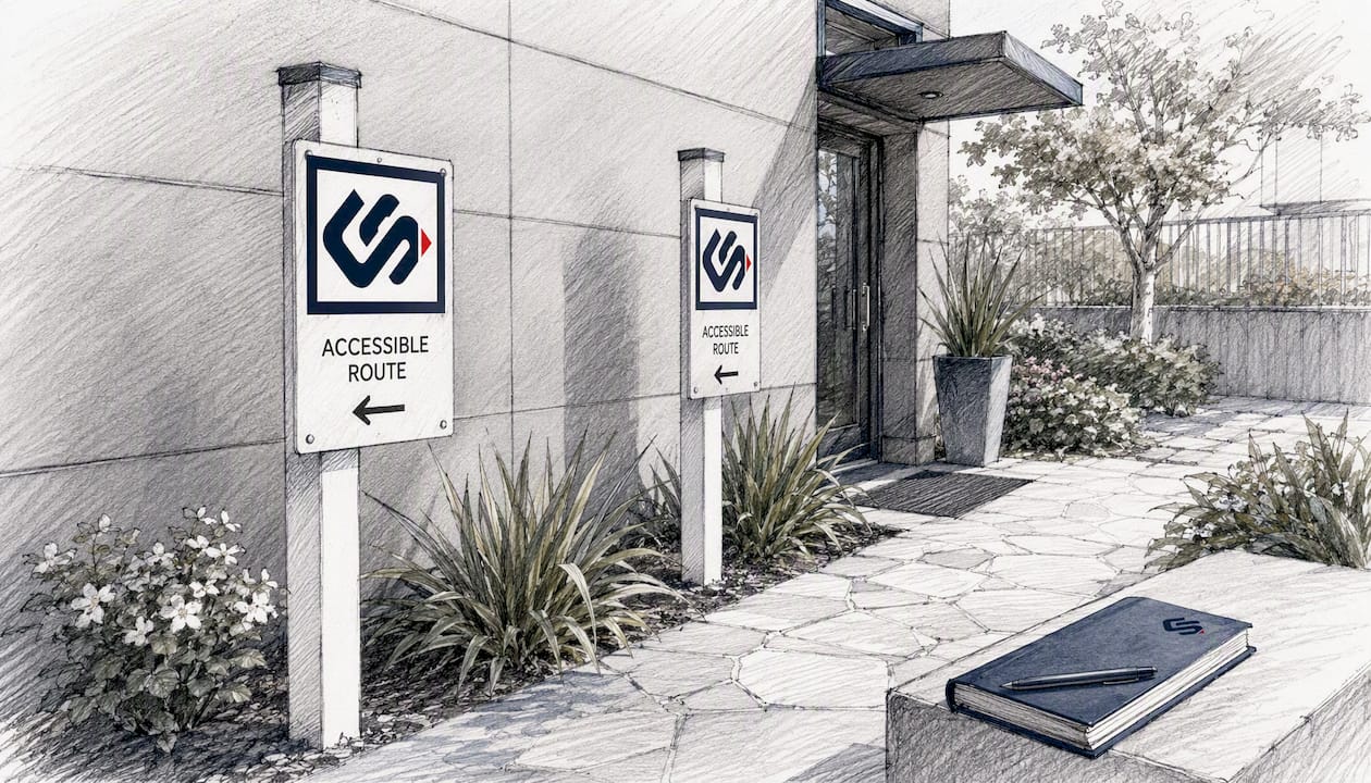
Two quick scenarios that illustrate this in practice: A retailer whose main entrance has steps must post a directional sign at that entrance pointing to the accessible side door. A restaurant with accessible parking must mark the route from those spaces to the accessible entrance, especially if the path is not obvious.
What do ADA and U.S. Access Board rules actually require?
The U.S. Access Board states that accessible route signage must identify accessible facilities and mark routes so users can navigate independently. The ADA Standards and Access Board guidance set clear visual and tactile rules. Here's a quick reference:
| Requirement | What the Standards Say | Where It Applies |
|---|---|---|
| High contrast | Light symbol/text on dark background, or dark on light | All accessible signage |
| Non-glare finish | Matte or satin surface to eliminate reflective glare | All accessible signage |
| Directional signs | Required when an entrance or facility is not the primary access point | Inaccessible entrances, restrooms, elevators |
| Tactile characters and Braille | Required at doorways that identify rooms and spaces | Door identification signs only |
| International Symbol of Access | Must comply with finish and contrast requirements | Accessible parking, entrances, restrooms |
| Route continuity | Accessible routes must connect site arrival points to each accessible entrance | Parking, transit stops, loading zones |
One clarification worth knowing: tactile signs with raised characters and Braille are generally required at doorways, but most overhead directional signs do not require tactile characters. Adding Braille to overhead signs is unnecessary and can reduce legibility.
How do you design accessible signage that's actually legible?
Regulatory compliance and good design are not in conflict. The ADA's finish and contrast requirements push you toward choices that are also easier to read for everyone.
Key design rules to specify when ordering signs:
- High-contrast color schemes: White text on a dark background, or black text on white, are the most reliable combinations. Avoid mid-tone colors that reduce contrast.
- Non-glare finish: Matte or satin laminates prevent light wash-out. Glossy finishes fail in bright lobbies or near windows.
- Clean, legible fonts: Sans-serif typefaces like Helvetica or Arial read clearly at distance. Avoid decorative scripts on compliance signs.
- International Symbol of Access: Use it to identify accessible parking, entrances, and restrooms. For interior directional signs, high-contrast text and arrows often carry more wayfinding value than repeating the ISA on every panel.
- Minimal clutter: Each sign should contain only the information needed to guide the user to the next decision point. A sign that tries to say too much says nothing clearly.
Pro Tip: When specifying materials with your sign vendor, request a non-glare laminate and ask for a physical sample. What looks matte on screen can still reflect under fluorescent or LED lighting in your actual space.
Good commercial lighting design also plays a role. Signs placed near bright windows or directly under spotlights can wash out even with a matte finish. Plan sign placement alongside your lighting layout.
Where should you mount and place accessible route signs?
Placement determines whether a sign actually works. A technically compliant sign mounted where no one sees it at the moment they need it fails its purpose.
Key decision points for placement:
- Accessible parking and loading zones: Signs at each designated space, plus directional signs pointing toward the accessible entrance.
- Site arrival points: Transit stops, sidewalk entries, and passenger loading zones all need directional signs if the accessible entrance is not immediately visible.
- Inaccessible entrances: Post a directional sign at the inaccessible door pointing to the nearest compliant entrance. This is a federal requirement, not a suggestion.
- Interior intersections: Lobbies, corridor junctions, and elevator landings are decision points where users need confirmation they're on the right path.
The ADA Standards note that access aisles at accessible parking spaces and passenger loading zones must be marked. Accessible routes that cross vehicular areas are not federally required to be marked as crossings, though local codes may add that requirement.
Pro Tip: Walk the route yourself from the accessible parking space to the farthest accessible restroom. Stop at every point where you had to make a decision about which way to go. Each of those points needs a sign.
How to build an accessible signage system that works for your business
Treating signage as a system rather than a checklist of individual signs is what separates businesses that pass an audit from those that genuinely serve every customer.
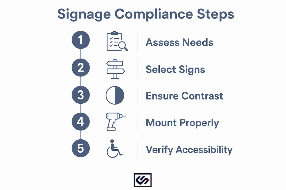
- Map your site first. Identify every site arrival point (parking, transit, sidewalk) and draw a line to each accessible entrance and facility. Every gap in that line is a missing sign.
- Standardize your terminology and symbols. Use the same wording and the same symbol style across every sign. Inconsistency confuses users and signals a patchwork approach to inspectors.
- Keep accessibility elements compliant while staying on-brand. Your brand colors can work on accessible signs if contrast ratios are preserved. A sign vendor can test your palette before production.
- Prioritize critical decision points first. If budget is a constraint, start with site arrival points and inaccessible entrances. These are the highest-impact locations and the most common compliance gaps.
- Schedule periodic inspections. Signs fade, get covered by seasonal displays, or are removed during renovations. A quarterly walk-through catches problems before they become complaints.
- Document sign locations. Keep a simple site map that links each accessible element to its sign location. This speeds up audits, repairs, and future vendor quotes.
Accessible route signage audit checklist for your property
Use this table on-site. Any "No" answer is a fix to schedule.
| Checkpoint | Pass/Fail Criteria | Priority if Failing |
|---|---|---|
| Sign present at required point | Sign exists at each accessible parking space, entrance, and facility | High |
| High contrast | Light on dark or dark on light; no mid-tone combinations | High |
| Non-glare finish | Matte or satin surface; no visible glare under current lighting | Medium |
| Tactile/Braille at doorways | Raised characters and Braille on door identification signs | High |
| Mounting height and clearance | Sign visible and unobstructed from the approach path | Medium |
| Sightline and lighting | Sign readable from 6 feet; not washed out by nearby light sources | Medium |
| Route continuity | Signs connect site arrival points to each accessible entrance | High |
When you find issues, prioritize by safety and legal exposure first, then user impact. A missing directional sign at an inaccessible entrance is a higher-priority fix than a slightly reflective finish on an interior sign.
Next steps when problems are found:
- Repair or replace damaged or faded signs immediately.
- Update your wayfinding plan if a route has changed due to renovation.
- Contact a sign vendor for measurement, fabrication, and installation of missing or noncompliant signs.
Common mistakes owners make with accessible route signage
Most compliance problems come down to a short list of recurring errors.
- Leaving accessible features unmarked. A ramp, accessible restroom, or alternate entrance that has no sign is functionally useless to someone who doesn't already know it's there. Fix: add a directional sign at the nearest decision point upstream.
- Low-contrast or reflective materials. Dark text on a medium-gray background, or any glossy finish, can fail contrast requirements. Fix: reface with high-contrast, matte-finish panels.
- Signs placed after the decision point. A sign that appears after a user has already passed the turn they needed is too late. Fix: relocate to the point where the user must choose a direction.
- Adding Braille to overhead directional signs. Overhead signs don't require tactile characters, and adding them complicates fabrication without helping users. Reserve tactile and Braille for door identification signs where the Standards require them.
- Skipping maintenance. A sign covered by a seasonal banner or faded to illegibility is the same as no sign. Quarterly checks prevent this.
The most common gap, according to U.S. Access Board guidance, is missing site-level directional signage from parking or transit stops to the accessible entrance. That's the first place to look.
Three storefront scenarios that show what to sign and where
Scenario 1: Retail store with accessible parking and a side accessible entrance. Post the International Symbol of Access at each designated parking space. At the main (inaccessible) entrance, post a directional sign with an arrow pointing toward the accessible side entrance. Mark the path along the building facade if it's not immediately obvious.
Scenario 2: Restaurant with front steps and a side ramp. At the top of the front steps, post a directional sign pointing to the ramp entrance. If the accessible restroom is on a different level reached by elevator, post directional signs at the host stand and at the elevator landing. The route from the accessible entrance to every accessible facility should be signed continuously.
Scenario 3: Multi-tenant office building with a shared parking lot. Mark accessible parking spaces for the building. Post directional signs at the lot entrance pointing toward the accessible building entrance. Inside, each tenant suite with a non-accessible primary door needs a directional sign to its accessible entry. Shared accessible restrooms and elevators need identification signs at each doorway.
Crispsign makes compliant, branded accessible signage straightforward
Getting your accessible route signage right doesn't have to mean choosing between compliance and a professional look. Crispsign produces custom-fabricated signs built to your specifications, with materials that meet ADA contrast and finish requirements while carrying your brand identity.
Crispsign ships nationwide and offers optional installation coordination, so you're not left figuring out mounting on your own. Whether you need a single directional sign for an inaccessible entrance or a full site wayfinding package, every sign is designed online, built to spec, and delivered ready to install. Fast turnarounds mean you can address compliance gaps without waiting weeks for production.
Ready to get your accessible signage sorted? Request a quote at Crispsign and get a clear price on exactly what your site needs.
Key Takeaways
Accessible route signage must connect every site arrival point to every accessible facility using high-contrast, non-glare signs, with tactile/Braille reserved for door identification signs where ADA Standards require them.
| Point | Details |
|---|---|
| Core definition | Accessible route signage identifies accessible facilities and marks routes from site arrival points to accessible entrances. |
| When signs are required | Directional signs are required whenever an entrance, restroom, or facility is not the primary access point. |
| Top design rules | Use high contrast, non-glare finish, and the International Symbol of Access on parking, entrances, and restrooms. |
| Tactile/Braille scope | Raised characters and Braille are required at door identification signs; overhead directional signs do not require them. |
| Crispsign next step | Crispsign produces ADA-compliant, custom-fabricated accessible signage shipped nationwide with optional installation coordination. |
Why accessible signage is worth getting right the first time
Most business owners think about accessible signage only when they're facing an inspection or a complaint. That's the wrong frame. A customer who can't find your accessible entrance doesn't come back, and they don't complain to you directly. They just leave.
The businesses that get this right treat accessible route signage the same way they treat their storefront sign: as a direct communication with a customer who is trying to choose them. The ADA sets the floor, but the real standard is whether every person who arrives at your property can get to what they need without asking for help.
What I see most often is not willful noncompliance. It's a gap between the accessible features a business has installed and the signage that makes those features findable. A ramp that no one knows is there is a ramp that doesn't work. Fix the signage, and the investment in the ramp pays off.
Useful sources
The following primary sources cover the technical rules referenced throughout this guide. Consult them directly for full specifications, dimensional requirements, and exceptions.
- U.S. Access Board: Chapter 7 Signs — Visual and tactile sign requirements, ISA use, and when signs are required to identify accessible facilities.
- U.S. Access Board: Chapter 4 Accessible Routes — When directional signs are required and how accessible routes must connect site arrival points to accessible entrances.
- U.S. Access Board: Accessible Routes (PDF) — Dimensional requirements for route width, ramps, curb ramps, and marking requirements for parking access aisles.
- U.S. Access Board: Chapter 7 Communication Elements — Finish, contrast, tactile character, and Braille requirements for accessible signs.
These sources cover U.S. federal ADA Standards. Local building codes may impose additional requirements; verify with your local authority having jurisdiction.
FAQ
What is the purpose of accessible route signage?
Accessible route signage identifies accessible facilities and marks routes from site arrival points so people with disabilities can navigate independently, as required by the ADA and U.S. Access Board.
When are directional signs required under ADA?
Directional signs are required when an entrance, restroom, or other facility is not the primary or most obvious access point, directing users to the nearest accessible alternative.
Do all accessible signs need Braille?
No. Braille and raised tactile characters are required on door identification signs. Most overhead or directional signs do not require tactile characters under ADA Standards.
What contrast and finish do accessible signs need?
Signs must use a non-glare finish and either a light symbol/text on a dark background or a dark symbol/text on a light background to meet ADA visual requirements.
Can Crispsign produce ADA-compliant accessible route signs?
Yes. Crispsign fabricates custom accessible signage built to ADA contrast and finish specifications, ships nationwide, and offers optional installation coordination for business owners.