
Why Sign Design Matters for New Brands: A Practical Guide
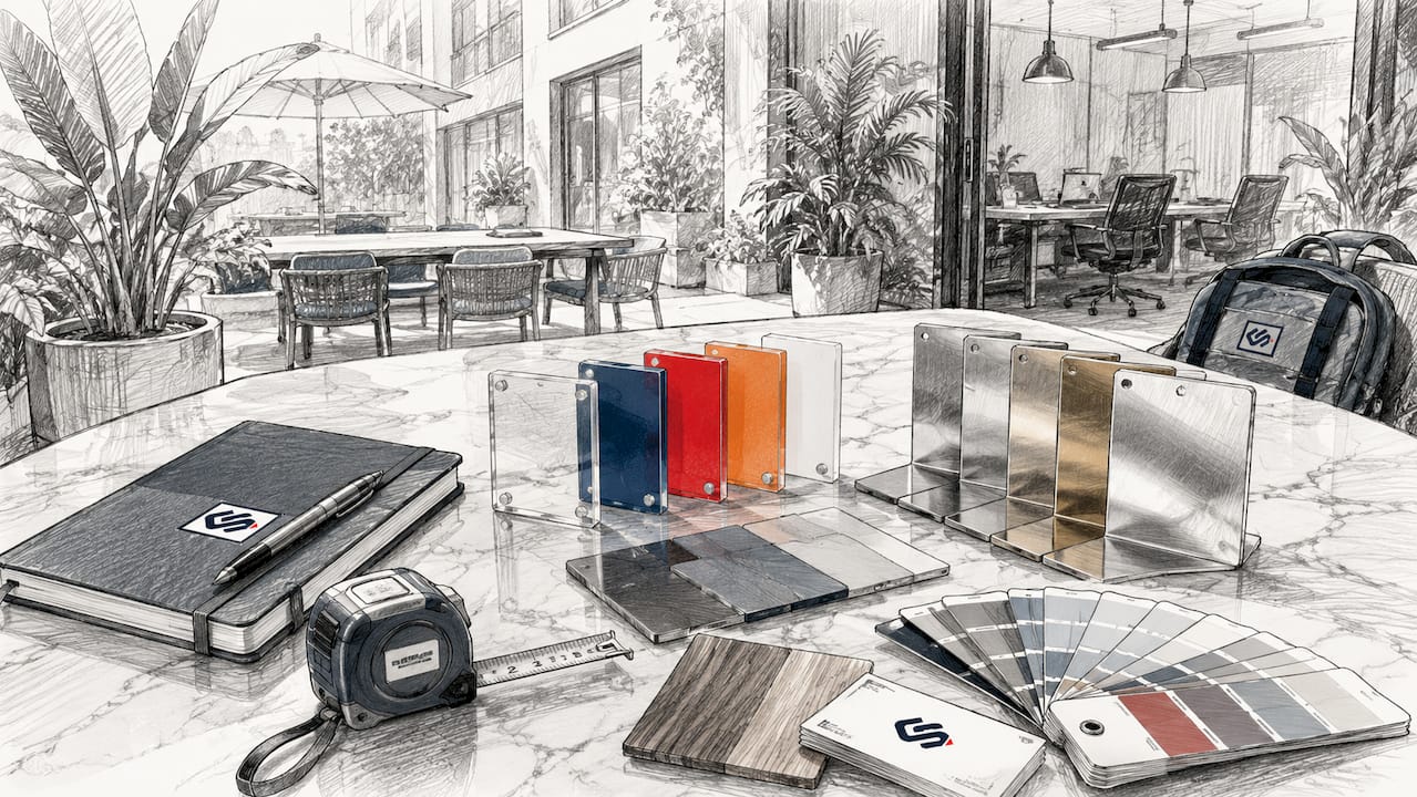
Your storefront sign is your brand's first salesperson, and for a new business, it may be the most important marketing asset you own. Great sign design drives visibility, shapes first impressions in seconds, and converts passersby into paying customers. Three reasons explain why this matters so much for new brands: legibility at real-world distances, the trust signal a quality sign sends before anyone walks through your door, and the safety and compliance standards that govern how signs must perform. The Federal Highway Administration has determined that 41% of accidents occur because of inadequate signage, a finding the Foundation for Sign Research applies directly to on-premise business signs. Crispsign works with new brands every day to turn these principles into signs that actually perform.
- Visibility: A sign that cannot be read at approach distance does not exist for the driver passing by.
- First impressions: Signage communicates brand quality before a customer decides to enter.
- Safety and compliance: Placement, letter size, and contrast are not style choices; they are design requirements backed by federal research.
Table of Contents
- Why does sign design matter for new brands?
- Core design principles every new brand must apply
- Which sign type fits your brand goals?
- How good signage moves foot traffic and brand perception
- Practical planning checklist: budget, timeline, and permits
- How to choose a sign partner that delivers
- How Crispsign's workflow solves common problems for new brands
- Key Takeaways
- Crispsign makes professional storefront signage straightforward
- FAQ
Why does sign design matter for new brands?
The strongest evidence comes from two directions: safety science and brand perception research. The Foundation for Sign Research, drawing on Federal Highway Administration data, establishes that Decision Sight Distance is the single most important factor in sign placement and sizing. At typical highway speeds, a driver quickly covers a significant distance each second. That leaves only a few seconds to detect your sign, read it, process the message, and decide to turn in. If your sign fails any one of those steps, the customer is gone.
On the perception side, PAGE Magazine's design commentary makes the point plainly: first impressions form in seconds, and your storefront sign communicates quality, values, and personality before a customer ever touches your door handle. A premium finish signals trust. A cluttered or poorly spaced sign signals the opposite. For a new brand with no reputation yet, that signal is everything.
Core design principles every new brand must apply
Keep your message short. Trade guidance recommends five words or fewer as a target, with the goal of being read and understood in under three to five seconds. Think headline, not paragraph.
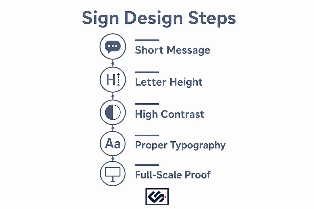
Letter height is not a style preference; it is a readability calculation. A practical rule: allow at least 1 inch of letter height for every 10 feet of viewing distance. A sign meant to be read from 50 feet away needs letters at least 5 inches tall. Stroke thickness matters just as much. Letters with strokes measuring roughly one-fifth of the letter height read cleanly at speed and in low light.
Contrast drives legibility more than color creativity does. White letters on a yellow background disappear; white on black or dark navy reads instantly. Studies cited by the Foundation for Sign Research show that 80% of trademark recognition comes from color, so choose your palette deliberately and protect it. Exterior contrast (sign edge against the building) and interior contrast (copy against sign background) both need attention.
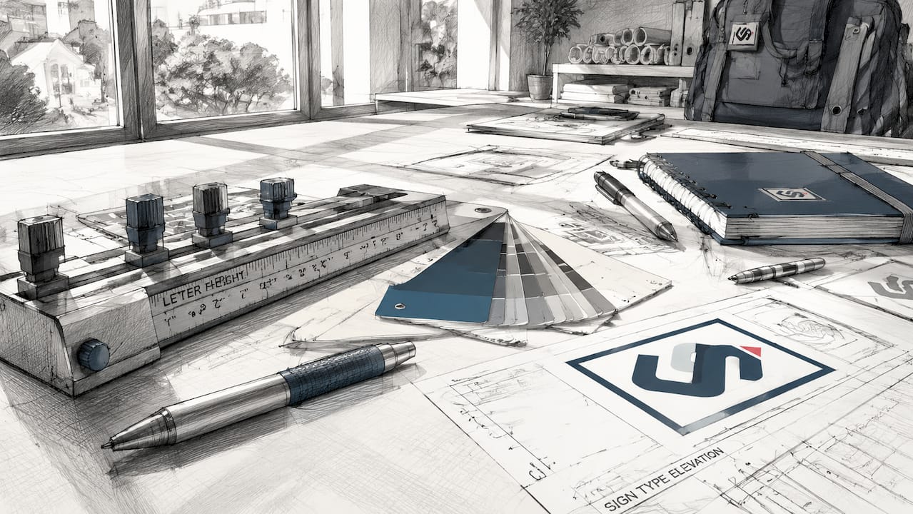
Typography defaults built for screens and print are wrong for large-format signage. Signs of the Times is direct on this: kerning, line spacing, and visual hierarchy must be adjusted manually. Software defaults create spacing that looks fine on a monitor and reads poorly at 30 feet.
Pro Tip: Print your design at full scale, tape it to the wall, and walk back to your intended viewing distance before approving any proof. What looks sharp on a laptop screen often reveals spacing or contrast problems at actual size.
Which sign type fits your brand goals?
| Sign Type | Best For | Viewing Context |
|---|---|---|
| Channel letters | Premium brand identity, retail, restaurants | Driver and pedestrian |
| Lightbox / cabinet | High visibility day and night, franchises | Driver-primary |
| Projecting / blade sign | Pedestrian-heavy streets, historic districts | Pedestrian-primary |
| Awning sign | Café, boutique, neighborhood retail | Pedestrian-primary |
| Window vinyl | Low-cost brand layer, hours, promotions | Pedestrian-primary |
| A-frame / sidewalk sign | Daily specials, foot traffic capture | Pedestrian-primary |
| Digital display | Rotating messages, event-driven promotions | Driver and pedestrian |
Material and finish choices change perceived quality as much as the design itself. Metal channel letters read as premium; flat vinyl panels read as temporary. Internally illuminated signs perform differently at night than reflective painted surfaces because luminance and luminescence behave differently. If your location has significant evening foot traffic or drive-by exposure after dark, illumination is a functional requirement, not an upgrade.
How good signage moves foot traffic and brand perception
A well-designed sign increases the number of people who notice your business and raises the share who decide to walk in. The perception effect compounds: a quality sign signals that the business inside is worth visiting, which affects willingness to enter and, often, willingness to pay. PAGE Magazine's design research frames it this way: a premium finish raises trust before any transaction occurs.
To measure sign impact, track foot traffic counts and average transaction value for four weeks before and four weeks after installation. Even a simple manual tally at consistent times gives you a before/after baseline. Incremental monthly revenue from increased entry rate is the clearest ROI signal available to a small storefront.
Practical planning checklist: budget, timeline, and permits
Relative budget bands by project scope:
| Project Type | Relative Cost Band | Notes |
|---|---|---|
| Simple flat panel or window vinyl | Low | Fastest production; limited durability |
| Awning or blade sign | Low–Mid | Requires structural attachment |
| Illuminated lightbox | Mid | Electrical permit typically required |
| Channel letters (non-illuminated) | Mid–High | Premium look; longer lead time |
| Illuminated channel letters | High | Electrical + sign permit; longest timeline |
Typical timeline from brief to installation:
- Site survey and brief: 1–3 days
- Design proof and revisions: 3–7 days
- Permit application and approval: 2–6 weeks (varies by municipality)
- Production: 1–3 weeks depending on sign type
- Installation: 1–2 days
Permit requirements vary significantly by city and sign type. Check with your local planning or zoning department on: maximum sign area (square footage), illumination restrictions, projection limits for blade signs, and historic district overlays. Common roadblocks include undersized permit drawings and missing electrical specs for illuminated signs.
For materials, aluminum and acrylic hold up well in most U.S. climates. Vinyl degrades faster in high-UV environments. Ask your sign partner for a warranty that covers both materials and installation workmanship.
How to choose a sign partner that delivers
Ask every candidate these questions before signing anything:
- Can you show me installed photos of similar storefronts, not just digital mockups?
- Do you provide scaled physical proofs or material swatches before production?
- Do you handle permit applications, or is that on me?
- What is your production timeline guarantee, and what happens if you miss it?
- What does your installation warranty cover, and for how long?
Physical proofs matter because site surveys and scaled mockups catch problems that screen previews miss. A good partner measures your sightlines from actual customer approach paths, not just from the front door.
Red flags to walk away from: no site survey offered, no physical samples or installed references, vague timelines with no written commitment, and no warranty on installation workmanship.
How Crispsign's workflow solves common problems for new brands
Crispsign built its production process around the specific pain points new brands face: slow timelines, permit confusion, and signs that look different in person than they did on screen. Here is how the workflow runs:
- Brief and site survey: Crispsign collects your brand assets and photographs the actual installation location to account for sightlines, obstructions, and mounting surfaces.
- Scaled design proof: You receive a proof sized to real-world dimensions, not just a screen mockup, so contrast and letter height can be evaluated accurately.
- Permit support: Crispsign prepares permit-ready drawings and guides you through local submission requirements.
- Production: Signs are fabricated to spec using materials matched to your durability and finish requirements.
- Installation and post-install QA: The team installs and confirms the sign reads correctly from intended approach distances.
- Guarantee: Professional-grade results backed by a workmanship warranty.
A typical new storefront project: milestones and outcomes
- Week 1: Site visit, brand brief, design proof delivered
- Week 2: Proof approved; permit application submitted
- Weeks 3–8: Permit review period (municipality-dependent)
- Weeks 8–10: Production complete; installation scheduled
- Day of install: Post-install sightline check from street
A common mid-project pivot: a client starts with a flat backlit panel for budget reasons, then upgrades to channel letters after seeing the proof side by side. The channel letter version reads as more premium from the street and holds up better over time. That kind of comparison is easier to make when your partner provides physical proofs rather than screen renders alone.
Key Takeaways
For new brands, a well-designed storefront sign is the highest-ROI marketing asset you can invest in because it works 24 hours a day, requires no ongoing spend, and shapes brand perception before any other touchpoint.
| Point | Details |
|---|---|
| Letter height is a formula | Allow at least 1 inch of letter height per 10 feet of viewing distance for reliable legibility. |
| Color drives recognition | Studies show 80% of trademark recognition comes from color; choose and protect your palette deliberately. |
| Permits take the most time | Permit review runs 2–6 weeks; start the application immediately after design approval to protect your opening date. |
| Physical proofs prevent costly rework | Demand scaled proofs and material swatches before production; screen mockups miss contrast and spacing problems. |
| Crispsign for new brands | Crispsign handles site survey, scaled proofing, permit support, production, and installation for small and medium storefronts. |
A word on design discipline
New brands consistently underestimate how much their sign does before anyone speaks to them. The instinct is to pack in the logo, tagline, phone number, website, and hours. Resist it. The Signs of the Times principle is worth repeating: strong hierarchy and minimal copy outperform ornate, information-dense signs every time. Your sign has one job at distance: make someone want to stop. Everything else can live on your window vinyl or your website.
The brands that get this right early build a visual foundation that carries through every subsequent touchpoint. The ones that rush a cheap sign to meet an opening date often spend more money replacing it within two years than they would have spent doing it correctly the first time.
Crispsign makes professional storefront signage straightforward
Getting your sign right the first time saves money, protects your opening timeline, and sets your brand up with a credible street presence from day one. Crispsign handles the full process for small and medium storefronts: site survey, scaled design proofs, permit-ready drawings, fabrication, and installation, all backed by a workmanship guarantee. No chasing multiple vendors, no permit surprises, no signs that look different in person than they did on screen.
If you need interior signage, ADA-compliant lobby signs, or branded lobby panels alongside your storefront sign, Crispsign's lobby and ADA signage solutions cover that too. Get your project started with an instant estimate at crispsign.com.
Sources and further reading
Primary research:
- Arts & Science of Sign Design (Executive Summary) — Foundation for Sign Research / FHWA. Primary research on Decision Sight Distance, letter sizing, contrast, luminance, and the 41% accident statistic.
- Arts & Science of Sign Design (Full) — Full technical reference for sign design science.
Trade commentary and design guidance:
- Sign Legibility is Not a Style — Signs of the Times — Practical guidance on kerning, line spacing, and visual hierarchy for physical signage.
- Beyond the Surface: How Sign Design Shapes First Impressions — PAGE Magazine — Brand perception and first-impression research applied to storefront signage.
- Sign Design That Sells — Inkbot Design — Practical rules for letter height, copy length, and legibility testing.
FAQ
How does sign design affect a new brand's foot traffic?
A legible, well-placed sign increases the number of passersby who notice your business and raises the share who decide to enter. Better visibility and a quality finish both contribute to higher walk-in rates.
What is the letter height rule for storefront signs?
Allow at least 1 inch of letter height for every 10 feet of viewing distance. A sign read from 50 feet needs letters at least 5 inches tall for reliable legibility at normal approach speeds.
How long does a new storefront sign project take?
From brief to installation, expect 8–10 weeks when permits are involved. The permit review period alone runs 2–6 weeks depending on your municipality, so submit the application as soon as your design is approved.
Does Crispsign handle permits and installation?
Yes. Crispsign prepares permit-ready drawings, supports the local submission process, and handles installation with a post-install sightline check, covering the full project from site survey to final QA.
How many words should a storefront sign have?
Five words or fewer is the practical target. Signs read at driving speeds need to be understood in under three to five seconds, which means a single clear message beats a detailed one every time.