
Why Wayfinding Signs Reduce Confusion in Any Space
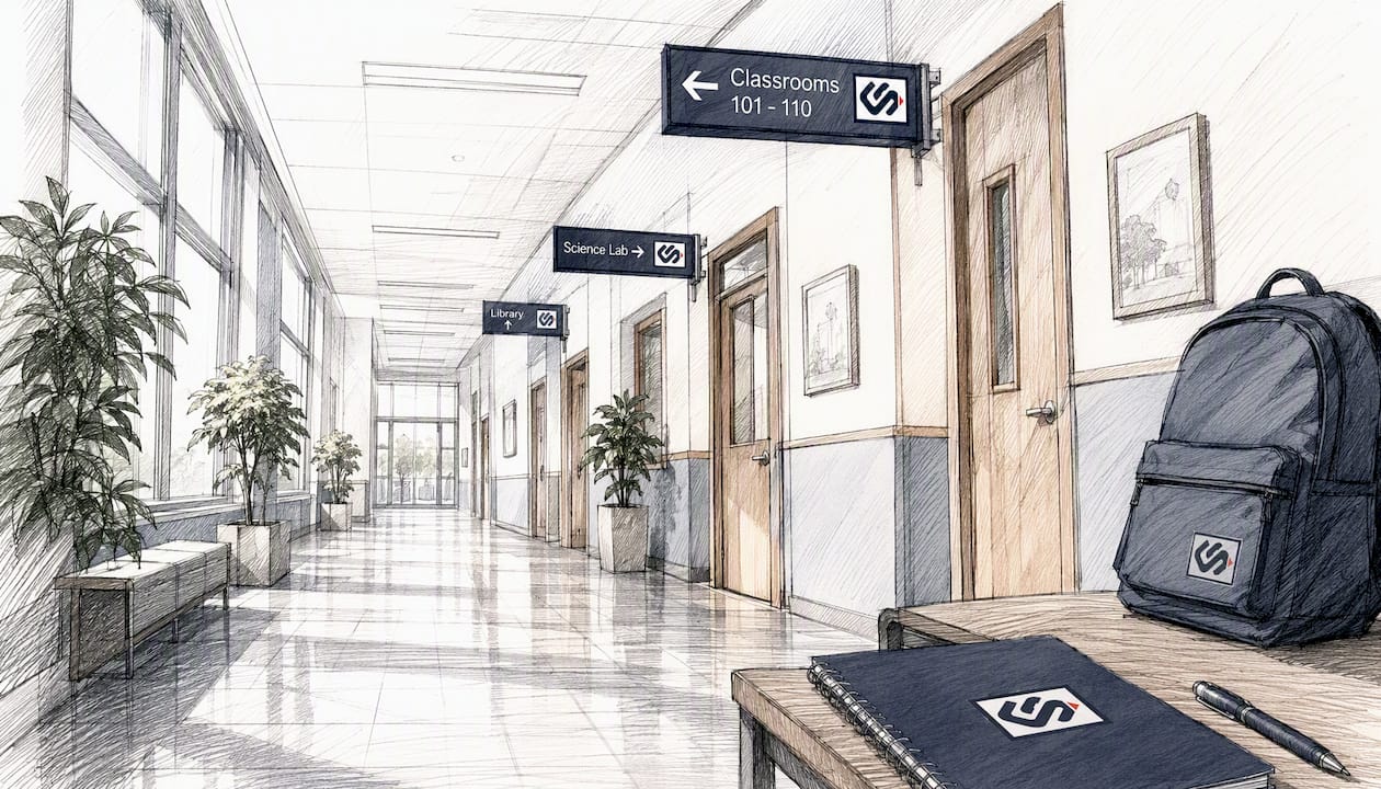
Well-designed wayfinding signage reduces confusion by lowering cognitive load, clarifying decision points, and confirming that visitors are on the right path. That single mechanism explains most of the frustration you see in hospitals, office buildings, and retail centers where people stop, backtrack, and ask staff for help. Three fixes you can act on today:
- Standardize terminology. Use the same name for every location across every sign, map, and directory. "Conference Suite A" on the lobby directory and "Meeting Room A" on the door is a guaranteed wrong turn.
- Fix your decision-point signs first. A decision point is any intersection, elevator bank, or entrance where a visitor must choose a direction. Signs placed after the turn, behind a pillar, or above sightline fail at the moment they matter most.
- Add confirmational repeats. Place a smaller "you're heading the right way" sign 30–50 feet past each major turn. Visitors who don't see confirmation within a few steps assume they made a wrong choice.
Research published in Frontiers in Psychology confirms that poor wayfinding triggers measurable stress responses, including elevated blood pressure, headaches, fatigue, and anxiety, all of which color how visitors perceive your entire space.
Table of Contents
- Why wayfinding signs reduce confusion: the cognitive and operational case
- Core design principles that actually reduce confusion
- How signage turns confusion into confident navigation, step by step
- Accessibility and ADA considerations: inclusive signage reduces confusion for everyone
- Common wayfinding mistakes that increase confusion and how to fix them
- How to audit, design, test, and maintain a wayfinding system
- What drives cost and how long a wayfinding project typically takes
- How to measure whether your wayfinding actually reduced confusion
- What the research actually shows about wayfinding and human performance
- Key Takeaways
- Why function should always outrank aesthetics in a wayfinding spec
- Crispsign builds wayfinding systems that actually get people where they're going
- Useful sources and further reading
- FAQ
Why wayfinding signs reduce confusion: the cognitive and operational case
The human brain navigates by building a mental map, and every time a person encounters an unclear sign or a missing one, working memory takes a hit. Cognitive load increases, situation awareness drops, and decision-making slows. A human-factors framework identifies exactly these four pathways: cognitive load, situation awareness, decision-making clarity, and emotional engagement as the mechanisms through which signage shapes how people experience moving through a space.
Research signal: Poor wayfinding can trigger negative physical and emotional responses including elevated blood pressure, headaches, fatigue, frustration, and anxiety, directly affecting how visitors perceive your facility. (Frontiers in Psychology)
The operational side of this is just as concrete. When signs work, staff spend less time giving directions and more time doing their actual jobs. In office environments, effective directional signage helps new employees and visitors reach meeting rooms, lobbies, and departments without interrupting anyone. Punctuality improves, visitor satisfaction scores rise, and the facility feels competent before a single conversation happens.
Core design principles that actually reduce confusion
Getting wayfinding right is less about aesthetics and more about a disciplined set of rules applied consistently. These are the principles worth writing into any spec or RFP:
- Consistency. Fonts, colors, terminology, and symbols must match across every sign in the system. Consistent visual cues help people move confidently and reduce hesitation.
- Legibility. High-contrast text on a clean background, minimum 1-inch letter height per 25 feet of viewing distance, and a typeface with a generous x-height. Sans-serif fonts like Helvetica or Frutiger hold up at distance; decorative brand typefaces often don't.
- Visual hierarchy. Primary destinations get the largest type and highest placement. Secondary information sits below. Never let a room number compete visually with a department name.
- Placement at decision points. Signs belong at the moment of choice, not after it. Eye-level placement (roughly 60–66 inches to center) beats ceiling-mounted signs in most interior environments.
- Confirmational signs. Repeat directional cues after each turn so visitors know they're still on track.
- Standard symbols. Use ISO 7010 or ANSI/NFPA 170 pictograms for emergency egress and universal functions. Custom icons require learning; standard ones don't.
- Wayfinding mapping. A you-are-here map at major entry points anchors visitors spatially before they start moving.
Pro Tip: When your brand palette uses low-contrast color combinations, create a dedicated wayfinding color sub-palette with documented minimum contrast ratios (WCAG AA requires 4.5:1 for normal text). Brand fidelity is worth protecting, but not at the cost of legibility.
A common placement error: mounting a directional sign on the far wall of a corridor so it's only visible once a visitor has already passed the turn. The right placement puts the sign in the sightline of someone approaching the decision point, ideally illuminated or in a high-contrast zone so it reads from 20+ feet away.

How signage turns confusion into confident navigation, step by step
Picture a visitor arriving at a multi-building medical campus for the first time. At the parking structure exit, a large identification sign with the campus name and a color-coded building map reduces hesitation before they take a single step. That one sign sets the mental framework for everything that follows.
Inside the main entrance, a you-are-here directory confirms their location and shows the fastest route to their destination. Without it, they're guessing. With it, they're navigating. The difference in arrival time and stress level is immediate.
At corridor intersections, a directional plaque with an arrow and the destination name handles the decision point cleanly. The sign doesn't need to list every room in the building. It needs to answer one question: "Which way?" Overloaded signs with six or more destinations create the same hesitation as no sign at all.
Elevator banks deserve their own logic. Floor-by-floor directory panels inside the elevator car, combined with a landing sign at each floor exit, prevent the "which direction do I turn when I get off?" pause that sends people wandering. On multi-building campuses, overhead blade signs at building entries and color-coded zone markers let visitors self-navigate without staff intervention.
Emergency egress is where placement precision becomes a safety issue. Exit signs must be visible from any point in a corridor, with no obstructions, and backed by photoluminescent or illuminated secondary markers at floor level for smoke conditions. The importance of directional signage in emergency scenarios goes beyond navigation convenience: it directly affects evacuation speed.
Accessibility and ADA considerations: inclusive signage reduces confusion for everyone
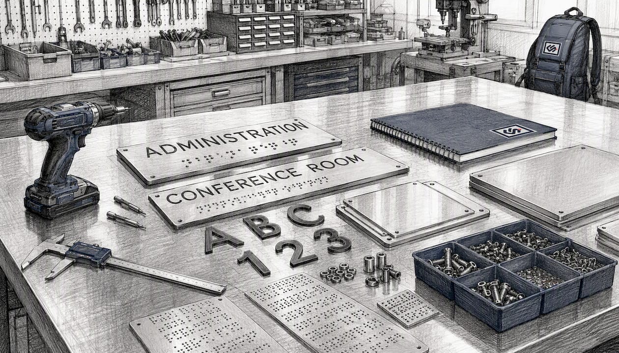
ADA-compliant signage isn't just a legal checkbox. The features that make signs accessible, high contrast, clear pictograms, raised characters, braille, and consistent placement, make signs better for every user. Predictability is the core benefit: when visitors know that room identification signs are always mounted at a consistent height to the right of the door latch, they stop searching and start reading.
For room identification signs, U.S. ADA standards require raised characters and Grade 2 braille, mounted with the centerline at 60 inches above the floor, on the latch side of the door. Directional and informational signs (overhead or wall-mounted) don't require braille but must meet contrast and character-height minimums. Tactile maps at major decision points serve visitors with visual impairments and also help sighted visitors who process spatial information better through a physical reference.
Multimodal cues — combining color, text, symbols, and tactile elements — create redundancy. Redundancy is exactly what reduces confusion: if one cue fails (a visitor is colorblind, a light burns out, a visitor doesn't read English), another cue carries the message. For ADA-compliant sign production, specifications must be locked in before fabrication, not added as an afterthought.
Common wayfinding mistakes that increase confusion and how to fix them
Most wayfinding failures aren't design failures. They're process failures: signs get added incrementally, nobody audits the full system, and the result is a patchwork that confuses more than it guides.
- Inconsistent terminology. "Lobby," "Main Entrance," and "Reception" all mean the same place on different signs. Fix: pick one name per location and enforce it across every touchpoint.
- Cluttered sign faces. Mixing navigational messages with promotional content or decorative graphics forces the eye to work harder. Clustering unrelated messages on one panel is one of the most common design errors in wayfinding. Fix: one sign, one purpose.
- Poor placement near decision points. A sign mounted after the turn, or visible only from one direction, fails the visitor it was meant to help. Fix: audit every decision point for sightline and approach angle.
- Over-branding that kills contrast. Brand colors applied without a contrast check produce signs that look great in a design file and disappear on the wall. Fix: document minimum contrast ratios in the spec and test with printed mock-ups before fabrication.
- Too many colors. Color-coding works with 4–6 zones maximum. Beyond that, visitors can't hold the system in memory. Fix: simplify the zone structure before adding more colors.
- Outdated maps. A you-are-here map showing a floor plan that no longer matches reality is worse than no map. Fix: build a maintenance schedule into the signage program from day one.
One point worth emphasizing: adding more signs to a fundamentally confusing floor plan has diminishing returns. Research confirms that floor plan complexity exerts a major influence on navigation outcomes even when signage is present. If your building layout is genuinely disorienting, signage alone won't fix it. Architectural cues, simplified routing, and strategic landmarks need to work alongside the signs.
How to audit, design, test, and maintain a wayfinding system
A wayfinding project that skips the audit phase almost always produces signs in the wrong places. The process below keeps you from that outcome.
Phases: Site audit → strategy and zone mapping → schematic sign design → prototype fabrication → pilot testing in one zone → full rollout → maintenance schedule.
Use this audit template in the field:
| Location | Decision point? | Sightline clear? | Lighting adequate? | Visibility distance (ft) | Competing visuals? | Notes / action |
|---|---|---|---|---|---|---|
| Main lobby entry | Yes | Yes | Yes | — | No | Add you-are-here map |
| Corridor B / C junction | Yes | Partially | No | 15 | Yes (bulletin board) | Relocate sign, add lighting |
| Elevator bank | Yes | No | Yes | 20 | No | Sign behind pillar — move |
| Restroom corridor | No | Yes | Yes | 30 | No | Add confirmational arrow |
| Emergency stairwell | Yes | Yes | No | 10 | No | Add illuminated exit sign |
For pilot testing, pick a single zone and run a simple A/B approach: measure wrong turns, pauses longer than five seconds at decision points, and staff direction inquiries before the change, then measure the same metrics after. Observable metrics like these are repeatable and give you a defensible case for the full rollout budget. Interactive kiosks and live-updating digital maps can also collect anonymous analytics automatically, which is useful for ongoing measurement in high-traffic facilities.
Quick wins (days to weeks): fix misplaced decision-point signs, standardize terminology, add confirmational arrows. System-level changes (months): full audit, redesign, ADA retrofits, new fabrication.
What drives cost and how long a wayfinding project typically takes
Cost in a wayfinding program scales with three things: quantity, complexity, and compliance requirements. Here's what moves the number in each direction.
Primary cost drivers:
- Sign quantity and physical size (more signs, larger panels = higher material and fabrication cost)
- Material and finish selection (aluminum composite vs. cast acrylic vs. dimensional letters vs. digital displays)
- Custom fabrication vs. standard panel systems
- Digital display integration (hardware, software licensing, content management)
- Installation complexity, including ceiling heights, wall substrates, and permitting requirements
- ADA retrofits on existing signage (often requires full replacement, not just modification)
- Site survey and sightline documentation before design begins
Rough scale cues:
- Small fix (a handful of decision-point signs, standardized terminology): days to two weeks from approval to install
- Moderate program (one floor or one building, new system design, ADA-compliant production): 4–12 weeks
- Full campus or enterprise rollout (multi-building, phased, with pilot testing): 2–6 months
Timeline stretches when permitting is required, when prototype approval cycles run long, or when the facility can't be accessed during business hours. Building maintenance schedules into the contract from the start prevents the "we'll update it later" drift that turns a good system into an outdated one within two years.
How to measure whether your wayfinding actually reduced confusion
Measurement doesn't require expensive technology. The most useful KPIs are ones your team can collect with a clipboard and a counter.
| KPI | Measurement method | Collection frequency |
|---|---|---|
| Direction inquiries to staff | Staff log (tally per shift) | Daily for 2 weeks pre/post |
| Wrong turns / backtracking rate | Observational audit (trained observer) | Weekly spot-checks |
| Dwell time in wayfinding zones | Video review or observer timing | Pre/post pilot |
| Average arrival time to appointments | Appointment system data | Monthly |
| Safety incident response time | Incident log | Ongoing |
| Visitor satisfaction score | Post-visit survey (1 question) | Ongoing |
The before/after plan is straightforward: establish a two-week baseline on all KPIs before any change, implement the signage update in a pilot zone, then measure the same KPIs for two weeks post-installation. If direction inquiries drop and wrong turns decrease, you have a documented case for scaling. Campus studies show that well-placed signage can decrease wrong turns by 50% and backtracking by 62%, though results depend heavily on floor plan complexity. Use those figures as a benchmark, not a guarantee.
What the research actually shows about wayfinding and human performance
The psychological evidence is harder to dismiss than most facility managers expect. Navigation struggles create measurable stress responses that change how people evaluate a space entirely. The Frontiers in Psychology integrative review documents elevated blood pressure, headaches, and fatigue as direct outcomes of poor wayfinding, not just annoyance. Visitors who arrive stressed at their destination carry that stress into the interaction that follows, whether it's a medical appointment, a job interview, or a client meeting.
Key finding: A campus study found that adding signage increased travel rate by 13%, decreased wrong turns by 50%, and decreased backtracking by 62%. Floor plan complexity still exerted a major influence on outcomes. (SAGE Journals)
The SAGE campus study results are significant because they quantify what most facility managers sense intuitively but can't prove to a budget committee. A 50% reduction in wrong turns and a 62% drop in backtracking are numbers worth putting in a business case. The caveat from the same study matters equally: signage has diminishing returns in very complex floor plans. If the architecture itself is disorienting, signs help but don't solve the problem alone.
For first impressions in professional service environments, the connection between smooth navigation and perceived quality is direct. A visitor who arrives at Studio2U or any client-facing business without confusion or delay starts the experience in a positive frame. That's not a soft benefit.
Key Takeaways
Well-designed wayfinding signage reduces confusion by lowering cognitive load, clarifying decision points, and confirming progress, and the operational and psychological benefits are measurable from day one.
| Point | Details |
|---|---|
| Fix decision points first | Signs at intersections and elevator banks produce the fastest reduction in wrong turns and staff inquiries. |
| Consistency is non-negotiable | Matching terminology, fonts, colors, and symbols across every sign prevents hesitation and backtracking. |
| ADA features help everyone | High contrast, raised characters, and tactile cues create redundancy that benefits all visitors, not just those with disabilities. |
| Measure before and after | Track staff direction inquiries, wrong turns, and dwell time pre/post installation to build a documented ROI case. |
| Crispsign delivers end-to-end | Crispsign handles custom wayfinding fabrication, ADA-compliant production, and optional installation coordination, shipped nationwide. |
Why function should always outrank aesthetics in a wayfinding spec
Most wayfinding projects go sideways at the same moment: when the brand team reviews the design and asks for the typeface to match the logo, the colors to match the brand palette, and the sign size to match the architectural aesthetic. None of those requests are unreasonable on their own. The problem is that they're applied without a legibility check, and the result is a beautiful sign system that nobody can read from 20 feet away.
The insight that gets overlooked most often is this: a sign that a visitor notices but can't read quickly is functionally the same as no sign at all. The brain registers the sign, attempts to decode it, fails under time pressure, and the visitor either stops moving or asks for help. You've spent the budget and created the same problem.
The practical fix is simple but requires discipline during the schematic phase. Document minimum contrast ratios before any color is approved. Require sightline mock-ups at actual scale before fabrication begins. Test prototypes with real users, not designers. The placement change that produces the biggest navigation gain is almost always the least expensive one: moving a sign from the wrong side of a decision point to the right side costs nothing in fabrication and everything in outcome.
Signage that works is signage that disappears into the background of a confident visitor experience. When it's doing its job, nobody comments on it. That's the goal.
Crispsign builds wayfinding systems that actually get people where they're going
Crispsign takes wayfinding projects from audit to installation, with custom-fabricated signs built to your exact spec and shipped nationwide. Whether you need a handful of ADA-compliant room ID plaques or a full multi-building directional system, the process is the same: a quick audit of your decision points and sightlines, a schematic proposal with placement recommendations, prototype approval before full production runs, and optional installation coordination through a vetted third-party installer.
Every sign is fabricated to spec, including raised characters, braille, and contrast-compliant finishes for ADA requirements. The CrispLobby wayfinding line covers interior directional signs, lobby identification panels, and room ID plaques. For full ADA upgrades, the CrispLobby ADA signage page walks through compliance options and available finishes. Get your instant estimate at crispsign.com/lobby and have a proposal in hand before your next planning meeting.
Useful sources and further reading
- Wayfinding in Interior Environments: An Integrative Review — Frontiers in Psychology. Peer-reviewed review documenting the psychological and physiological effects of poor wayfinding, including stress responses and visitor perception impacts.
- Wayfinding Signage and Walking Perception in Urban Environments — Human factors framework identifying cognitive load, situation awareness, decision-making, and emotional engagement as the four pathways through which signage affects navigation.
- Effects of Signage and Floor Plan Configuration on Wayfinding Accuracy — SAGE Journals. Campus study quantifying the impact of signage on wrong turns (50% reduction) and backtracking (62% reduction), with important caveats about floor plan complexity.
- What Is Wayfinding? How It Works and Why It Matters — Digital Signage Today. Practical overview of operational benefits, consistent visual cues, and digital wayfinding tools including kiosks and live-updating maps.
- A Systematic Review of Factors Influencing Signage Salience in Indoor Environments — MDPI Sustainability. Research review on visual salience factors that determine whether a sign gets noticed in complex indoor environments.
FAQ
What are the benefits of wayfinding signage?
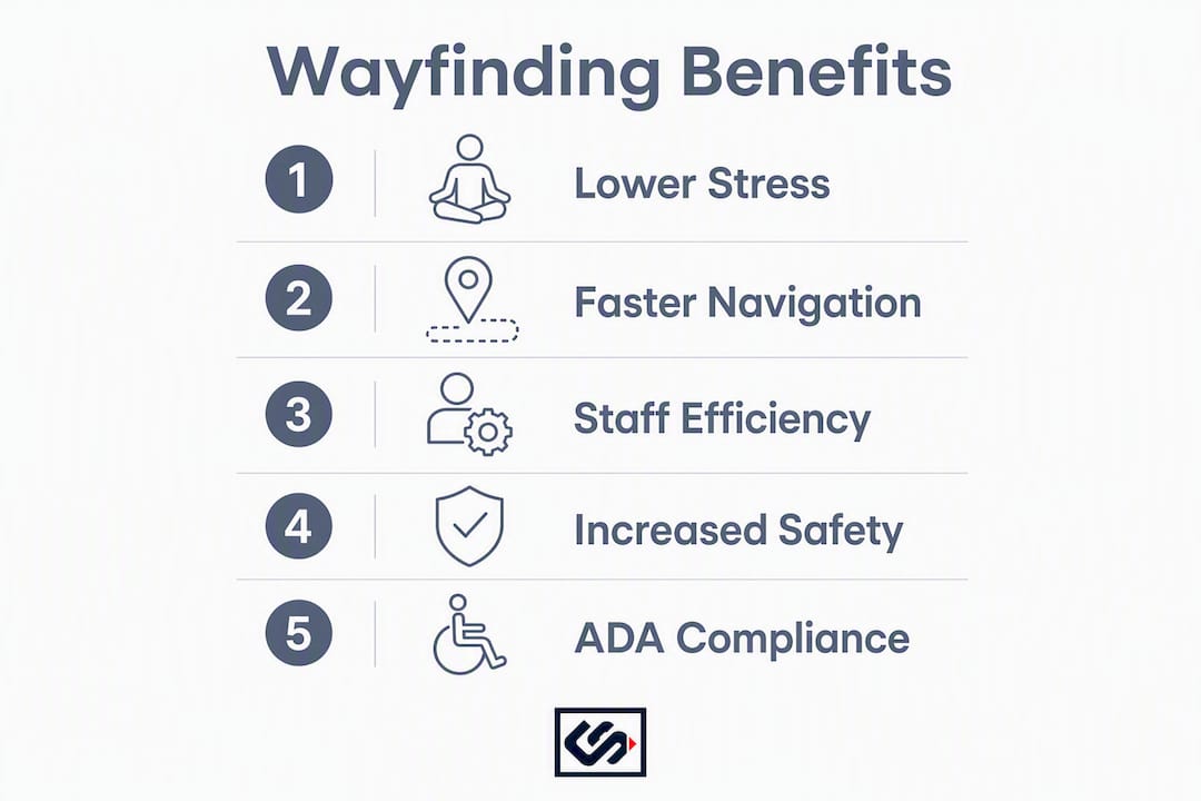
Wayfinding signage reduces visitor confusion, lowers cognitive load, cuts staff time spent giving directions, and improves safety by clarifying emergency egress routes. Facilities with effective directional signage also see higher visitor satisfaction scores and fewer appointment delays.
What do wayfinding signs mean?
Wayfinding signs are a coordinated system of visual cues, including directional arrows, identification panels, you-are-here maps, and regulatory markers, that guide people through a space by answering three questions: Where am I? Where do I want to go? How do I get there?
What is the best practice for wayfinding signage?
Place signs at every decision point before the turn, use consistent terminology and symbols throughout the entire system, and add confirmational signs after each turn. ADA-compliant contrast ratios and placement heights should be locked into the spec before fabrication begins.
What are common wayfinding mistakes?
The most common errors are inconsistent location names across signs, cluttered sign faces that mix navigation with promotional content, poor placement that puts signs after the decision point rather than before it, and brand color palettes applied without a contrast check. Each mistake increases hesitation and backtracking rather than reducing it.