
Design Eye-Catching Restaurant Entrance Signs That Win
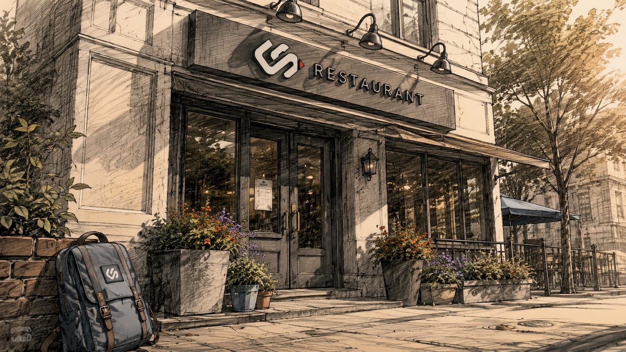
A restaurant entrance sign is the first sales pitch your building makes. Get it right, and foot traffic follows. Get it wrong, and potential customers walk past without a second look. To design an eye-catching restaurant entrance sign, you need three things working together: visibility from a distance, clear brand identity, and layered messaging that pulls people closer. The industry term for this approach is tiered exterior signage, and it applies whether you run a fine dining room or a neighborhood bistro. This guide covers every layer, from the street to the door.
What are the essential components of an eye-catching restaurant entrance sign setup?
The most effective restaurant signage works in three tiers, each targeting customers at a different distance. Layered signage enhances visibility and builds customer trust as people move from the street to your door. Each tier has a specific job, and skipping one creates a gap in your customer conversion path.
Tier 1: The primary sign at 50 feet
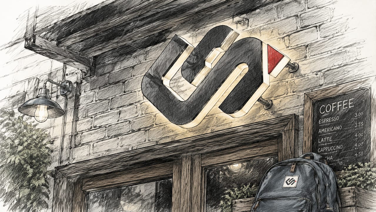
Your main fascia sign or channel letter display must be readable from 50+ feet to capture attention from passing vehicles and pedestrians. That distance standard exists because it matches the reaction time a person needs to decide whether to stop. The sign should show your name and logo clearly, use high contrast colors, and include illumination for evening hours. Backlit channel letters and light boxes are the most reliable formats for this tier.
Tier 2: Pedestrian engagement at 20 feet
A-frame sandwich boards positioned at eye level effectively engage pedestrians with daily specials and witty messaging. This is where personality enters the picture. A chalkboard A-frame with a clever line about your burger or a rotating wine special does two things: it stops foot traffic and signals that real people run this place. Social proof displays, including printed Google review scores or award badges, also belong at this distance. They build trust before a customer ever opens your door.
Tier 3: Door-level friction removal
The final tier covers everything within arm's reach of your entrance. Menu displays should be backlit or well-lit, concise, current, and priced visibly at standing eye level. QR codes linking to your full menu, hours of operation, and reservation links all belong here. This tier removes the last reason a hesitant customer has to walk away.
Key components by tier:
- Primary sign: Channel letters, light boxes, or illuminated cabinet signs with your name and logo
- A-frame boards: Daily specials, seasonal offers, or a single witty line that reflects your brand voice
- Social proof: Printed review scores, press mentions, or award plaques mounted near the entrance
- Door-level signs: Backlit menu display, hours, QR code, and any accessibility or payment information
Pro Tip: Neon signs and sculptural dimensional lettering serve double duty. Illuminated neon signs add warmth and character and photograph well at night, making them organic social media content every time a guest snaps a photo outside your restaurant.
How do you choose fonts, colors, and materials for maximum readability?
Color contrast is the single most important design decision in attractive restaurant signage. Dark text on a light background, or light text on a dark background, reads clearly at distance. Avoid mid-tone combinations like navy on dark gray. The contrast rule applies regardless of your brand palette. Work your brand colors into the background, border, or accent elements rather than forcing them into the text itself.
Font choice follows a simple rule: if you have to squint to read it from across the street, it fails. Script fonts and heavily decorative typefaces look beautiful up close but collapse at distance. The best restaurant entrance signs use clean serif or sans-serif fonts for the primary name, then reserve decorative lettering for secondary elements like taglines or A-frame boards viewed at close range.
Material selection affects both durability and visual character:
- Metallic finishes: Brushed aluminum and stainless steel read as upscale and hold up in weather without fading
- Acrylic with LED backlighting: Clean, modern look with strong night visibility and low energy draw
- Hand-painted wood or metal: Hand-painted signage creates premium, high-impact visual branding with a craft feel that mass-produced signs cannot replicate
- Neon or LED neon flex: Warm, retro character that photographs well and works for both modern and vintage concepts
- Chalkboard panels: Low cost, fully updatable, and ideal for the A-frame tier
Lighting deserves its own decision. A sign that reads perfectly at noon can disappear at 7:00 PM without proper illumination. Front-lit, back-lit, and halo-lit options each create a different mood. Halo lighting, where light glows behind raised letters, reads as premium. Front-lit cabinet signs read as practical and clear. Match the lighting style to the restaurant's overall atmosphere.
How do you maintain and update restaurant entrance signs effectively?
Poorly maintained signage damages brand perception more than no signage at all. A burned-out letter in your name or a sun-faded A-frame tells customers the same story: this place does not pay attention to details. Maintenance is not optional. It is part of your marketing budget.
Follow this maintenance routine to keep your signage working at full strength:
- Clean primary signs weekly. Dust, bird droppings, and grime reduce contrast and readability. A microfiber cloth and mild cleaner handle most surfaces without scratching.
- Inspect lighting every Monday morning. Burned-out bulbs or flickering LEDs should be replaced the same day they are noticed. Broken lights undermine brand credibility instantly.
- Update A-frame and chalkboard content daily. Stale specials or last week's event listing signal neglect. Fresh content signals an active, attentive team.
- Audit pricing and menu displays monthly. Outdated prices create distrust at the door. If your menu has changed, your door display must reflect it.
- Schedule a seasonal design refresh. Swap in seasonal colors, holiday messaging, or updated photography every three to four months to keep the storefront feeling current.
Well-maintained, updated signs build trust with customers and reinforce quality perceptions of the restaurant. That connection between sign condition and perceived food quality is not intuitive, but it is real. Customers make assumptions about kitchen standards based on what they see before they walk in.
Pro Tip: Keep a small maintenance kit near the host stand: chalk markers, a cleaning cloth, and a spare bulb for your most-used fixture. The faster you can fix a problem, the less time it spends working against you.
What are creative ideas and trends for restaurant entrance signs in 2026?
The most memorable examples of eye-catching restaurant signs share one quality: they give people a reason to stop and look, not just read. Creative entrance sign design in 2026 leans into three directions: sculptural presence, social media appeal, and personality-driven messaging.
Custom sculptural signage attracts social media photography, increasing brand visibility and guest engagement. A three-dimensional logo mounted above the entrance, an oversized neon installation, or a mosaic tile sign panel all function as landmarks. Guests photograph them. Those photos reach audiences you never paid to reach.
Creative concepts worth considering for your storefront:
- Dimensional lettering with depth: Channel letters or foam-core letters with metallic finish create shadow and depth that flat signs cannot match
- Chalkboard art with rotating wit: A single clever line updated daily builds a local following. People walk past just to see what you wrote this week.
- Mirrored or reflective A-frames: Minimalist mirrored stainless steel A-frames engage pedestrian curiosity more effectively than loud, cluttered messages. The reflection draws the eye without demanding attention.
- Story and values panels: A small framed panel near the entrance explaining your sourcing philosophy or founding story adds personality that a logo alone cannot deliver
- Layered sign combinations: The strongest examples of creative bistro signs combine a bold primary sign, a neon accent, and a witty A-frame into a single cohesive visual system
The trend toward signage as brand identity rather than just wayfinding reflects a broader shift in how restaurants compete. Your entrance is not just a label. It is the first chapter of the experience you are selling.
| Sign type | Best use case | Visibility tier |
|---|---|---|
| Channel letters | Primary name display, day and night | 50+ feet |
| Neon or LED neon | Brand accent, social media appeal | 20–50 feet |
| A-frame chalkboard | Daily specials, personality messaging | 5–20 feet |
| Backlit menu display | Menu preview, pricing, hours | At the door |
| Sculptural or dimensional | Brand landmark, photography magnet | 20–50 feet |
Key Takeaways
A restaurant entrance sign works best when it operates as a tiered system, with each layer targeting customers at a specific distance and serving a distinct purpose.
| Point | Details |
|---|---|
| Primary sign visibility | Your main sign must be readable from at least 50 feet with clear fonts and strong contrast. |
| Tiered signage approach | Use three tiers: primary sign, pedestrian-level A-frame, and door-level friction removal. |
| Material and lighting match | Choose materials and lighting that suit both your brand personality and your operating hours. |
| Maintenance is non-negotiable | Broken lights and stale content damage customer trust as much as a bad review. |
| Creative signs drive social reach | Sculptural and neon signs generate organic photography that extends your brand beyond the block. |
What I've learned after years of watching restaurants get their signs wrong
Most restaurant owners treat signage as a one-time purchase. They spend real money on the primary sign, install it, and consider the job done. That is the most common and most costly mistake I see.
The restaurants with the strongest street presence treat their entrance as a living system. The A-frame gets updated every morning. The lighting gets checked every week. The primary sign gets a refresh every couple of years. That consistency compounds. A well-maintained sign in year three looks better than a neglected premium sign in year one.
The other thing I have noticed is that restraint works better than most owners expect. A mirrored A-frame with nothing on it stops more people than a chalkboard packed with ten specials. Curiosity is a more powerful pull than information overload. The best entrance signs I have seen make you want to know more, not hand you everything at once.
The permit side also catches people off guard. Many restaurant owners design a sign they love, order it, and then discover local zoning restricts the size, illumination type, or placement. Getting sign permits sorted before fabrication saves real money and real frustration. Do not skip that step.
— Nick
How Crispsign helps restaurant owners build signage that works
Restaurant owners who want professional results without the back-and-forth of managing multiple vendors find a direct path with Crispsign.
Crispsign designs and fabricates custom restaurant entrance signs, from illuminated channel letters to dimensional sculptural pieces, with a production workflow built for faster turnaround. The team handles design, fabrication, and permit coordination, so you are not managing three separate contractors. For restaurants that also need interior or accessibility signage, Crispsign's lobby and ADA solutions cover the full scope of professional signage from the street to the dining room. Every sign ships fabricated to spec, ready to install.
FAQ
What makes a restaurant entrance sign readable from the street?
A primary restaurant sign must be readable from at least 50 feet, using high-contrast colors, clean fonts, and illumination for night visibility. Avoid decorative scripts for the main name display.
How often should I update my A-frame or chalkboard sign?
Update A-frame and chalkboard content daily. Stale messaging signals neglect and reduces the pedestrian engagement these signs are designed to create.
What sign types work best for social media visibility?
Neon signs and custom sculptural or dimensional lettering generate the most organic photography. Sculptural signage acts as a social media landmark that guests photograph and share without any prompting.
Do I need a permit for a restaurant entrance sign?
Most municipalities require a permit for exterior signs, particularly illuminated or large-format displays. Check local zoning rules before ordering fabrication to avoid costly changes after production.
What is the biggest mistake restaurant owners make with entrance signage?
Neglecting maintenance is the most damaging error. Broken lights and outdated information undermine brand credibility instantly, regardless of how well the sign was originally designed.