
How Custom Signs Boost Visibility for Your Business
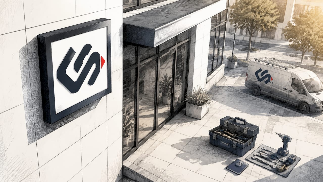
Custom signs are the most direct tool a business owner has to capture attention before a customer ever walks through the door. In the signage industry, this function is called wayfinding and brand visibility signage, and it covers everything from exterior channel letters to interior lobby panels. Understanding how custom signs boost visibility means understanding placement, design, and the behavioral science behind how people actually see and respond to signs. Research shows that 61% of consumers could not find a business because its signage was too small, unclear, or not visible from an adequate distance. That single statistic represents lost revenue happening right now, outside your front door.
How custom signs boost visibility through strategic placement
Placement is the most underestimated factor in sign effectiveness. Most business owners spend hours choosing fonts and colors, then mount their sign flat against a wall and call it done. That approach leaves real foot traffic on the table.
Eye-tracking and heatmap studies reveal exactly where pedestrians look as they move past a storefront. Attention clusters on surfaces that align with natural head and eye movement during walking. A flat-mounted sign forces viewers to turn their heads at an unnatural angle. An angled sign meets them where their gaze already is.

Angling signs between 30 and 55 degrees significantly increases visual engagement and reduces fixation latency compared to flat-mounted signs. Fixation latency is the time it takes for the eye to lock onto a target. Shorter latency means faster recognition, which matters enormously on a busy sidewalk where a pedestrian passes your storefront in under three seconds.
Signs also function as behavioral triggers that slow pedestrian pace and increase storefront scanning. A study of over 1,100 pedestrian trajectories confirmed that sign placement directly changes foot traffic patterns and dwell times. A sign positioned at the right height and angle does not just inform. It physically changes how people move.
Key placement principles to apply:
- Mount at eye level or slightly above. Signs placed between 5 and 7 feet from ground level capture the most natural sightlines for adult pedestrians.
- Angle outward toward approaching traffic. A 30 to 55 degree angle from the building face maximizes early detection.
- Limit competing visual elements nearby. Environmental visual clutter dilutes sign effectiveness. Keeping two or fewer competing signs in a viewer's field of view improves attention and engagement.
- Position signs within the optimal recognition range. For pedestrians, this is typically 10 to 30 feet. For vehicle traffic, extend that range significantly.
Pro Tip: Test your sign's visibility by standing at the distance where most of your foot traffic originates, whether that is a crosswalk, a parking lot entrance, or a transit stop. If you cannot read it clearly in under two seconds, your placement needs adjustment.
Common placement errors are well documented. The storefront signage mistakes most likely to cost you customers include mounting signs too high, placing them behind obstructions like awnings or trees, and ignoring the approach angle of your primary customer flow.
Which design principles make custom signs stand out?
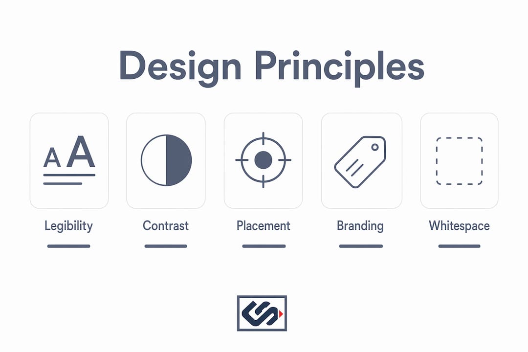
Design determines whether a sign gets noticed and remembered. The most common mistake businesses make is prioritizing visual style over legibility at distance.
The Rule of 10 is the industry standard for letter sizing: 1 inch of letter height for every 10 feet of viewing distance. A sign meant to be read from 50 feet away needs letters at least 5 inches tall. Failure to apply this rule produces signs that look polished up close but are completely illegible to passing traffic.
Color contrast and material finish
High contrast between text and background is non-negotiable. Dark text on a light background, or light text on a dark background, outperforms low-contrast combinations in every legibility study. High-contrast matte finishes with indirect halo lighting yield maximum visibility day and night while reducing glare and eye strain. Matte and satin finishes outperform high-gloss acrylic across different weather and lighting conditions. Gloss looks premium in a showroom but creates reflection problems in direct sunlight or rain.
Brand anchors and peripheral recognition
Brand color splashes on sign edges trigger peripheral vision recognition, increasing brand familiarity before a customer even looks directly at the sign. Peripheral color processing is faster than shape or text recognition. This means your brand colors do marketing work before your logo or name registers consciously. Use this to your advantage by keeping brand colors consistent across all sign elements, including borders, mounting hardware covers, and surrounding architectural details.
Whitespace and font selection
Whitespace prevents visual crowding. A sign packed with text, logos, phone numbers, and slogans forces the viewer's brain to work too hard. The result is that nothing gets retained. Leave at least 30% of your sign face as open space. Choose clean, sans-serif fonts for exterior signs. Decorative scripts may match your brand personality, but they fail at distance and in low light.
| Design element | Best practice | Common mistake |
|---|---|---|
| Letter height | 1 inch per 10 feet of viewing distance | Sizing for close-up aesthetics only |
| Finish | Matte or satin with indirect lighting | High-gloss acrylic in outdoor settings |
| Color contrast | Dark on light or light on dark | Similar hue combinations |
| Whitespace | Minimum 30% of sign face | Filling every inch with information |
| Font style | Clean sans-serif for exterior use | Decorative scripts at distance |
Pro Tip: For signs that must perform in both daylight and after dark, specify indirect LED halo lighting behind channel letters. It eliminates glare, maintains color accuracy, and keeps your sign readable at 11 PM as clearly as at noon.
The role of signage in brand identity goes beyond aesthetics. A well-designed sign communicates professionalism and reliability before a customer reads a single word.
What measurable benefits do custom signs provide?
Custom signage delivers measurable returns across multiple business metrics, not just brand awareness. The benefits of custom signs compound over time because a sign works every hour the business is open, and often when it is closed.
High-quality wayfinding signage increases average basket value by up to 15% by reducing customer anxiety and increasing time spent in store. When customers can navigate easily, they browse longer and spend more. Wayfinding signage, the category of signs that guide people through a space, functions like a silent sales associate.
"Custom signage acts as continuous, low-cost advertising that builds brand familiarity and trust in local communities. Signs serve as visual magnets attracting both foot and vehicle traffic, sometimes generating hundreds of daily impressions."
That daily impression count matters because brand familiarity drives purchase decisions. A customer who has seen your sign every day for three months is far more likely to walk in than one encountering your business for the first time. Custom signage builds brand familiarity passively, without ongoing ad spend.
Foot traffic metrics provide more accurate and immediate insights into sign engagement than relying solely on sales data. Sales figures are affected by pricing, inventory, staff performance, and seasonality. Foot traffic isolates the sign's contribution to drawing people in. Track pedestrian counts before and after installing or repositioning a sign to get a clear read on its actual impact.
Motion and simple transitions increase noticeability by 30–35% compared to static signage, improving walk-in rates immediately upon implementation. This applies specifically to digital signage formats. For businesses considering a hybrid approach, combining a static exterior sign with a digital interior display captures both the brand consistency of physical signage and the attention-grabbing power of motion.
How can businesses implement custom signage effectively?
Effective signage does not happen by accident. It requires a clear process from goal setting through installation and ongoing maintenance.
Define your primary visibility goal. Are you trying to attract new foot traffic from the street, guide existing customers through your space, or reinforce brand recognition in your local area? Each goal points to a different sign type and placement strategy.
Audit your current sightlines. Walk the approach paths your customers use. Identify where their eyes naturally land. Note any obstructions, competing signs, or lighting gaps that reduce your current sign's effectiveness.
Apply the Rule of 10 before finalizing letter size. Measure the distance from your sign to the farthest point where you want it to be readable. Divide by 10 to get your minimum letter height in inches.
Choose materials for your specific environment. A sign in a high-humidity coastal area needs different materials than one in a dry inland climate. Matte finishes, aluminum substrates, and UV-resistant inks extend sign life and maintain legibility.
Plan for lighting from the start. Retrofitting lighting onto an existing sign is expensive and often looks unfinished. Specify your lighting approach during the design phase, whether that is halo LED, front-lit channel letters, or backlit panels.
Integrate signage into your broader brand system. Your exterior sign, interior wayfinding, window graphics, and vehicle wraps should all use the same color palette, fonts, and logo treatment. Consistency builds the brand familiarity that drives repeat visits.
Measure foot traffic before and after installation. Use a simple door counter or a more detailed pedestrian analytics tool to establish a baseline. Compare counts at the same time of day and week after your sign goes up. The data will tell you whether placement and design are working.
Schedule regular maintenance reviews. A faded, cracked, or flickering sign does more damage than no sign at all. Build a quarterly inspection into your operations calendar. Review exterior sign errors that accumulate over time and address them before they affect customer perception.
Treating signage as a living part of your marketing, not a one-time purchase, is what separates businesses that grow their foot traffic from those that plateau.
Key Takeaways
Custom signs boost storefront visibility most effectively when placement, design legibility, and foot traffic measurement work together as a system.
| Point | Details |
|---|---|
| Placement angle matters | Angling signs 30–55 degrees from the building face reduces fixation latency and increases pedestrian engagement. |
| Apply the Rule of 10 | Use 1 inch of letter height per 10 feet of viewing distance to keep signs legible to passing traffic. |
| Matte finishes outperform gloss | High-contrast matte or satin finishes with indirect lighting maintain visibility in all weather and lighting conditions. |
| Wayfinding increases basket value | Quality wayfinding signage can raise average basket value by up to 15% by reducing customer anxiety in-store. |
| Measure foot traffic, not just sales | Pedestrian counts isolate sign impact more accurately than sales data, which is affected by many other variables. |
What I've learned after years of watching signs succeed and fail
Most business owners treat signage as a one-time expense rather than a marketing asset. That mindset is the single biggest reason so many signs underperform.
I have seen businesses invest in beautiful, expensive signs that generated almost no new foot traffic. The design was flawless. The problem was placement. The sign faced the wrong direction for the primary pedestrian flow, and nobody caught it until months of lost opportunity had passed. Conversely, I have watched a simple, well-placed sign with strong contrast and correct letter sizing outperform a flashier installation that cost three times as much.
The insight that most articles miss is this: businesses tend to obsess over typography and color effects while ignoring detection distance. A sign that looks great in a design mockup at arm's length may be completely invisible to someone driving past at 30 miles per hour. Detection distance is the first problem to solve. Everything else is secondary.
The other shift I would encourage is viewing your signage as a concierge system rather than a static billboard. Your exterior sign draws people in. Your window graphics confirm they are in the right place. Your interior wayfinding moves them through the space. Each sign in that sequence has a specific job. When they work together, the customer experience feels effortless. When one link breaks, the whole system loses effectiveness.
Small and medium businesses have a real advantage here. You can make signage decisions quickly, test them, and adjust. Large chains often take months to approve a sign change. You can move in a week. Use that speed.
— Nick
Crispsign builds signs that work as hard as you do
Crispsign specializes in custom storefront signage fabricated to spec for small and medium businesses that need professional results without the enterprise price tag. From exterior channel letters to lobby and ADA signage, every sign goes through a production review before it ships. The goal is simple: your sign should capture attention, communicate your brand clearly, and hold up over time. If you are ready to put a sign on your building that actually earns its place, Crispsign's team is ready to build it. The sign your building wears says everything before a customer says a word.
FAQ
How do custom signs boost visibility for small businesses?
Custom signs increase visibility by combining correct placement, legible design, and brand-consistent colors that attract attention from pedestrians and drivers. Research shows 61% of consumers have failed to find a business due to poor signage, making quality signs a direct driver of foot traffic.
What is foot traffic signage?
Foot traffic signage refers to signs designed specifically to attract and guide pedestrians toward and through a business. This includes exterior signs that draw people in and interior wayfinding signage that moves them through the space.
What angle should a business sign be mounted at?
Signs angled between 30 and 55 degrees from the building face generate significantly more visual engagement than flat-mounted signs. This angle aligns with natural eye and head movement during walking, reducing the time it takes a pedestrian to notice and read the sign.
How do I measure whether my sign is working?
Track foot traffic counts before and after installing or repositioning your sign. Foot traffic metrics provide more accurate insight into sign performance than sales data alone, since sales are affected by pricing, staffing, and other variables.
Does sign lighting really make a difference?
High-contrast matte finishes with indirect halo LED lighting maintain sign visibility day and night while eliminating glare. A sign that is unreadable after dark loses all its marketing value during evening hours, which for many businesses represent peak customer activity.