
The Role of Contrast in Signage: A 2026 Guide

Contrast in signage is defined as the measurable difference in luminance and color between a sign's text, graphics, and background. That difference is the single biggest factor determining whether your sign gets read or gets ignored. The role of contrast in signage goes far beyond aesthetics. It governs legibility from a distance, guides the eye through a visual hierarchy, and signals brand credibility before a customer reads a single word. Industry standards now specify a minimum luminance contrast ratio of 4.5:1 for standard text and 3:1 for large text. Those numbers are not suggestions. They are the threshold between a sign that works and one that fails.
What is the role of contrast in signage for visibility?
Contrast operates through two primary mechanisms: luminance and color. Understanding both is the foundation of effective signage design.
Luminance contrast measures the difference in brightness between foreground and background. It is the dominant driver of legibility. Light-on-dark and dark-on-light pairings produce the strongest luminance contrast and can be quantified with a contrast ratio for consistent, repeatable results. A white letter on a black background scores near the maximum ratio of 21:1. That combination reads clearly at distance, in low light, and at an angle.
Color contrast adds a second layer. Hue and saturation differences make signs more visually distinct from their surroundings. However, color contrast alone is not enough. The human visual system processes luminance faster than hue. A red letter on a green background may look vivid on a screen but reads poorly in physical environments because the luminance values of red and green are often nearly identical.
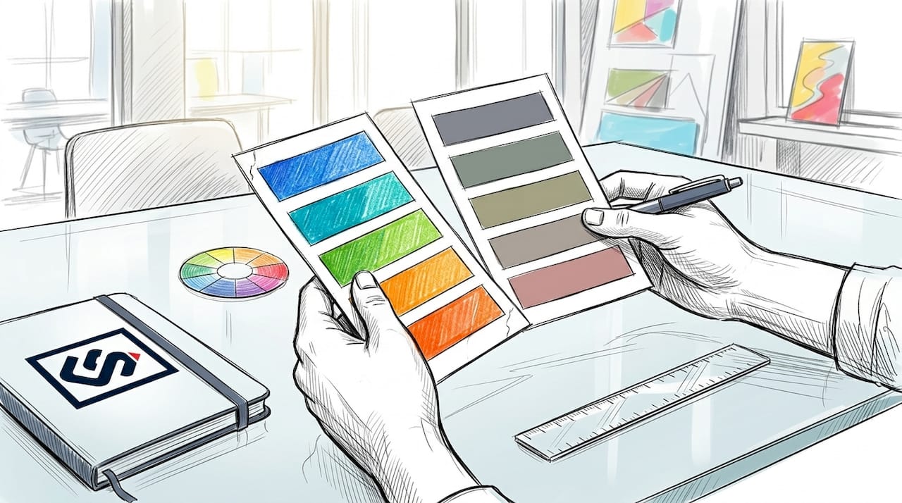
Saturation pitfalls are a common trap. Saturated, high-intensity colors placed side by side create visual "vibration," a perceptual blur that reduces legibility even when the colors appear highly contrasted on a monitor. Orange on red, or purple on blue, are classic examples. The effect is especially pronounced on backlit signs.
Here is a quick reference for contrast type, what it measures, and its primary application:
| Contrast type | What it measures | Primary application |
|---|---|---|
| Luminance | Brightness difference | Legibility at distance and in low light |
| Hue | Color family difference | Visual distinction from background |
| Saturation | Color intensity difference | Attention and brand differentiation |
Color blindness affects roughly 8% of men and 0.5% of women. That means a significant share of your customers cannot distinguish red from green. Relying on hue alone excludes those customers entirely. Luminance contrast works for everyone.
Pro Tip: Test your sign colors by converting the design to grayscale. If the text and background look similar in grayscale, your luminance contrast is too low regardless of how vivid the colors appear in full color.
How do environment and materials affect contrast performance?
A sign that looks perfect on screen can fail completely in the field. Environmental variables including ambient light angle, reflections, and surface texture all reduce perceived contrast. This is not a minor concern. It is the most common reason well-designed signs underperform after installation.
Natural light changes throughout the day. A sign with strong contrast at noon may wash out completely in direct afternoon sun. Artificial lighting introduces its own variables. Fluorescent overheads cast a flat, even light that flattens contrast. Sodium vapor streetlights shift color perception dramatically, making yellow signs appear white and blue signs appear gray.
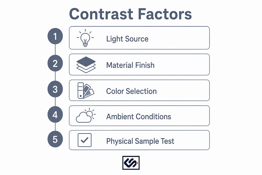
Material finish matters as much as color choice. Glossy surfaces reflect ambient light directly into the viewer's line of sight, creating glare that obscures the sign face. Brushed metal and glass are the worst offenders. ADA standards specifically require non-glare finishes on tactile signs for this reason. The same principle applies to any sign where legibility is the priority.
The mounting background compounds the problem. A white sign mounted on a white wall loses all contrast at the edges. A dark sign on a brick facade may blend into the texture. The sign's contrast ratio must account for the actual surface it sits against, not just the internal contrast between text and sign background.
- Test the sign in the intended location at multiple times of day
- Check performance under both natural and artificial lighting conditions
- Evaluate glare from all primary viewing angles
- Confirm the sign reads clearly against the actual mounting surface
- Review legibility for viewers approaching from 10 feet, 30 feet, and 100 feet
Pro Tip: Request a physical sample or proof from your sign fabricator and install it temporarily before committing to full production. What you see in a digital proof is not what you get on a wall.
What are best practices for high contrast signage design?
Strong contrast in signage starts with color selection, but it does not end there. Font choice, spacing, and layout all determine whether contrast translates into actual readability.
1. Start with proven color pairings. High-visibility combinations like black on yellow, white on navy, and blue on white maintain clarity across lighting conditions. These pairings work because they combine strong hue contrast with strong luminance contrast. Black on yellow, for example, is the combination used on road hazard signs globally. That is not a coincidence.
2. Adapt your brand palette for physical environments. Brand colors built for print or digital screens often fail in physical signage unless adjusted for luminance and light reflection. A navy blue that looks rich on a website may appear nearly black on a matte sign panel. Work with a fabricator who understands how material finishes affect color output. Crispsign's production process includes a review step specifically for this adjustment.
3. Choose fonts that hold up at distance. Sans-serif typefaces like Helvetica, Futura, and Franklin Gothic maintain legibility at distance because their strokes are uniform. Decorative or script fonts lose definition quickly. Letter spacing should be slightly wider than standard print settings. Tight tracking that looks elegant on a business card becomes unreadable on a storefront sign.
4. Use outlines and backboards to separate text from busy backgrounds. A thin contrasting outline around letters adds a second layer of separation. A solid backboard behind the sign face creates a controlled contrast environment regardless of what the mounting surface looks like. This technique is especially effective for window signs and exterior channel letters.
5. Balance contrast with brand consistency. High contrast does not mean abandoning your brand colors. It means finding the high-contrast version of your palette. A brand built on soft pastels can still achieve strong signage contrast by pairing a light pastel background with a deep, saturated version of the same hue for text. The role of signage in brand identity depends on consistency, and contrast is the mechanism that makes that identity visible.
How does contrast in signage support accessibility and compliance?
Accessibility and visibility are the same goal measured by different standards. ADA requirements mandate tactile characters with high contrast and non-glare finishes to support legibility for people with visual impairments. Meeting those requirements does not just protect you legally. It makes your signs work better for every customer.
The WCAG contrast ratio thresholds, 4.5:1 for standard text and 3:1 for large text, apply directly to physical signage as a practical benchmark. These ratios are measurable with free tools and give you an objective pass/fail standard before fabrication begins.
Research on safety signage recognition shows that effective human response under varied lighting requires meeting dual thresholds: a Color Visual Acuity score of at least 4.0 and a Perceived Color Difference of at least 0.0005. That finding matters for any business operating in environments with emergency lighting, dim interiors, or variable outdoor conditions.
Visual impairments affect a large portion of the population, and dyslexia affects readability for many more. High contrast reduces the cognitive load required to read a sign. Tactile text, Braille, and high-contrast finishes improve usability for all audiences, not just those with diagnosed impairments. Businesses that treat accessibility as a design principle rather than a compliance checkbox build stronger brand trust.
- Use a minimum 4.5:1 luminance contrast ratio for all standard sign text
- Apply non-glare finishes to any sign where direct viewing is expected
- Confirm tactile characters meet ADA height, font, and mounting specifications
- Avoid color-only coding; always pair color differences with luminance differences
- Test signs for legibility under emergency or reduced lighting conditions
Common storefront signage mistakes often trace back to skipping these accessibility checks. A sign that fails ADA standards is also a sign that fails a significant share of your customers.
Key Takeaways
Contrast is the most measurable and most overlooked factor in signage effectiveness. Get it right and your sign works harder than any other marketing asset on your building.
| Point | Details |
|---|---|
| Luminance drives legibility | Prioritize brightness difference over hue; it works for all viewers including those with color blindness. |
| Test in real conditions | Digital proofs do not show glare, ambient light shifts, or mounting surface effects. |
| Meet the 4.5:1 standard | Apply WCAG luminance contrast ratios to physical signage as a measurable pass/fail benchmark. |
| Adapt brand colors for signage | Colors built for screens often fail on physical materials; adjust for luminance and finish. |
| Accessibility is a design advantage | ADA-compliant contrast improves usability for every customer, not just those with impairments. |
Contrast is not a style choice. It is a performance spec.
After working in signage design for years, the pattern I see most often is this: a business invests in a beautiful sign, approves the digital proof, and then wonders why foot traffic does not respond. Nine times out of ten, the problem is contrast. Not the logo. Not the font. The contrast.
The mistake is treating contrast as an aesthetic decision made at the end of the design process. It is not. Contrast drives legibility almost as much as size, and a sign with strong contrast reads from farther away than a larger sign with weak contrast. That is a measurable, testable fact. Yet most businesses never measure it.
The other thing I see constantly is the gap between screen and reality. A designer sends over a mockup that looks sharp on a monitor. The client approves it. The sign gets fabricated. Then it goes up on a wall with afternoon sun hitting it at 45 degrees, and the text disappears. Signage colors designed for digital screens underperform in physical environments unless specifically adjusted for luminance and material reflectance. That adjustment has to happen before fabrication, not after.
The trend I am watching in 2026 is adaptable signage: designs that account for multiple lighting environments from the start, with contrast ratios validated for both daylight and artificial light conditions. That is where professional sign design is heading. The businesses that get ahead of it now will have signs that work in every condition their customers encounter.
Treat contrast as a specification, not a preference. Measure it. Test it. Build it into your brief before a single design decision gets made.
— Nick
Crispsign's ADA signage solutions put contrast to work
Your sign is the first thing a customer sees. It should never make them work to read it.
Crispsign builds ADA-compliant signage with high-contrast finishes, non-glare materials, and tactile characters fabricated to spec. Every sign goes through a production review that checks luminance contrast against WCAG standards before it ships. The result is signage that meets accessibility requirements and performs in real-world lighting conditions. Whether you need lobby signs, room identification, or exterior wayfinding, Crispsign delivers professional-grade results with faster turnaround than traditional fabricators. Get signage that works as hard as your business does.
FAQ
What is the minimum contrast ratio for signage?
The recommended minimum luminance contrast ratio is 4.5:1 for standard text and 3:1 for large text, based on WCAG guidelines applied to physical signage. These ratios are measurable before fabrication and serve as a reliable pass/fail standard.
Why does my sign look good on screen but poor in person?
Colors and contrast ratios optimized for digital screens often fail in physical environments because material finishes, ambient light, and glare all reduce perceived contrast. Always test a physical sample under real installation conditions before approving full production.
Does contrast in signage affect ADA compliance?
ADA standards require high-contrast, non-glare finishes on tactile signs, making contrast a legal requirement for many commercial applications. Meeting these standards also improves legibility for all customers, not just those with visual impairments.
What color combinations give the best sign visibility?
Black on yellow, white on navy, and blue on white are among the highest-performing combinations because they combine strong luminance contrast with strong hue contrast. These pairings maintain clarity across a wide range of lighting conditions.
How does color blindness affect signage design?
Color blindness affects a meaningful portion of the population, making hue-only contrast unreliable. Designing for strong luminance contrast ensures your sign remains legible for color-blind viewers and performs better for all customers in low-light conditions.