
What Is First Impression Signage? A Guide for SMBs

First impression signage is the visual messaging a business displays to communicate its identity and professionalism before any customer interaction occurs. The sign your building wears is often the first thing a prospective customer sees, and 75% of consumers notice a sign before anything else about a business. That single statistic explains why signage is not decoration. It is your first sales pitch. This guide breaks down how first impression signage works, what design standards govern it, and how small to medium-sized business owners can use it to drive real foot traffic and revenue.
What is first impression signage and why does it matter?
First impression signage refers to any exterior or interior sign that shapes a customer's initial perception of your business. The industry term for this practice is environmental graphic design (EGD), which covers the full range of visual communication built into a physical space. Whether you call it first impression signage or EGD, the goal is the same: make the right statement before a word is spoken.
The business case is direct. 60% of businesses report sales increases after improving their signage. That figure reflects a simple truth: better signage brings more customers through the door. For a small retail shop or a local service provider, that kind of lift can be the difference between a slow quarter and a strong one.

Signage also sets the tone for everything that follows. A clean, well-lit exterior sign tells customers the business is professional and worth their time. A faded, crooked, or cluttered sign tells them the opposite, even if the product or service inside is excellent.
How does signage shape customer perception?
Customers form rapid judgments from visual cues, and signage is the most prominent cue on any storefront. Psychologists call this the primacy effect: the first piece of information a person receives carries disproportionate weight in all later assessments. Initial impressions formed rapidly influence all later customer assessments, often causing a cognitive bias that confirms the original impression. That means a bad first look is hard to undo.
First impressions are weighted heavily by the brain, and initial signage impressions heavily influence all subsequent evaluations of the business and its brand. A customer who sees a poorly maintained sign may discount positive in-store experiences because the original negative impression anchors their overall judgment.
The practical consequences for business owners are significant:
- A damaged or illegible sign signals neglect, even when the interior is spotless.
- Inconsistent branding across signs creates confusion and reduces trust.
- Overly complex signage overwhelms viewers and pushes them to move on.
- A strong, clear sign builds confidence before a customer steps inside.
Negative impressions from poor signage may cause customers to discount positive store attributes they encounter later. This is not a soft, theoretical risk. It is a documented pattern in consumer psychology that directly affects buying behavior. Investing in the role of signage in brand identity is one of the highest-return decisions a small business owner can make.
What design principles make signage effective?
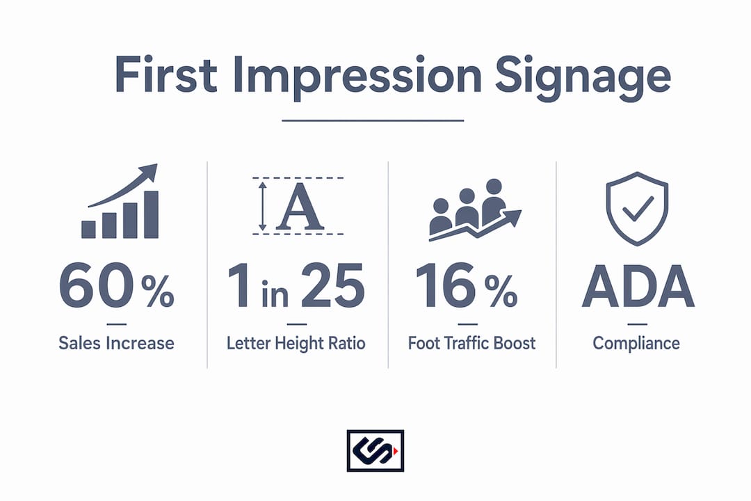
Effective signage follows measurable standards, not guesswork. The most cited legibility rule in the industry states that 1 inch of capital letter height supports comfortable reading at 25 feet of viewing distance, with a maximum of 1 inch per 50 feet. A sign mounted 50 feet from the curb needs letters at least 2 inches tall to be readable without strain.
| Design Element | Standard or Best Practice |
|---|---|
| Letter height | 1 inch per 25 ft of viewing distance (comfortable); 1 inch per 50 ft (max) |
| Color contrast | Dark text on light background or light text on dark background |
| Letter spacing | Open tracking improves legibility at distance |
| Material durability | Weather-rated materials for exterior; ADA-compliant finishes for interior |
| Message length | Limit to 5–7 words for exterior signs viewed from a moving vehicle |
Good color contrast and letter spacing are as important as letter size for readability at a distance. Dark text on a light background, or the reverse, outperforms low-contrast combinations by a wide margin. This is not a stylistic preference. It is a legibility standard backed by decades of visual research.
ADA compliance adds another layer of obligation for interior signage. Tactile characters, Braille, and specific mounting heights are required in many commercial spaces. Working with a fabricator who understands both municipal codes and ADA regulations protects you from costly retrofits after installation.
Pro Tip: Before finalizing any sign design, print or plot the design at full scale and view it from the actual installation distance. What looks sharp on a monitor often reads differently at 30 or 50 feet.
What are the most common signage mistakes to avoid?
Most signage failures are preventable. The most common errors share a root cause: skipping validation steps before production.
- Not testing at actual viewing distance. Designs approved on screen frequently fail in the field. Failing to prototype signage at actual installation sites leads to unexpected readability and compliance issues that are expensive to fix after fabrication.
- Ignoring mounting obstructions. Trees, awnings, utility poles, and neighboring signs can block significant portions of your sign. A site survey before design locks in the correct dimensions and placement.
- Overloading the message. Sign clutter causes mental friction that confuses viewers and degrades the first impression. Every word or graphic element that does not serve the core message weakens the sign.
- Skipping professional consultation. Designers must validate signage designs with professional fabricators and on-site full-size prototypes to confirm practical legibility and compliance with local and ADA regulations.
- Inconsistent brand elements. Using different fonts, colors, or logo versions across multiple signs fractures brand recognition and looks unprofessional.
Pro Tip: Treat your signage plan the same way you treat a lease negotiation. Get a site survey, review local permit requirements, and confirm ADA obligations before you spend a dollar on production.
For a deeper look at what goes wrong most often, the common exterior sign mistakes guide from Crispsign covers the specific errors that cost business owners the most money and visibility.
How can you use signage to boost foot traffic and sales?
Exterior signage is your most cost-effective marketing channel. Targeted improvements to signage can increase weekly sales by up to 16%, according to Sign Research Foundation data. That figure applies to businesses that made deliberate, research-backed changes to their storefront signs, not just cosmetic updates.
A practical approach to creating memorable signage follows a clear sequence:
- Audit your current signage. Walk your storefront from the street at multiple times of day. Note what is visible, what is blocked, and what is illegible. Take photos from 25, 50, and 100 feet.
- Align signage with your brand identity. Your exterior sign, window graphics, and interior wayfinding signs should use the same fonts, colors, and logo. Consistency builds recognition.
- Add directional signs where needed. Wayfinding signage guides customers from the parking lot or street to your entrance, reducing friction and improving the overall experience.
- Measure the impact. Track foot traffic and weekly sales before and after any signage change. This data tells you what is working and where to invest next.
- Update signage as your brand evolves. A sign that was accurate three years ago may no longer reflect your current offerings or visual identity.
Exterior signage drives customer foot traffic and sales by clearly communicating brand identity and offerings to passersby. The key word is "clearly." Clarity and speed of message delivery are paramount for exterior signs, where viewers have limited attention spans and sight distances. A passerby moving at 25 mph has roughly two seconds to read your sign. Every design decision should serve that constraint.
Key Takeaways
First impression signage is the single most visible investment a small business owner can make, and the research consistently shows it pays off in measurable sales growth.
| Point | Details |
|---|---|
| Signage drives sales | 60% of businesses report sales increases after improving their signage. |
| Primacy effect is real | Initial signage impressions anchor all later customer judgments about your business. |
| Legibility has a standard | Use 1 inch of letter height per 25 feet of viewing distance for comfortable readability. |
| Clutter kills conversions | Limit exterior signs to 5–7 words and remove any element that does not serve the core message. |
| Prototype before production | Always test full-scale mockups on-site to catch readability and compliance issues early. |
Why I think most businesses underinvest in signage until it's too late
After years of working with business owners on signage projects, I keep seeing the same pattern. Signage gets treated as a one-time setup cost rather than an ongoing brand asset. A business opens, installs a sign, and then ignores it for a decade while everything else about the brand evolves.
The retail environment has shifted significantly. Foot traffic patterns changed after 2020, and customers now make faster decisions about whether to enter a business. Your sign has less time to work than it did five years ago. That makes the quality of the first impression more important, not less.
The businesses I have seen grow consistently are the ones that treat signage the same way they treat their website. They review it annually, update it when the brand changes, and test new approaches when sales plateau. That mindset shift, from cost to investment, is what separates the storefronts that pull customers in from the ones that get walked past.
If you are on the fence about upgrading your signage, run the math. A 16% increase in weekly sales from a signage update pays back the production cost faster than almost any other marketing spend. The sign your building wears is working 24 hours a day, seven days a week, without a salary.
— Nick
How Crispsign builds signage that works from the first glance
Your storefront deserves a sign fabricated to spec, built from durable materials, and designed to meet both your brand standards and local compliance requirements.
Crispsign works with small to medium-sized businesses nationwide to design and build custom exterior and interior signage that makes the right first impression every time. From channel letters to ADA-compliant lobby signage, every product goes through a production review before it ships. You get professional-grade results without the back-and-forth that slows most sign projects down. If your current signage is not pulling its weight, Crispsign is ready to build something that does.
FAQ
What is first impression signage?
First impression signage is any sign that shapes a customer's initial perception of your business before they interact with staff or products. It includes exterior storefront signs, window graphics, and interior lobby signs.
How does signage affect customer buying decisions?
Signage influences buying decisions through the primacy effect: the first visual impression anchors all later judgments. Poor signage can cause customers to discount positive in-store experiences they encounter afterward.
What is the standard letter height for readable signage?
The industry standard is 1 inch of capital letter height per 25 feet of viewing distance for comfortable reading. At 50 feet, the minimum recommended height is 2 inches.
How much can better signage increase sales?
Targeted signage improvements can increase weekly sales by up to 16%, according to Sign Research Foundation research. The gain reflects increased foot traffic driven by clearer, more visible storefront communication.
What are the most common signage mistakes?
The most common mistakes are overloading the sign with too much text, skipping site surveys, and failing to test designs at actual viewing distances before production. Each of these errors reduces legibility and weakens the first impression.